In this age, there may not be a single person, who is not familiar with the character, “Batman”, created by DC Comics. The superhero character was first introduced in 1939 by Detective Comics (DC Comics), and a queer logo was given to the same a year later to emphasize its nature and activities. This Batman logo has the shape of the silhouette of a bat in bold black. However, the logo went through several modifications (about 30) to be the brand identity it is today.
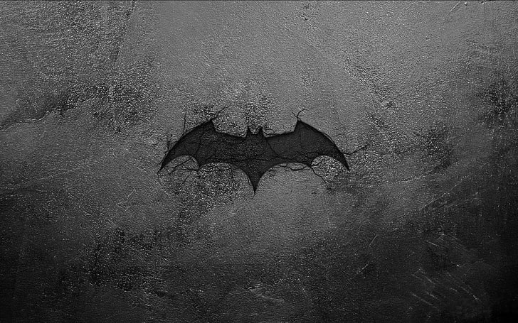
Although entirely fictional, Batman’s adventures have stolen the hearts of children and adults alike, and the silhouette of the Bat logo is recognized globally. The iconic superhero now has nearly 20 movies in his kitty, a combination of animation and otherwise. He also intrigued the legendary producer and director, Christopher Nolan, to create a series of three blockbuster movies, under the title, “The Dark Knight”. The total earnings from the movies went beyond $1 billion worldwide.
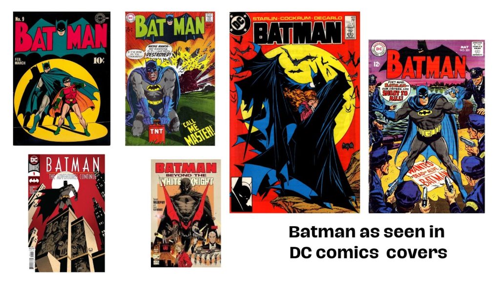
There is not a speck of doubt that Batman is more than just a superhero in the DC Universe. Unlike other superheroes of DC and Marvel, he doesn’t hold any superpower nor has the birthright to be a hero. It will not be wrong to say that he is a “hero by choice”, and not “by birth”. Owing to this greatness, and the work he does, the Batman brand has soared over the years through books, movies, and collectibles. It is one of the striking factors that enhance the superhero’s brand story.
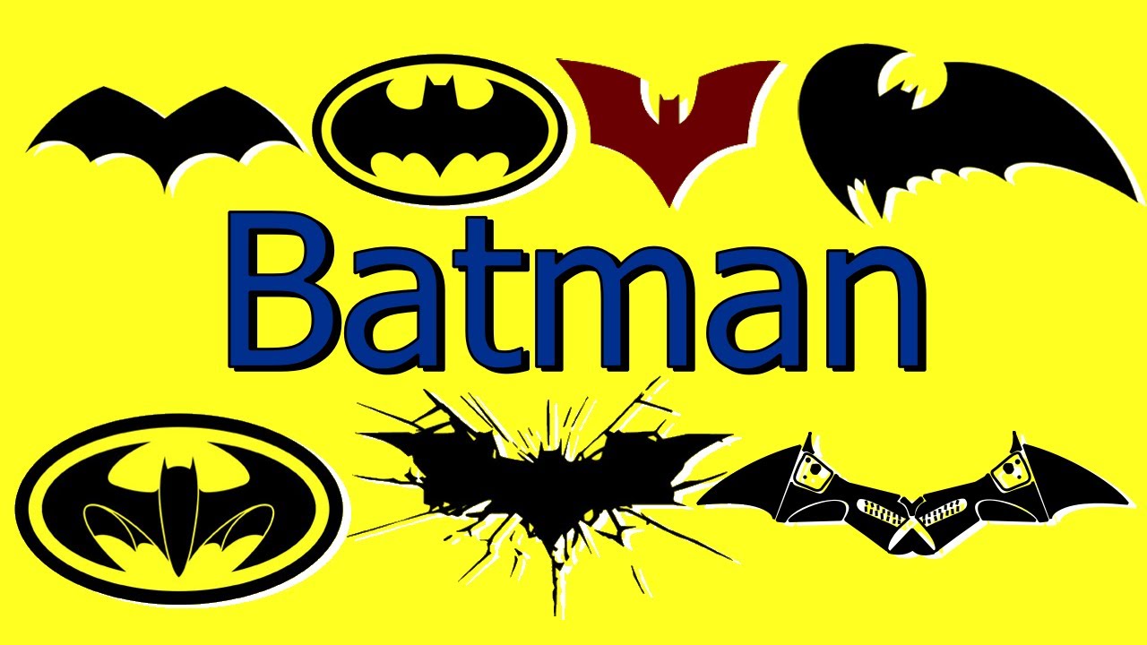
Likewise, the Batman logos over the years underwent both subtle and distinctive changes to stay on par with the needs of the audience.
Have you ever wondered why Batman was named so? Scroll on!
How did Batman get his name?
In the comic books, as well as in the movies, we have seen that Bruce Wayne (the character of Batman) chose this name to turn his fear in his favor. Yes, he was said to be scared of bats as a child. That is why, when he grew up, he chose the name, “Batman”, as his alter ego.
The vigilante avatar of Bruce Wayne wanted his enemies to shiver at the name itself. The criminals in Gotham City did end up fearing the name, as the story unfolded, thus establishing the superiority of Batman. He wanted to be seen as the caped vigilante, who worked in the night to cleanse the city of crimes and criminals.
However, according to some recent theories, there happens to be an alternative origin of the name. Several years before Bruce Wayne emerged as Batman, it is believed that there was a different Bat-man, a criminal, or a group of criminals, who kidnapped Wayne’s daughter, Helen in 20th-century Gotham.
During that time, the city was under the aid of detective Slam Bradley, who was called upon by the Wayne’s to investigate the disappearance of their girl, Helen. There was a note left in her room, apparently by the kidnapper, which was signed with a bat symbol.
Then there was this assumption that Bruce Wayne’s father, Thomas, sometimes hooded up in a bat outfit at parties for entertainment. It may also be the reason for Bruce choosing the name for his vigilante alter ego later.
Whatever might be the reason, it is clear now that the purpose he chose the name was successful, as criminals feared it. Not only criminals, but the name also invoked fear in the minds of the general residents, who, maybe, were traumatized by other “Bat-men” in the city.
History of the Batman Logo
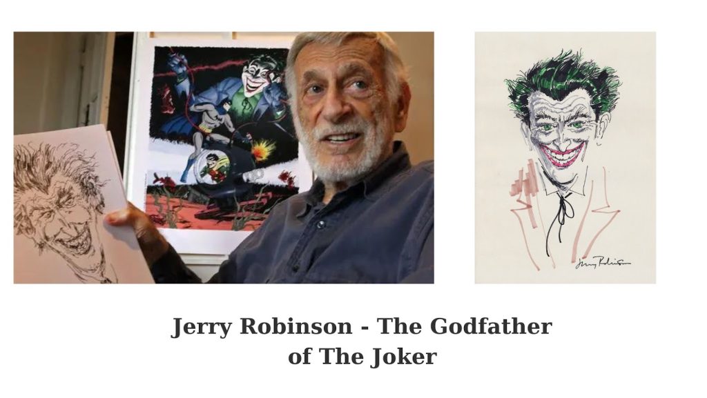
Much before Batman became a worldwide name, the logo was designed as an emblem to highlight the character in the comic books. In a blog by Todd Klein, It was revealed that the original Batman logo was created by Jerry Robinson, the famous American comics artist, as well as the co-creator of characters, Robin and The Joker, who appeared in the Batman stories later.
The logo was a simple, winged symbol of a bat with no ears or head. This logo went through numerous changes over the decades to be the current, impactful mascot of the superhero, which is used in books, movies, T-shirts, fan gifts, collectibles, etc. worldwide.
The current logo is designed by Cathryn Laver, after carefully studying the different versions of the bat logo since its inception. She has also confessed that she gained inspiration for the current Batman logo from a video that featured all stages of its evolution. Take a look at a similar video to understand how the visual identity of the superhero evolved through several decades.
Origin of the Batman Logo – Inspiration and Other Facts
The inspiration behind the logo of Batman is not much different from that of the name. As the story goes, Bruce Wayne witnessed the cold-blooded murder of his parents in his childhood. Since then, he wanted to grow up and become a ruthless criminal hunter to protect his city, Gotham, and its residents. Every superhero needs some kind of inspiration to put on the cape. Bruce gained his inspiration from his fear of bats, which he turned in his favor.
The Batman logo is a representation of Wayne’s alter ego, “The Bat”, which he used in his outfits and accessories, toys that he used to chase and catch criminals in Gotham City. He wanted his enemies to fear him like crazy, and the logo served that purpose quite well. At first, the Bat mascot in the logo did not have any ears or a head, but just two wings. Later, both these features were incorporated into the logo to create a fearsome brand identity for the caped superhero.
The hidden meaning of the Batman Logo
It is simple –
“I am Vengeance, I am the Night, I am Batman!”
Bats are known to be nocturnal creatures and often associated with supernatural entities, because of their queer nature. It comes as no big surprise that a superhero, who wanted to be feared by criminals, will choose the symbol to represent his stature. Hence, the meaning that the Batman logo seems to be hiding is fear – a chronic fear in the minds of the wrongdoers, something that Bruce Wayne always wanted.
On the other hand, the bat symbol stands for justice in the fight of good versus evil, and hope, especially during a crisis. As Batman protects Gotham City which feels hopeful on seeing his symbol, the logo is supposed to instill the same in the minds of Batman’s audience.
Additionally, the Batman logo has a deep message that everyone, a fan of the character or otherwise, should know.
As Bruce Wayne puts it,
“The idea was to be a symbol. Batman could be anybody; that was the point.”
It means that Batman’s identity is not his property. It is a symbol that serves a higher purpose, to protect, and to serve. In the movie, “The Dark Night”, Wayne delivers this dialogue, instantly rising above his vigilante status and proving that he is the selfless hero that everybody wants.
How the Batman Logo evolved through eight decades
Batman’s brand identity has changed, but the basic symbol has been the same – a bat.
Let us now learn about the different stages of the evolution of the logo to get an idea about its journey.
1939-41
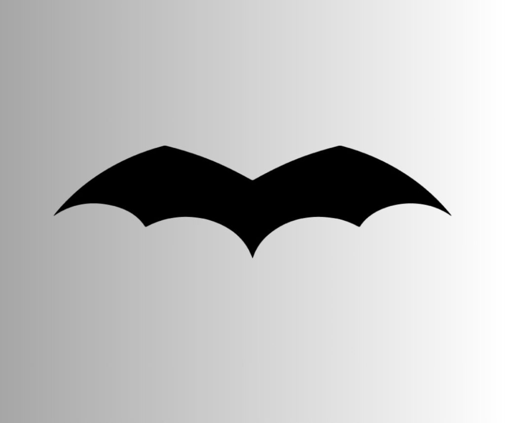
The first Batman logo was the simplest. It featured the wings of a bat, without any head or ears. There were five curved wing points in this design. It was in this way that the logo was introduced to the world in the books of DC Comics. The silhouette of bat wings became the character’s identity for decades. However, this identity was not sold as a franchise, because soon a second iteration was released.
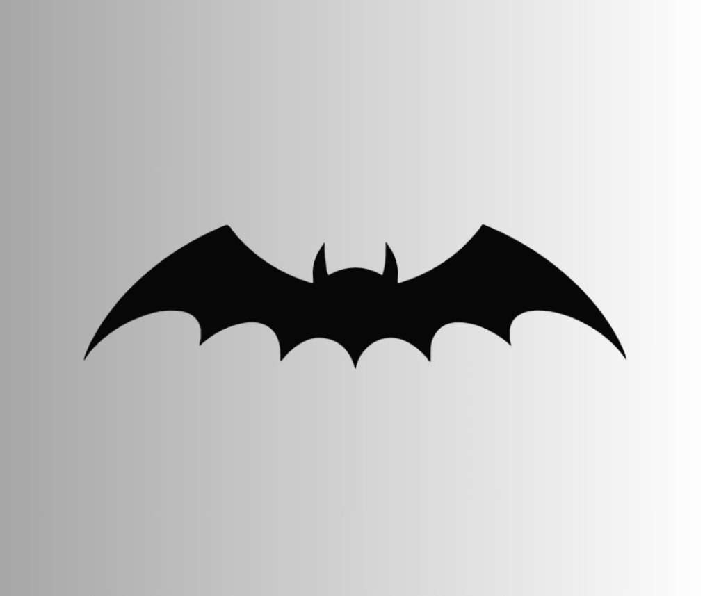
The second one, released in the same year, had distinct bat ears and a bat head added to the design. The two upper wing points were sharpened to depict a more bat-like image.
1941-44
This image had a gothic angle attached to it. The head became smaller, while the wing points were sharpened more, with the top wing angles made sharper and more distinct. The logo was also expanded vertically, thus making the wings appear taller.
1944-46
The fourth iteration of the Batman logo competed for both vertical and horizontal space. The number of wing points increased from five to seven, and the length of each tip elongated, thus accentuating each wing.
1946-50
The wing tips were again reduced to five, and the head became larger and more distinct along with its ears. The tail tip, as you can see in the image, appeared longer than the others.
1950-56
In the issues published during the phase, 1947-1950, the wing tips in the logo tended to appear rounded. Finally, the 1950 logo was introduced with the wings being curvier and less spacious than its predecessors. It is believed that this logo was designed to make the emblem fit perfectly on the chest of the superhero’s outfit. The bat appeared larger without occupying too much space.
1956-58
The curved image might not have gone down well with the audience, which might be the reason for the bat returning to its original sharp avatar. This image of the bat had a somewhat triangular shape, more compact and less spacious. This triangular Batman logo remained in practice for most of the 50s.
1958-60
The 1958 Batman logo was thinner but wider. The wing points were longer, making the head and the ears more visible.
1960-64
The size of the wings returned to its 50s versions, larger and wider. However, the size of the bat head remained the same.
1964-66
It was in this year that there was a characteristic change in the Batman logo. The creators introduced a bright yellow elliptical background for the dark black logo. While the reason for such a change is still unclear, some fans argue that the creators might have wanted to usher in a new Batman era. Hence, they might have thought to create a design that would be different from all its predecessors.
But one important thing to note here is, that introducing the yellow background did not pose many changes to the original bat emblem, which remained the same. Only the side of the wings on either side became curvier and shorter to fit into the oval frame.
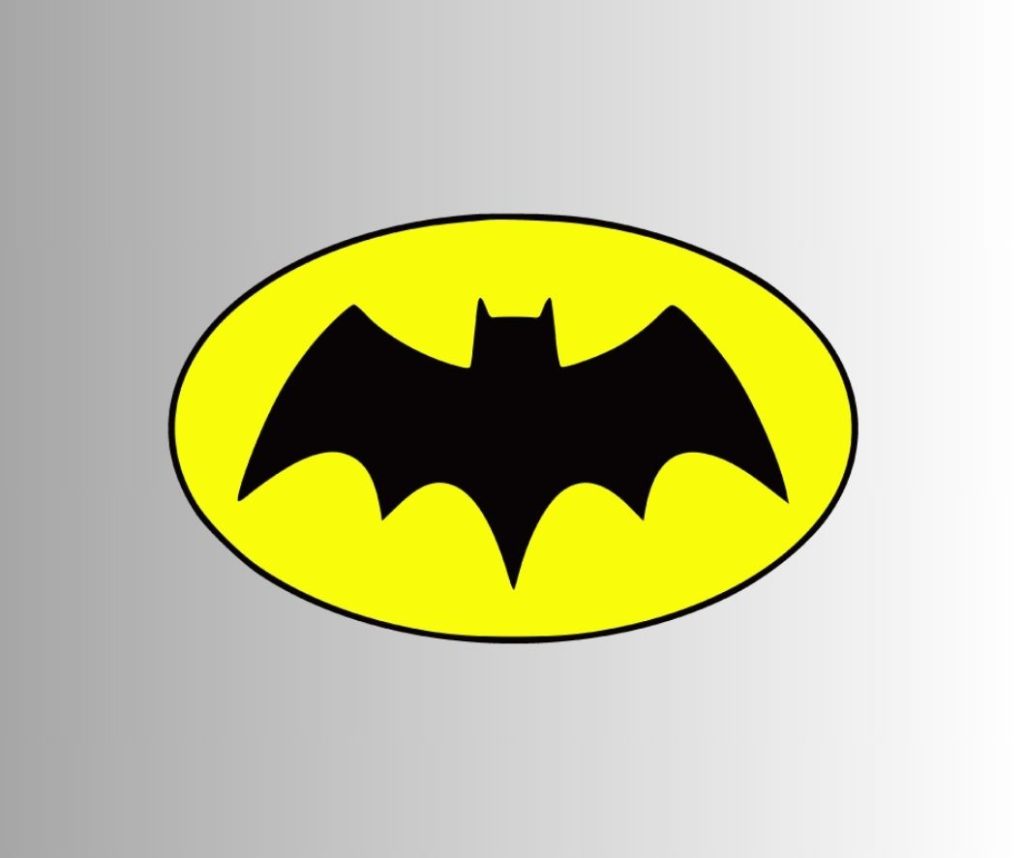
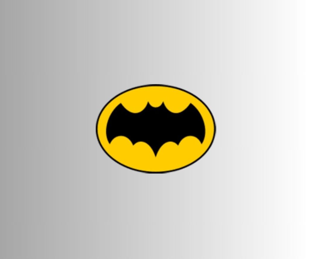
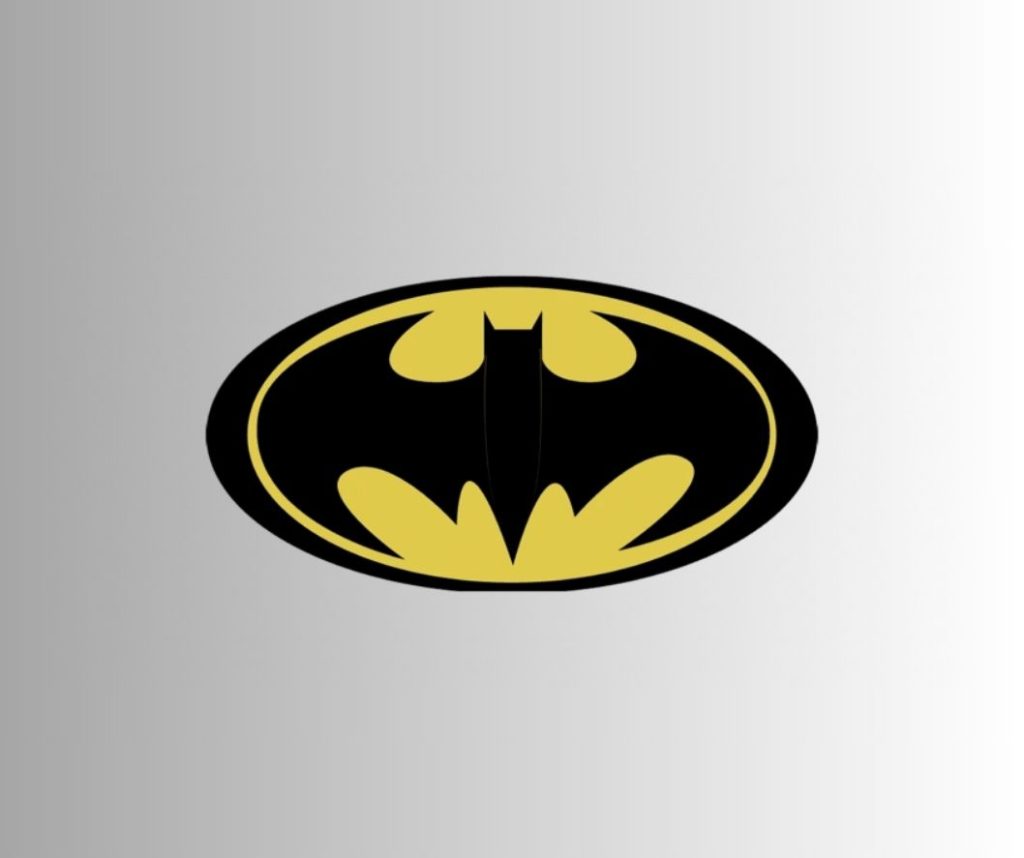
1966 – 2000
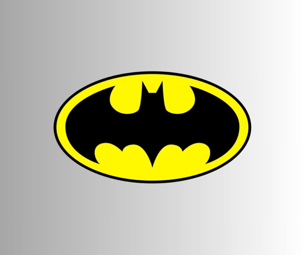
This phase marks the most important stage in the evolution of the Batman logo. The winged design was transformed entirely by giving visual emphasis to its yellow background. The side of the wings had a completely curvy appearance, fitting perfectly into the yellow ellipse. These two wings were spread out on both sides to fill up the space inside the ellipse. The bat head became more prominent, as well as its sharp ears, which were tilted a little on either side.
2000
After 30+ of living with the same design, the DC creators decided to design one more makeshift logo for their favorite superhero. The yellow ellipse was dropped, and the logo returned to mimic the image of its vintage versions, with its wings appearing closely similar to the 1946 logo. The only difference was the size of the logo, which was larger than any of its predecessors.
2011-2016
This design was simpler, with the sharp claws on the side wings of the bat dropped, and the tail of the bat lengthened. The head appeared a tad smaller than its previous version.
2016-2018
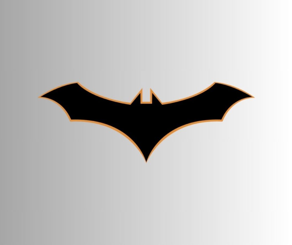
The 2016 logo is more geometric in appearance with sharp cuts and angles. It is also highlighted with a light orange border. One distinctive thing about this logo is, there are no curves in the image.
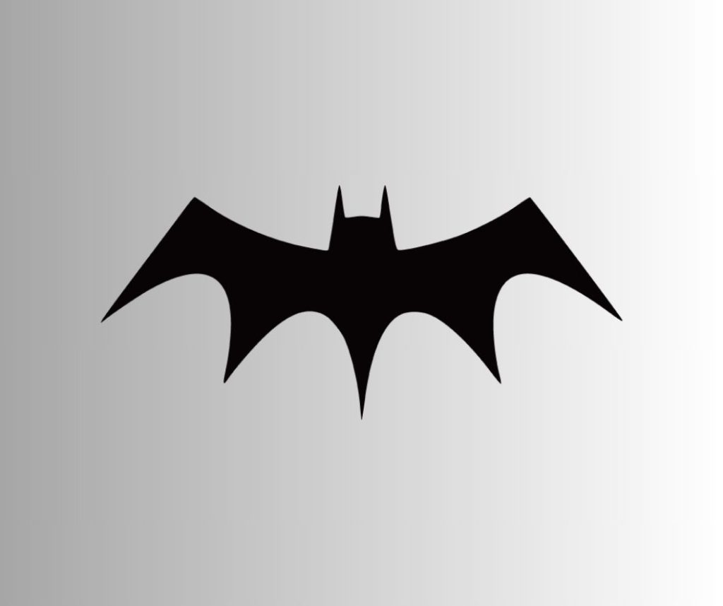
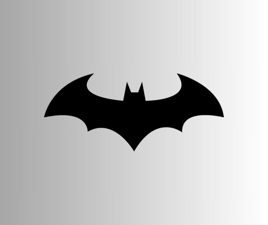
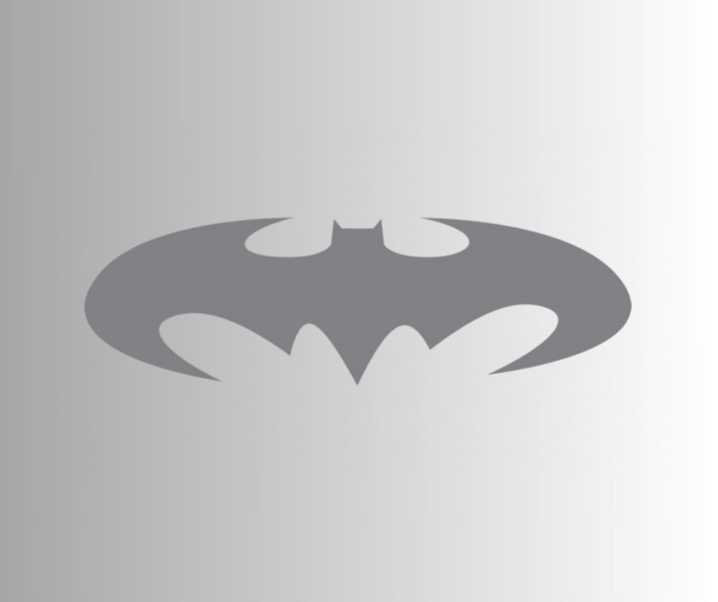
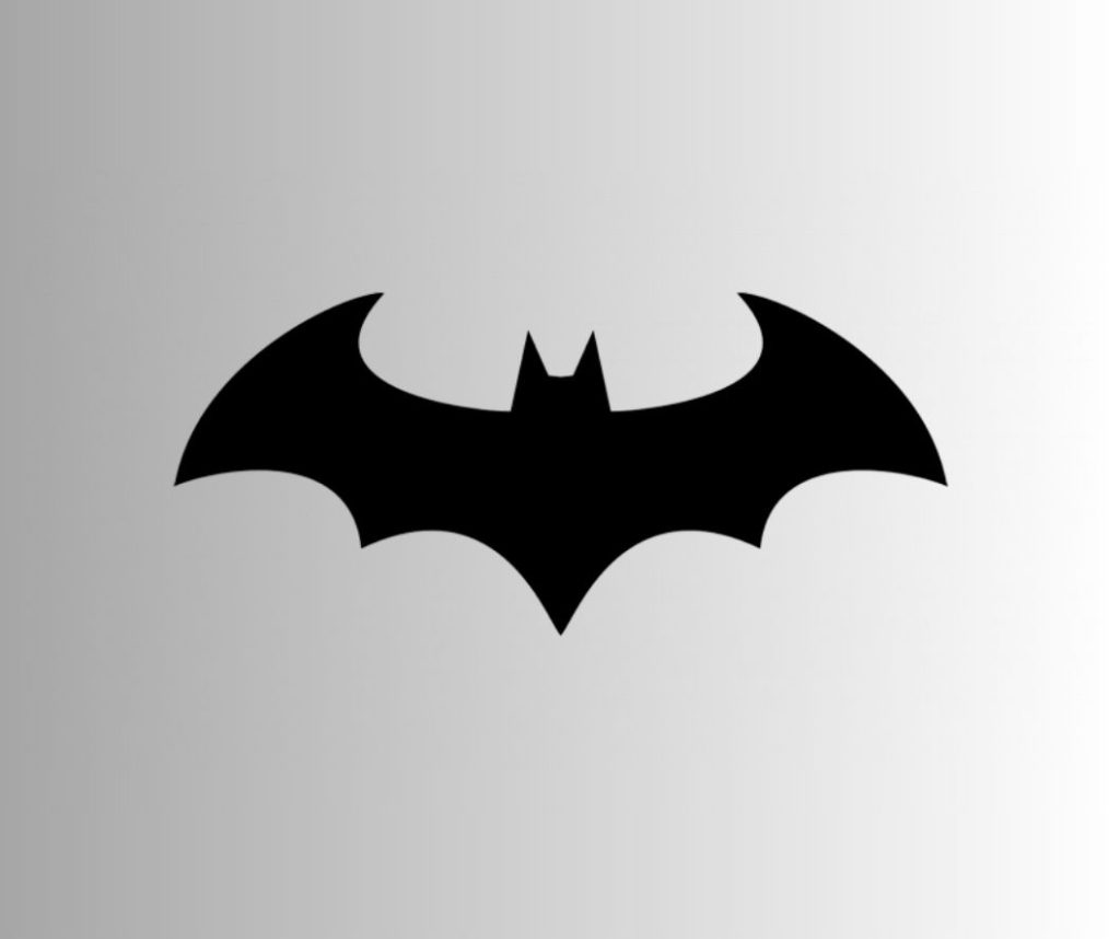
2018 – Present
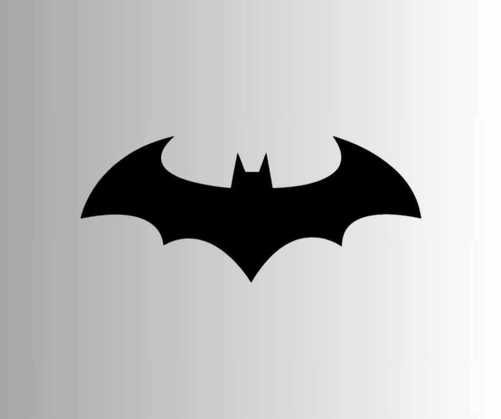
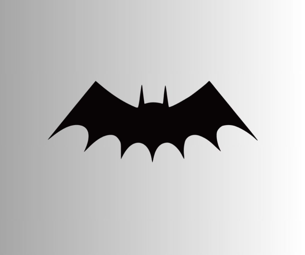
The current logo of Batman is, by far, the simplest and the most elegant of them all. It features large wings with a distinct head and sharp ears. The claws on the side wings make their reappearance, giving the bat image a realistic touch.
Evolution of the Batman Logo in Movies
Now, besides the books, the logo of Batman in the movies too has undergone several changes over the years. It was a part of the brand development process to keep the logo in sync with trends.
The first-ever movie appearance was in 1943, in which an American actor, Lewis Gilbert Wilson, played the role of Batman.
The logo used in the movie was small, much like those in the books at that time. However, this logo had more detailing in the batwings than its comic book counterpart. The bat was also thinner and wider.
1949
Coming to 1949, the creators went the extra mile to design logos for the “Batman and Robin” series. The bat appeared similar to its 1943 version. However, the shape of its head was somewhat different. Also, the bat was larger than its predecessor.
1966
Adam West starred in the television series, for which this logo was designed. Staying in sync with the book logo, the movie logo adopted a different form with the yellow ellipse appearing as a primary background setting. The shape of the wings of the bat was made oval but not filling in the entire space of the ellipse, as in the books.
1967
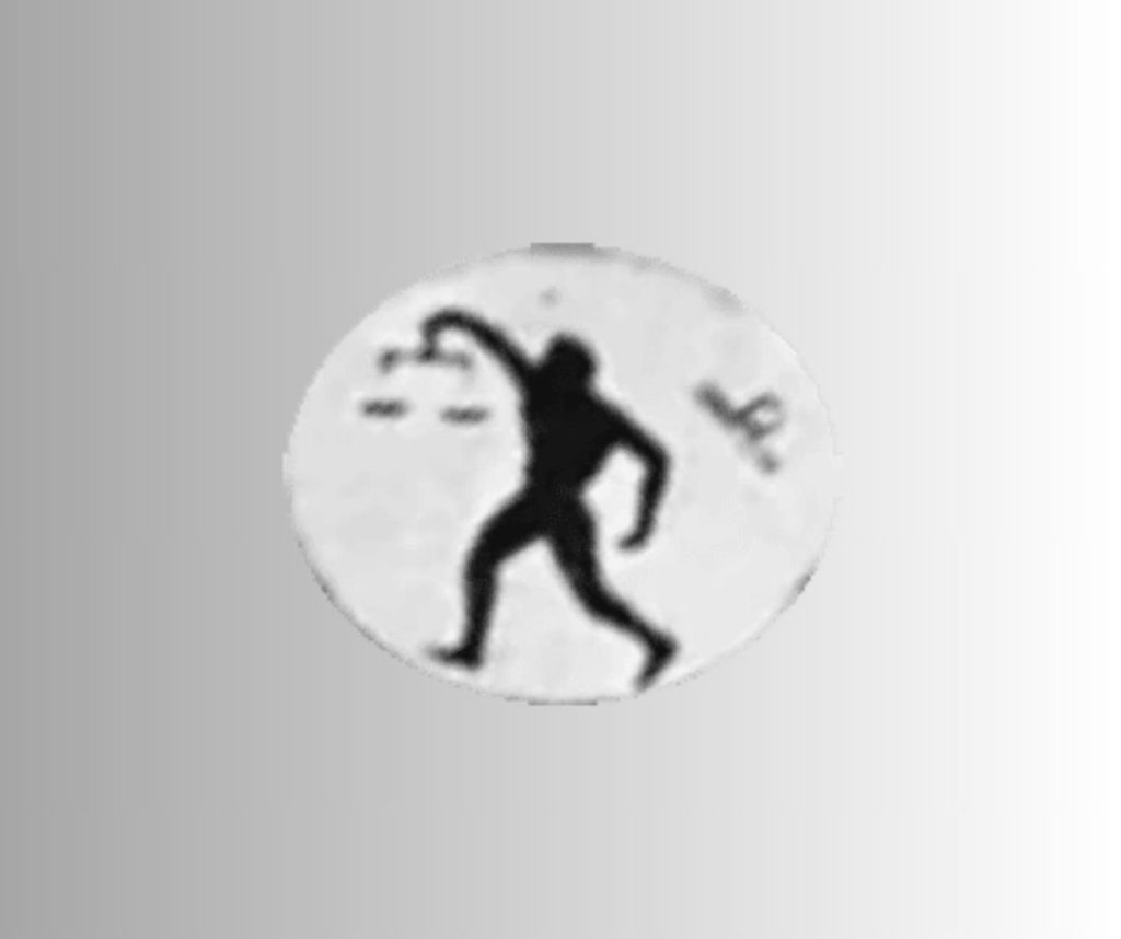
For the movie, “Batman vs. Dracula”, the creators introduced a different type of logo for Batman. It featured a man holding a scale to represent “justice”. This logo remained for a brief period until the bat returned for good.
1989
In the Michael Keaton starrer, the Batman logo, yet again, appeared with its characteristic yellow ellipse. The bat inside the logo was larger and somewhat different from the one in the books. The posters of the movie showed the bat inside the logo with five wing points, while in the movie, the same logo appeared with seven-pointed wings. The logo was also bordered by black.
1992
The emblem was again updated for the movie “Batman Returns” and was similar to the one in the books. The only difference, perhaps, was the extended tail of the bat, and the different shade of yellow, which was used in the background.
However, this logo was changed just a year later (1993) with the same yellow ellipse as in the comics. The bat in this logo had wider wings and a shorter tail.
This logo was used in the animated movie, “Batman – Mask of the Phantasm”, which was released in the same year.
1995
In the movie, “Batman Forever”, the logo was embossed on the suit, instead of being drawn on it. As a result, it occupied more space than its predecessors. This change ushered in a new approach to the concept of logo design, which was more of a relief pattern.
1997
The bat logo on the suit of the superhero in the movie, “Batman and Robin” (1997) was also embossed. It adopted the oval shape from the comics’ logo, only it wasn’t yellow this time. Instead, this was a black-on-black logo, smaller and more distinct. George Clooney, in the movie, put on a costume with a different logo, which was closer to the 1995 version.
Then the emblem for “The New Batman Adventures” in the same year showcased a more angular logo with less-extended wings.
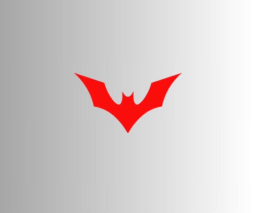
1999-2000
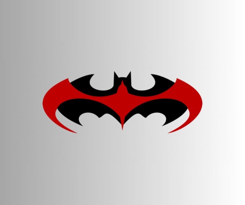
The “Batman Beyond” series designed a different logo, a red one with elevated wings, as shown below.
There was a mini-series in 2000, namely, “OnStar: Batman” that used the yellow oval logo with a black background and a black bat in the middle.
The wings (as you can see in the image) on either side of this bat logo were extended longer, and it also had a longer tail.
2004
The TV series “The Batman” featured a wider bat logo with many round curves on the lower side of the wings. Also, the angles at the corners of the wings were almost at 90-degrees.
2005

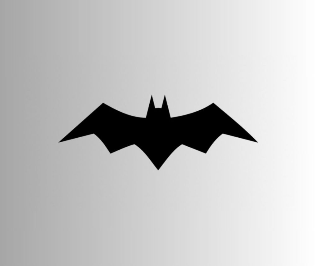
This year marks a remarkable twist in the history of Batman with Christopher Nolan’s “Batman Begins”, the first movie in his Dark Knight series. The logo used in this movie was similar to the one in the comics at that time. It featured a simple, geometric relief bat image in bold black with no extra detailing.
All three Batman movies in Nolan’s trilogy used simpler, more stylish, geometric bat logos. In the one below, the wings were elevated to adapt a symmetrical horizontal position with the head of the bat.
It was an aerodynamic design, as the shapes were used as tossable weapons in the movie.
2008
In 2008, the Nolan Batman logo adopted a more caped image of the superhero. The tail, as a result, was dropped, and the logo was bigger and thicker than any of its previous versions.
2009
The second movie in the “Batman” trilogy by Nolan brought back the previous geometric logo, only it was smaller this time. The shape of the wings was also tweaked a bit, and now, they didn’t have too much resemblance with the oval logo. The same logo was also used in the 2012 movie, “The Dark Knight Rises”, both in normal and HD versions.
2016
A completely different bat image was featured in the logo for the movie, “Batman v Superman” in 2016. It had way larger wings, a smaller head, a more prominent tail, and distinctive wing tops. The creators assumed this shape of the logo to make enough space for the Superman logo to be embossed in the middle of it. If the space in the middle was less than it is in the logo, the bat would have fought for prominence behind the “S” of the Superman logo. And, of course, the creators were against it.
2021
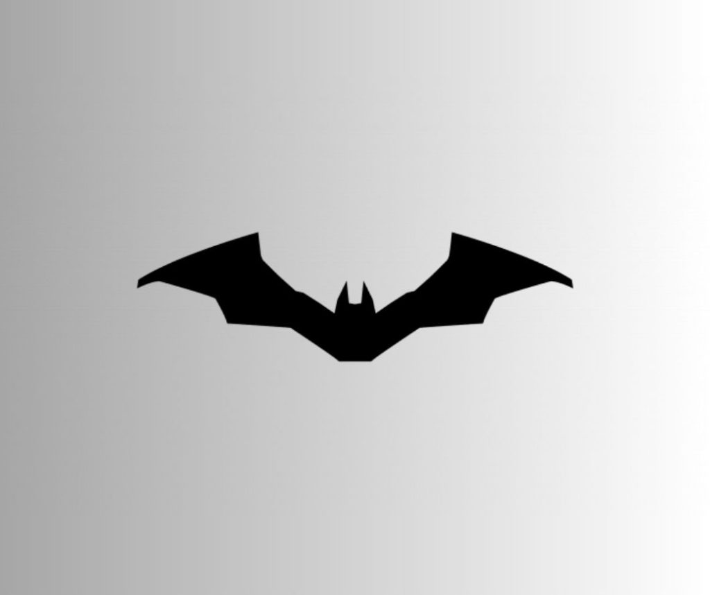
The 2021 Robert Pattinson batman logo is smaller, thinner, and the closest, and the most realistic image of a bat. It is 100% proportional with all the right shapes, geometric and stylish, to say the least.
So you see how the Bruce Wayne logo prompted the Batman brand-building process through several decades? From books to movies and beyond, the image of the bat is globally recognized today, representing power, hope, and justice to the seeking minds. The logo may undergo further changes in the following years, but the message it gives will remain the same.
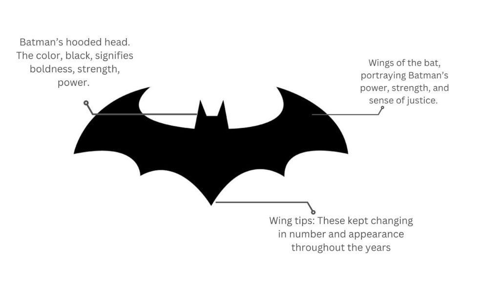
Features of the Batman logo (colors, fonts, shapes, and symbols/mascot)
| Font | Color | Shape/Symbol/Mascot |
| As you may have noticed already, there is no distinctive script in any of the Batman logos. However, in some versions, you may spot the brand name, “Batman” printed on the emblem. | The brand colors of the Batman logo are essentially black and yellow. Except in the versions that appeared in 1964 – 2000, the color was always a dark, bold black. It syncs well with the character, who calls himself “The Night”. Then again, bats are nocturnal creatures, essentially dark, which is why the logo is mostly black. | The symbol in the Batman logo is a bat, spreading its wings wide. It is also the mascot of the logo, representing the superhero’s alter ego. Bruce Wayne was afraid of bats in childhood. Hence, he chose this symbol to represent his vigilante identity to instill fear in the minds of criminals. |
Is the Batman logo considered an emblem, symbol, or insignia?
Now, this can be a tad difficult. Well, the logo is both an emblem logo, as well as a mascot logo. While most emblem logos are a combination of symbols and fonts, the Batman logo stands apart with its characteristic bat image without any definitive script whatsoever.
It is also a mascot logo, because of the image of the bat. The bat is the mascot of the Batman logo and represents the superhero’s stature in the fictional world. However, unlike the common mascot logos, the bat is unique in both imagery and impact. It is more directly connected to Bruce Wayne’s alter ego – Batman.
There are other types of logos that you can learn more about. If the Batman logo fits any other criteria, do let us know.
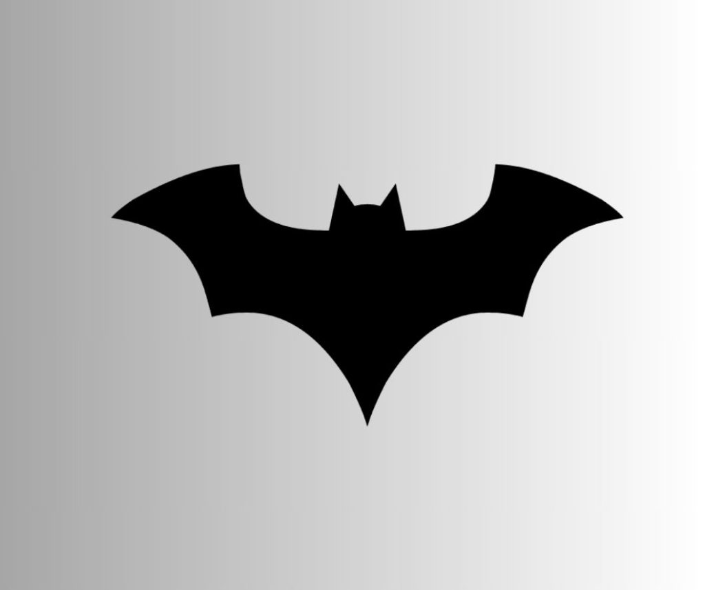
Batman Logo concept (with diagram)
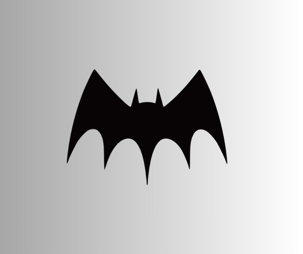
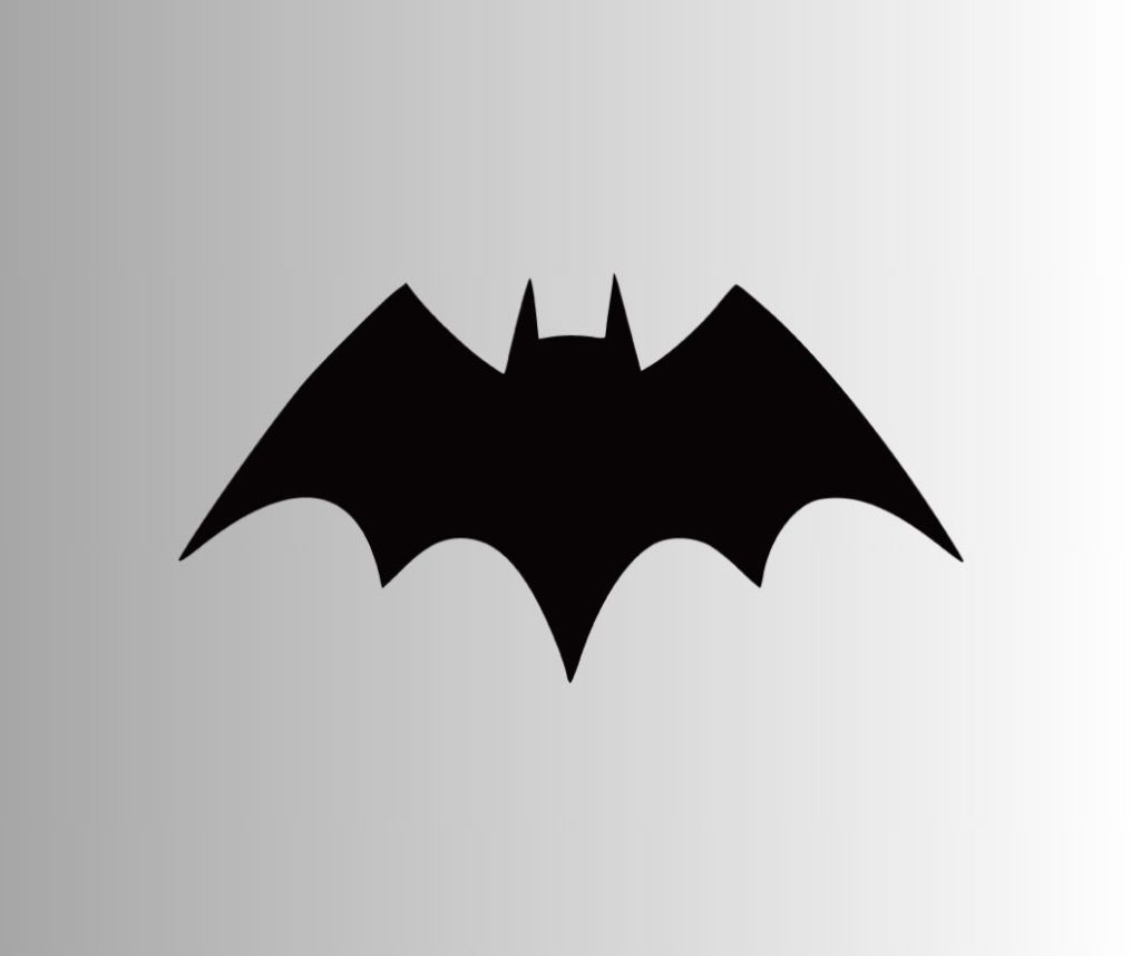
The current logo of Batman doesn’t have any yellow background. It is a sleek design with a completely proportionate bat. There are five wing points, and the wings on either side have sharp claws, in the same oval shape as that of the yellow ellipse of its predecessors.
The concept of the Batman logo has been explained below:
What are some special qualities of the Batman logo?
The one thing that strikes the mind is the usage of a symbol of fear to instill hope in the minds of the innocent. That is what Batman stands for – hope and justice. It also represents the fight to overcome one’s fears, like Bruce Wayne did. He was scared of bats as a child. So when he grew up, he not only overcame his fear but also turned it in his favor by adopting the title, “Batman” for his alter ego.
In other theories, the bat logo symbolizes power, darkness, and shadow, three characteristic qualities of Batman. He calls himself, “The Night”, as he guards Gotham City from criminals by staying in the shadows.
This is one reason why he is also referred to as “The Dark Knight” in Christopher Nolan’s Batman trilogy.
Interesting facts that you may not know about the Batman logo
- There is a lot of confusion regarding the origin of the bat signal in Gotham City. While some readers argue that it was set up by Gordon AFTER he met Batman, others opine that the bat signal had always been there. According to the second theory, the bat signal was created when Gordon was just a captain.
- The logo went through visible changes that we now know. But, what is more interesting is that these versions are only a small percentage of the ideas behind the logo. To follow the brand development strategies of the times, many ideas were scrapped before they were published or even tested. To sum up, hundreds of Batman logo ideas have been scrapped throughout the 8 decades of its existence.
- During the brand building process of Batman, many logos that were scrapped were picked up from the bin and reused in some issues with slight modifications. It was mainly done to make the Batman logo stay in sync with changing times.
- The bat in the logo has a deeper and more meaningful message. It represents the continuous fight of good against evil and the establishment of peace. The writers used the bat as an irony to suggest purity and justice.
- In the movies, the bat symbol on Batman’s chest slightly differs from the bat logo projected on the sky to ward off criminals in Gotham City. In the comics, however, both were the same, as it was easy to illustrate the logo in the books.
- The Batman logos used in the movies underwent some color variations to make the recent ones stand out. It is because the audience wanted to forget and move on from the previous versions of the logo once they got the newer movies enjoy.
A few facts about Batman that you should know
- The original creators of Batman were Bill Finger (the writer) and Bob Kane (the illustrator or artist).
- Batman was never projected as someone who had superpowers (something that was quite new in that age of superheroes like Superman and Wonder Woman). Later, Iron Man of Marvel’s Avengers came to be second in the list of superheroes without superpowers.
- The names of Batman’s parents were Thomas Wayne and Martha Wayne.
- Bill Finger came up with the name of Batman’s native city, Gotham, randomly, while scouring the pages of a phone book. The place he got the name from was Gotham Jewelers.
- Ben Affleck, who played the role of Batman in the movie, “Batman v Superman: Dawn of Justice”, has also put on the Superman suit in the movie, “Hollywoodland”.
- It was the audience that killed the character of Robin. Yes, the Joker hit him with a crowbar in one of the issues, but the audience voted for DC Comics to kill the character. Robin lost to the 5,343 votes for him to die over the 5,271 votes that wanted him alive.
- The Lamborghini that Bruce Wayne drove to one of the parties in the Batman Trilogy by Christopher Nolan was a Murciélago. The term, in Spanish, means “bat”. Of course!
- There was a Marvel-DC crossover issue in 1996 that witnessed Batman merge with the character of Wolverine. It featured Batman with claws on the cover. Any guesses about the name of the character? Well, it was Logan Wayne!
How popular is the logo of Batman?
The Batman logo has inspired the brand story of the DC superhero in several ways. It has become an inseparable entity to him. Without the logo, Batman is just Bruce Wayne, a billionaire with nothing to offer to the residents of Gotham City. However, when the bat logo appears in his outfit or the night skies, it changes the entire narrative. It would not be wrong to say that the caped vigilante has no identity without the significant bat logo.
Today, the Batman logo appears in several other places besides the comics and movies. It is embossed in Batman consumer collections, fan collectibles, T-shirts, Halloween costumes, and the list goes on.
In 2022, a viral marketing campaign to promote the Robert Pattinson starrer “The Batman” resulted in the bat symbol being projected on renowned skyscrapers all over the world.
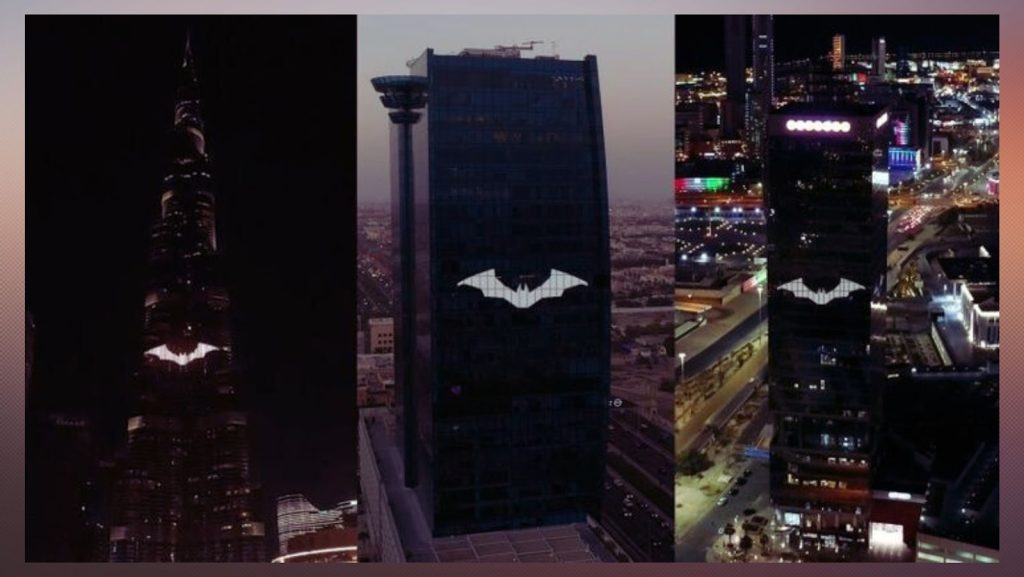
The list included King’s Road Tower (Jeddah), Burj Khalifa (Dubai), and the Dorado Towers (Kuwait). Such is the popularity of the Batman logo.
Who designed the iconic logos for Batman?
It was Jerry Robinson, the artist behind several comic characters, including Batman, who created the first-ever Batman logo.
Following the brand guidelines and the evolution of the logo through eight decades, Cathryn Laver designed the logo that is now being used widely. She confessed to seeking major inspiration from the evolution of the bat image to create a logo that matches the emotions of the audience and their expectations perfectly.
Batman Logo rebranding (make or break)
The Batman logo has been rebranded several times to keep it on par with the changing expectations and preferences of the audience. However, all the creators have tried to maintain the brand style guide (colors, image, etc.) to prevent hurting the sentiments of people.
Once, in 1967, the bat image was replaced with the image of a man holding a scale, which was a clearer way to depict the justice that is served by the superhero in his adventures. However, this rebranding strategy failed miserably, and the bat was made to come back in the next version.
In final words…
Batman is no longer JUST a comic superhero. He is a fictional human manifestation of power, goodness, and the triumph of good over evil. The bat logo that shines on his chest is more than a target for the enemies. It is a sign of protection, something that the people in Gotham City find relief in. Thus, in almost all the versions of the Batman logo, the bat remains unchanged.
While talking about iconic logos, the bat image will certainly occupy a high position. Despite being the emblem of a fictional character, it has garnered enough popularity over decades, eight to be precise. Today, there are few people, who will not recognize the logo, no matter which part of the world they live. Using a minimalist design and the base color black, the logo has captured the hearts of readers and movie buffs worldwide, including eminent movie makers, who have made billions from their individual Batman productions.
It doesn’t matter how many further changes the logo goes through. It is 100% certain, by now, that the bat image will not be gone soon.
Do you have questions about the Batman Logo/Symbol?
Who projects the bat signal into the skies of Gotham City?
According to the story, it is Commissioner Gordon, who keeps a large projector in his office to shoot up the bat signal during emergencies or otherwise. It is a way to give some relief to the residents that Batman is keeping a close watch.
Who projects the bat signal into the skies of Gotham City?
The material of Batman’s suit has several layers of Nomex, a non-combustible fabric worn by firefighters and policemen. In some versions, the suit is also made of Kevlar, which makes it bulletproof. To sum up, there is no consistent material for Batman’s suit, owing to his long history.
Is the Batman logo copyrighted?
Yes! It is both copyrighted and trademarked. If you use the logo in your products without permission, you might be sued and even behind bars.
Can I use the Batman logo for personal (non-commercial) branding?
Yes, you may! You can use the image of the logo for personal branding on social media.
What does the Batman logo stand for?
The Batman logo has always stood for justice, power, protection, purity, and timelessness. It is instantly recognized and valued all over the globe.