When it comes to creating or updating your company’s identity, choosing the right type of logo is crucial. There’s no “one size fits all” solution because different types of logos serve different purposes.
To make it easier for you to understand and differentiate between these different kinds of logos, we have grouped them into 17 key categories. By exploring each category, you will gain a better understanding of when to use each type of logo and also see examples of well-known companies that have successfully adopted each logo types.
So, let’s dive into the details and explore the 17 different types of logo design, their suitability for different situations, and the reasons why some famous companies have chosen to use each particular style.
Importance of Logo
- Customers typically need to encounter a logo around 5 to 7 times before it sticks in their memory and becomes associated with a brand.
- The Coca-Cola logo is incredibly iconic, with an astonishing 94% recognition among the global population.
- When consumers are familiar with a brand, they are 73% more likely to trust it and make a purchase.
- An impressive 42% of consumers believe that a logo effectively conveys a brand’s personality.
1. Wordmark Logos
Wordmarks work best when they have a modern and minimal look. Their clean and straightforward nature makes them incredibly versatile, allowing the wordmark to be effortlessly replicated across various mediums and even on busy backgrounds.
For new businesses, especially startups, a wordmark can be more effective than just a lettermark on its own. It helps to put the full name of the company out there and establish recognition. Wordmarks are particularly well-suited for companies with short, distinctive, and memorable names.
Since there’s no symbol to rely on, it’s crucial to choose a typeface that resonates with your target audience. You want to be distinctive while staying true to your brand. Don’t go for being different just for the sake of it.
It’s also important to be aware of competitors in your industry and avoid using a logo that’s too similar to another company. To make your wordmark truly unique, consider having a professional customize the typeface for you. This will ensure that your logo stands out from the crowd.
When executed well, a wordmark with a carefully chosen and beautifully customized font can be one of the most effective ways to ensure that your brand is remembered. Your audience will recall the name itself rather than relying on a symbol and trying to connect the dots to figure out which company it represents.
When are they best used
- When your company’s name is short, distinctive, and memorable
- When you are a new business looking to make a name for yourself
- When you need a logo that can be used across various mediums and on busy backgrounds.
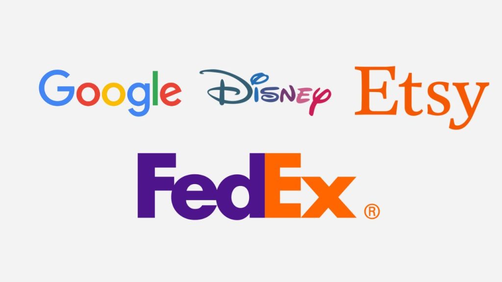
Examples
Google’s logo is seen by billions of people every day, and they even went the extra mile by creating their own custom typeface called ‘Product Sans.’ It gives their wordmark a unique and modern feel that perfectly fits the technology sector.
Disney
Disney’s logo is a fantastic example of a custom font tailored to their industry. It’s fun, quirky, and has a cartoon-like charm that speaks volumes about what they do and who their audience is. At the same time, it remains versatile and easy to read.
Etsy
Their logo is clean, clear, and modern. They have chosen a customized serif typeface that exudes elegance, vintage vibes, and a touch of tradition. It’s a subtle nod to their company’s ethos and its arts and crafts origins.
FedEx
While FedEx is actually a syllabic abbreviation of its original air division, Federal Express, it has become its own brand. At first glance, their logotype appears clean and simple, but there’s a hidden arrow cleverly incorporated between the ‘E’ and ‘X.’ This small detail makes it an iconic mark recognized worldwide.
2. Abstract Mark Logos
Abstract logos use a stand-alone icon or graphic as a symbol for an organization. However, unlike brand marks, abstract logos don’t represent a recognizable object. Instead, they are impressionistic symbols created exclusively for the company’s identity.
Take Apple’s logo, for example. It’s a clear pictorial representation of the fruit itself.
On the other hand, Pepsi’s logo, with its colored bands, doesn’t embody anything as literal. The swirling red, white, and blue sphere is purely a custom abstract icon with no direct connotations. Yet, it has become one of the most recognizable brand identities worldwide.
Using an abstract logo mark allows a business to condense its brand into a single, identifiable, and truly unique symbol. This significantly reduces the chance of similarity or confusion with competitors.
Opting for an impressionistic symbol rather than a literal representation also offers greater flexibility in the long run. Especially if there’s a possibility of the company’s direction or services changing.
For instance, let’s say a company initially specializes in yachts but later expands and focuses on aviation. Having a boat in their logo may no longer be suitable.
An abstract logo allows for adaptability while still symbolically conveying what the company does through the use of color and form without cultural implications tied to well-known objects.
The universal appeal of an abstract logo makes it a great choice for businesses aiming to stand out and transcend international boundaries.
Creating an abstract logo that effectively communicates ideas purely through color, shape, and structure can be challenging. It requires a solid understanding of core design principles.
To ensure that an abstract mark aligns with your company’s goals and objectives, seeking the assistance of a design professional is a wise choice.
When are they best used
- They shine in crowded sectors or markets where a truly unique symbol is crucial for standing out.
- They are ideal for global commerce, where a symbol is needed that remains unaffected by cultural diversities.
- If a business anticipates changes in its products or services in the future, an abstract logo allows for more flexibility.
Examples
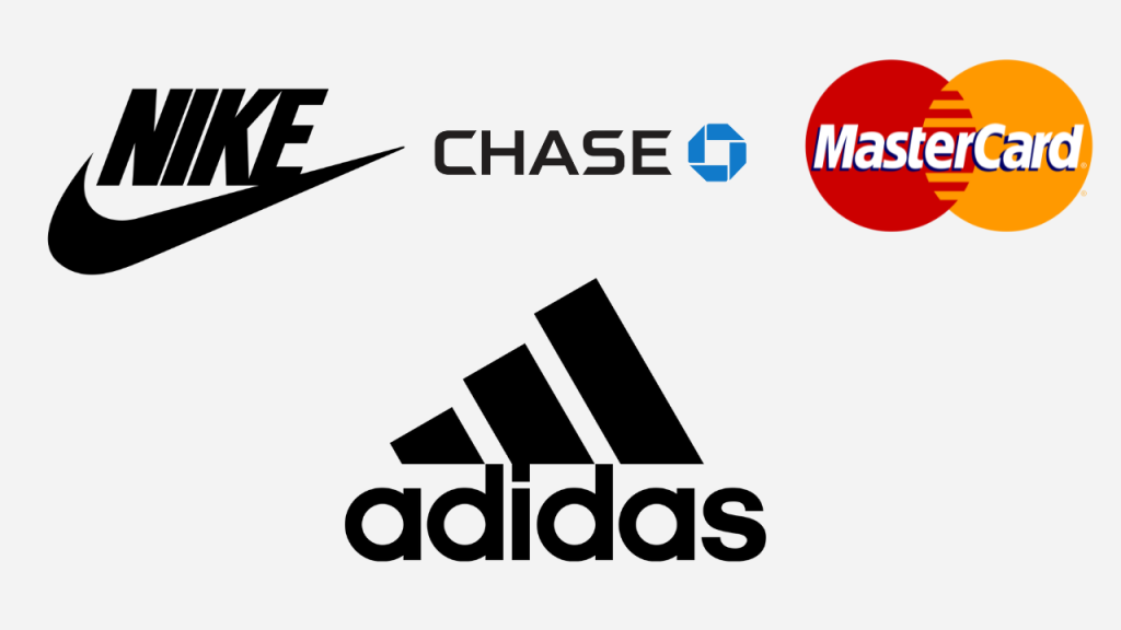
Nike
The Nike logo is a classic example. The swoosh symbolizes movement, freedom, and positivity. With its dynamic form, it’s a perfect fit for the sporting sector and aligns well with Nike’s famous slogan, ‘Just Do It.’
Mastercard
Mastercard underwent a logo transformation, simplifying it to just two interlocking red and yellow circles. Despite its simplicity, this abstract mark conveys a sense of security, trust, and confidence, making it highly recognizable and powerful.
Chase Bank
Chase Bank’s iconic octagon is another abstract mark with an interesting backstory. Originally known as ‘The Bank of the Manhattan Company,’ their mission was to provide fresh water to New Yorkers. The shapes within the octagon symbolize the original wooden water pipes laid in the late 1800s, connecting the logo to the company’s lesser-known origins.
Adidas
Adidas’s ‘trefoil’ logo, resembling a leaf, is widely recognized and worn on apparel worldwide. The three points of the trefoil represent the company’s core values: diversity, power, and growth. Beyond its symbolic meaning, it’s a unique and visually appealing mark that transcends boundaries and appeals to a diverse target audience.
3. Lettermark or Monogram Logos
Those abbreviations of a company’s name using the first letter of each word are known as initialisms. They are pretty cool because each letter is pronounced separately.
Monograms, on the other hand, can be a simple and straightforward way to convey your identity, especially if your organization’s name is on the longer side. By condensing it into a compact symbol, you make your brand more memorable and easier to talk about.
Lettermarks are generally clean, clear, and simple, which makes them suitable for all sorts of applications, regardless of their shape or size.
But here’s the thing about using a lettermark: you need to be meticulous with the design. It’s crucial to select a typeface that aligns with your brand.
A great logo is one that stands out and stays in people’s minds, so simply typing out the letters in a popular font won’t cut it. You will want to customize the characters in some way to make your monogram more distinctive and appealing to a broader audience.
When are they best used
- They work wonders when you want to condense long business names into memorable and recognizable initialisms.
- When you are just starting out, a typographic logo with the company’s full name in small text underneath the lettermark can be a smart move, until the lettermark itself becomes well known.
- Lettermarks shine when they need to be replicated across various applications, especially at smaller sizes. They maintain their impact and recognition no matter where you place them.
Examples
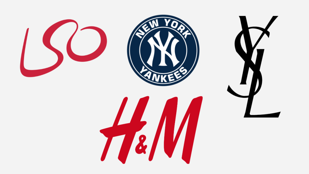
London Symphony Orchestra (LSO)
They have managed to shorten their long-winded name into the snappy LSO. And what’s really neat is that they have designed a unique custom font that’s super distinctive. It gives off the vibe of a conductor’s graceful hand movements, which is pretty awesome!
H&M
H&M stands for “Hennes & Mauritz.” Honestly, most people probably wouldn’t even know the full name because the H&M mark is so iconic on its own. It’s become a powerful brand that’s recognized worldwide. The way they have combined the letters in their logo with a sleek custom font is just genius.
New York Yankees
Their logo, with the NY monogram, is plastered on caps and merchandise everywhere, even though they are just a sports team from New York. It’s a beautifully designed monogram that has become a fashion icon globally. People can’t get enough of it!
Yves Saint Laurent (YSL)
They have chosen an elegant font that suits the fashion industry perfectly. The arrangement of the letters in their logo is really interesting and memorable. By using an initialism, they have made their French-language name more easily digestible in the global marketplace.
4. Brand Mark, Pictorial Mark & Logo Symbols
Logo symbols use an emblem to represent a company. Now, this doesn’t mean the emblem has to be a literal depiction of what the business does or the services it provides.
A pictorial mark logo can draw inspiration from various sources. As long as the chosen symbol is appropriate for your industry, resonates with your target audience, and is unique without being overly complicated, it can work really well.
Some organizations opt to use a graphic that literally represents their name, like Target or Apple. Others may choose logo categories that involve a symbol that illustrates what they do, such as Major League Baseball’s batter silhouette.
By using a recognizable symbol to communicate what you do, you can effectively tackle the challenge of a long or complicated name. Moreover, these symbols can transcend boundaries like language or cultural differences.
On the other hand, it’s becoming increasingly common to create brand marks with deeper meanings. Drawing inspiration from a business’s history, location, or unique characteristics can result in a distinctive and memorable symbol that tells your audience more about your organization and its values.
Designing a good pictorial logo involves taking everyday objects and transforming them into stylized symbols unique to your business. But, for new companies, it can be challenging to establish their identity in the market solely through a brand mark since it’s purely an image. It takes time to achieve brand recognition, and people may initially struggle to remember who you are.
When are they best used
- When a brand is already well-recognized within its industry
- When you want to simplify and modernize your brand’s identity for greater versatility
- When you need to convey what your business does graphically due to a long or complicated name
- When you operate internationally, and your business name doesn’t translate well
Examples
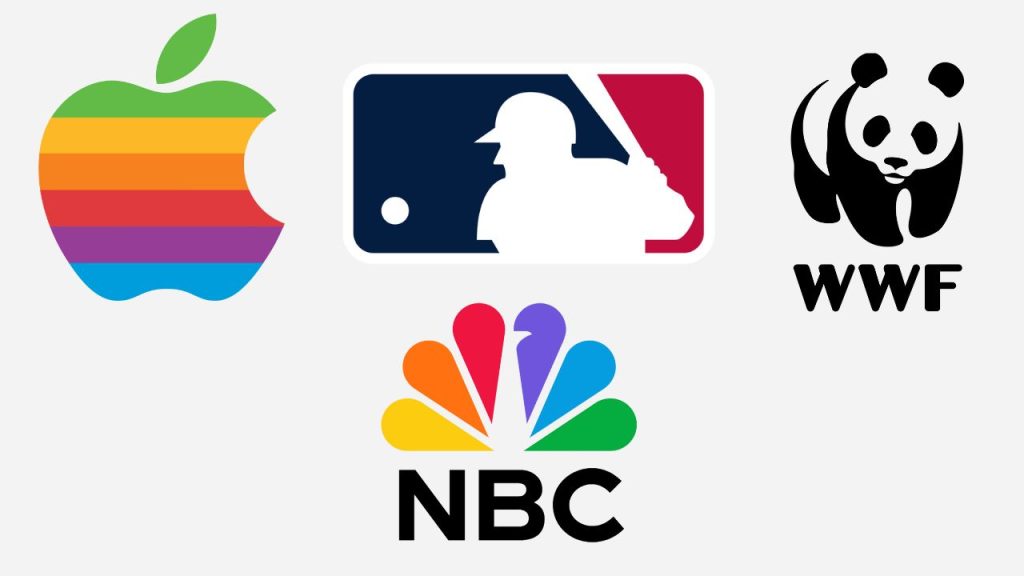
NBC
Their colorful peacock symbol is recognized worldwide. While it may not directly convey that they are a national broadcasting network, it’s modern and incredibly memorable. Interestingly, the colors of the peacock actually represent the different divisions within the organization.
Apple
Their logo has undergone quite an evolution. It started as a complex emblem and eventually transformed into the iconic multi-colored apple. Over time, the logo has gone through various color and style variations. As the company grew, the logo became simpler, and now the plain black apple silhouette is one of the most distinguishable symbols on the planet.
Major League Baseball (MLB)
Their brand mark condenses a long name into a clear, simple, and attractive graphic. It’s highly distinguishable as a symbol and clearly depicts what the organization is all about. You can spot the MLB logo on merchandise around the world, spreading recognition for the sport.
The World Wildlife Fund (WWF)
Their logo features a panda icon created using negative space. Inspired by Chi-Chi the Panda, who resided at the London Zoo in 1961 when the organization was formed, this highly distinctive symbol perfectly communicates what WWF stands for. It not only captures their mission but also overcomes language barriers, making it universally recognizable.
5. Mascot Logos
A mascot logo introduces a character or spokesperson who becomes the face of the brand. The style and inspiration for this mascot can vary depending on the business and its target audience. It can range from a completely fictional character to a real person who is an iconic figure associated with the company, such as its founder.
You will commonly find mascot logos in sectors like food and beverage, sports, and the entertainment industry. Businesses that aim to appeal to families and young children often embrace this branding style because it resonates well with their target market and provides excellent opportunities to connect with the audience on a personal level.
Having a mascot as an ambassador for your business allows you to convey your brand values effectively. It’s a powerful tool for
- Advertising
- Social media campaigns
- Events
Just think about sports teams and their mascots. They create fantastic opportunities for clubs to engage with young families and adult fans alike.
The style of a mascot logo can vary depending on the target audience. It can be colorful, cartoonish, and fun when appealing to families, or it can have a more sophisticated interpretation aimed at an older market.
Regardless of the direction chosen, it’s important to remember that a mascot logo is just one element of a successful brand. The detailed nature of a mascot may not always translate well to every application, especially those with smaller resolutions.
When are they best used
- When you want to create a wholesome feel for your brand
- When you aim to encourage customers to interact with your organization
- They add personality, charm, and a sense of fun that can enhance the overall brand experience
Examples
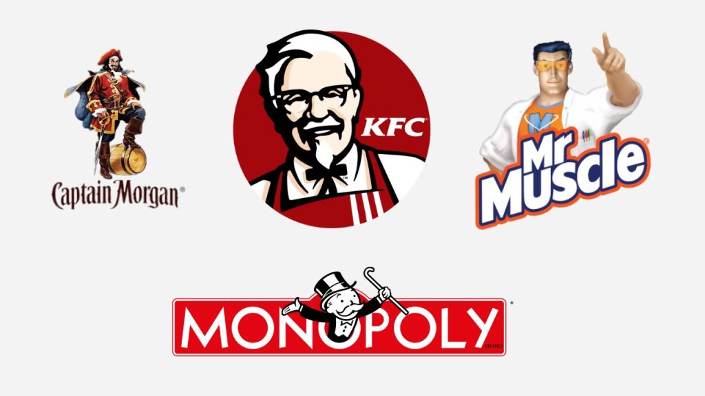
KFC-Logo
KFC’s mascot logo features Colonel Sanders, the iconic founder of the restaurant chain. Colonel Sanders’ distinct features make him the perfect fit for the job, while also highlighting the company’s rich history and authenticity. His presence in the logo has become synonymous with KFC’s brand identity.
Captain-Morgan-Logo
Captain Morgan Rum is another great example of a mascot logo in the food and beverage sector but with a target audience of adults. The mascot draws inspiration from Welsh privateer ‘Sir Henry Morgan,’ reflecting the history and authenticity of the brand’s exotic ingredients. It captures the adventurous spirit associated with rum and appeals to a mature market.
Monopoly-Logo
Monopoly’s mascot, ‘Rich Uncle Pennybags,’ has been around since 1940. Despite changes to the game itself, the mascot has remained consistent with minor modifications to the illustration style. Uncle Pennybags has stood the test of time and remains an enduring symbol of the game’s legacy. Monopoly continues to be a beloved family favorite and a classic board game after nearly 80 years.
Mr-Muscle-Logo
Mr. Muscle is an example of a mascot logo in a different market sector. Their superhero character represents the brand’s values of power and reliability in their ad campaigns. This macho man persona effectively conveys the brand’s message to consumers.
Other examples of mascot logos include Mickey Mouse for Walt Disney, Julio Pringles for Pringles, and Michael Jordan for Air Jordan. Mostly, the Mascot is used as a popularity symbol for the brand, as it garners maximum attention.
6. Emblems Logos
Emblem logos are a specific type of combination mark. Emblems are characterized by having a font displayed inside a symbol or an icon. They draw inspiration from crests, seals, and badges and are commonly associated with schools, organizations, and government agencies.
Although emblem logos often have a classic feel, they don’t have to be limited to traditional designs. In fact, many emblems have been modernized to appeal to contemporary audiences while still paying homage to their historical roots. This blend of tradition and modernity can create compelling emblem logos that resonate with 21st-century consumers.
While emblems are still prevalent in public agencies and educational institutions, they have gained popularity in other sectors as well, particularly in the food and beverage industry. The rise of the hipster culture has influenced the modernization of emblem logos, which can now be seen adorning beer labels and coffee cups worldwide.
When are they best used
- It’s important to note that emblem logos, due to their intricate nature with intertwined text and symbols, may not always be the most versatile option.
- They are commonly chosen by companies that plan to embroider their logo, but they may not work as effectively at smaller sizes or in certain applications.
- To ensure successful implementation, a well-designed emblem logo should be accompanied by carefully crafted supporting brand elements that can effectively translate across various mediums.
- Emblem logos are best suited for situations where a more traditional and professional appearance is desired
- They can also be a great choice for businesses in crowded marketplaces, such as the food and beverage sector, where a unique and highly stylized identity is necessary to stand out from the competition.
Examples
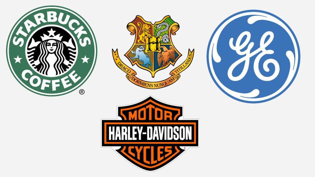
Starbucks
Starbucks, known worldwide, has one of the most famous emblems. Their logo combines a modern typeface with the iconic twin-tailed mermaid to create a distinctive and contemporary badge. You can spot the peculiar Starbucks logo on everything from their coffee cups to their storefronts.
Harley-Davidson
In the automotive sector, emblem logos are also quite common. Take Harley-Davidson, for instance. Their logo features a clean and simple crest that has gone through various iterations over the years. But, they eventually returned to a modern interpretation of their original 1910 emblem. This choice reflects their commitment to honoring their rich and successful history.
Hogwarts School of Witchcraft and Wizardry
Emblem-style logos are widely used by schools around the world, often characterized by intricate and detailed designs. These logos evoke a sense of distinction, quality, history, and achievement. Hogwarts School of Witchcraft and Wizardry, the renowned school from the Harry Potter series, is a prime example of an emblem logo in the education sector.
General Electric
When it comes to established organizations, emblem logos communicate authority, prestige, and tradition. General Electric, founded in 1891, has a modernized emblem logo that maintains a stripped-back interpretation. This emblem design resonates with their audience and conveys a sense of authority and tradition that comes with their long-established presence.
Another striking emblem logo that many of us are quite aware of is the Batman logo. Starting its journey from comic books, the Batman logo has made its mark in movies, television, and even a chain of consumer products (toys, outfits, etc.). The popularity of the bat emblem logo today is no less than Harry Potter, especially because of its exciting journey through several stages of evolution.
7. Combination Mark Logos
A combination logo combines a typographic mark (like a lettermark or wordmark) with a pictorial element (such as a symbol, abstract design, or mascot). These components can be:
- Arranged side by side
- Stacked on top of each other or
- Integrated together
The beauty of a combination logo lies in how the text and symbol work harmoniously to reinforce a brand’s identity. It’s a popular choice for businesses of all sizes, whether they are just starting out or have been around for years. Unlike using these elements separately, a combination logo allows people to associate the company name with the accompanying pictorial mark quickly. This association can greatly contribute to the growth and recognition of a brand, more so than a standalone pictorial mark.
By starting with a combination mark, you have the flexibility to simplify your brand identity or use the elements independently as your audience becomes more familiar with your brand. This versatility makes combination logos a highly adaptable choice for any business.
Moreover, combining a symbol with a wordmark opens up opportunities to differentiate yourself from competitors. The fusion of letters and graphic elements often results in a more distinctive mark, making it easier to secure a trademark.
When are they best used
- Combination logos are best used when you aim to create a truly unique mark that is easily recognizable and trademarkable.
- They offer versatility across various applications and provide an instant connection with your brand.
Examples
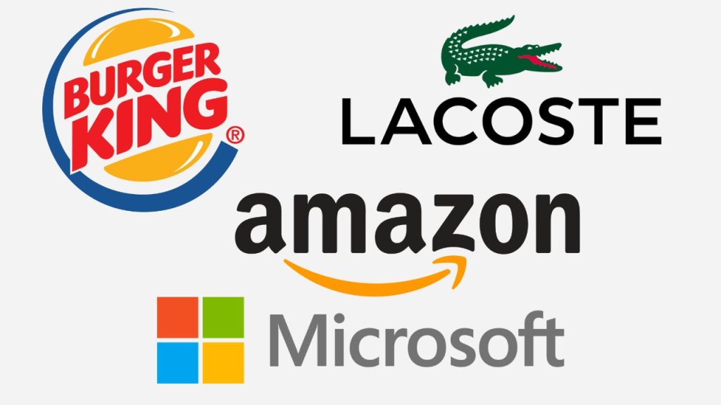
Burger King logo
One standout example is the Burger King logo, where the typographic element and symbol have been ingeniously blended to create a strong and highly unique brand identity. In this case, the typography cleverly forms the patties in the bun, adding a touch of creativity to the design.
Microsoft
Microsoft opts for a side-by-side combination mark. Their logo features four panes that represent different components of their business, including Windows, Office, Xbox, and Surface. Interestingly, these panes can also be used independently, separate from the accompanying text.
Amazon
When you first glance at the Amazon logo, it may seem like a simple wordmark. However, upon closer inspection, you will notice that it’s actually a combination logo. The subtle arrow starting from the letter ‘A’ and extending to the letter ‘Z’ symbolizes Amazon’s extensive range of products and its commitment to reliable delivery service.
Lacoste
Lacoste, the renowned clothing brand, boasts one of the most recognizable combination logos. Their logo features the iconic crocodile paired with a clean and modern logotype. It’s a classic example of a combination mark that effortlessly captures the essence of the brand.
8. Contoured Words Logos
You have probably come across contoured word logos before. They are quite similar to wordmark logos, featuring the company name but with an interesting twist – a captivating shape is incorporated alongside the typeface.
This offers a chance for businesses to infuse more color and creativity into their logo design. Plus, by incorporating rounded shapes, companies can convey friendliness and approachability. On the other hand, if a rectangular shape is used, it signifies stability and reliability.
Well-known brands like Samsung, BBC, Ikea, Levi’s, IMDB, Denny’s, Stanley, Danone, and Ridgid have embraced this type of logo design.
Advantages
✓ Enhanced Communication: By including shapes in the design, the contoured word logos communicate even more to the viewer, adding depth and visual interest.
✓ Approachable Aesthetics: These logos tend to look less strict and dry, creating a sense of approachability that can resonate well with audiences.
✓ Household Appeal: Many household and home goods brands opt for contoured word logos as they convey availability, affordability, and comfort – a perfect fit for their target audience.
Disadvantages
✗ Challenging Placement: Composing and placing contoured words logos on different media can be tricky due to the additional space they occupy. Proper sizing and proportions are key to maintaining visual harmony.
✗ Contrast Issues: If not designed well, achieving a good contrast between the shapes and letters can be difficult, potentially impacting legibility and overall visual impact.
When are they best used
- Contoured words can be used to create a sense of depth and dimension. This can be effective for brands that want to convey a sense of luxury or sophistication.
- Contoured words can be used to create a more playful or whimsical look. This can be useful for brands that want to target a younger audience.
- Contoured words can be used to create a more abstract or conceptual logo. This can be helpful for brands that want to stand out from the competition.
Examples
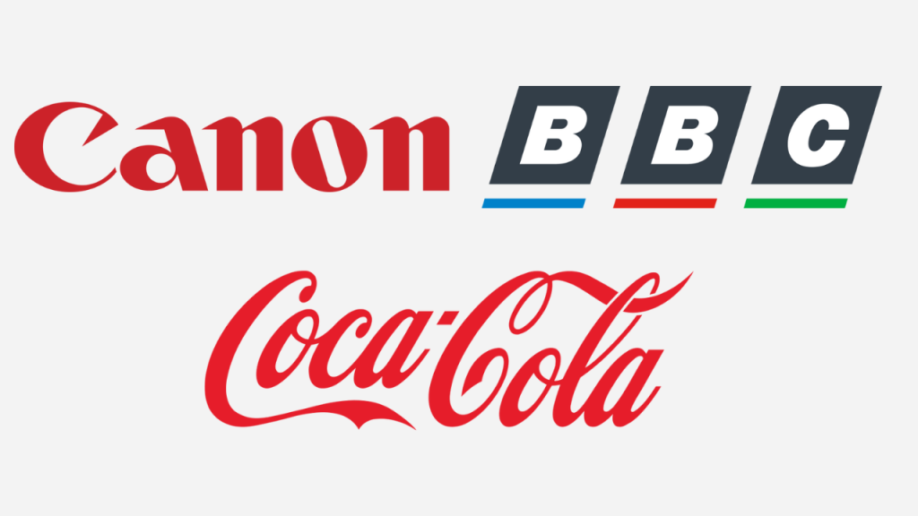
Coca-Cola
The letters in the Coca-Cola logo are all smooth and flowing, which gives the logo a sense of elegance and sophistication. This is in line with the brand identity as a premium beverage brand.
Canon
Canon is also a good example of a contoured logo. The letters in the logo are all smooth and rounded, which gives the logo a sense of professionalism and reliability. This is in line with Canon’s brand identity as a manufacturer of high-quality cameras and imaging products.
BBC
The BBC logo is a contoured words logo that uses a globe shape. The letters “B” and “C” are enclosed in the globe shape, and the word “BBC” is written in a stylized font that resembles a map. This shape and design suggest that the BBC is a news and broadcasting organization, and the overall look of the logo is classic and timeless.
9. Adaptable Logos
Abstract logos don’t feature any letters but instead rely on visual imagery to evoke a particular feeling or represent your brand. They can be a bit confusing, especially for new businesses, as the interpretation of an abstract symbol can vary among individuals. However, with a well-thought-out strategy, an abstract logo can set your brand apart from the competition.
Here are the pros and cons of using an abstract logo:
Pros:
- By creating an abstract logo that showcases your brand’s identity, you will craft something truly unique and instantly recognizable in the market.
- Abstract logos also offer versatility, allowing you to use them in advertising campaigns and on various branded merchandise.
Cons:
- If you are a new brand trying to establish a reputation, you may need to invest extra effort in helping people understand and associate your abstract logo with your brand.
- One solution is to create an abstract logo that conveys the specific feeling or message you want to evoke and consider using your brand’s name alongside the symbol until you gain recognition among your customers.
When are they best used
- To create a logo that can be used in a variety of different contexts. This can be effective for brands that want to have a logo that can be used on a variety of different marketing materials.
- To create a logo that can be easily updated over time. This can be useful for brands that want to keep their logo fresh and up-to-date.
- To create a logo that is more accessible to people with disabilities. This can be helpful for brands that want to make their logo more inclusive.
Examples
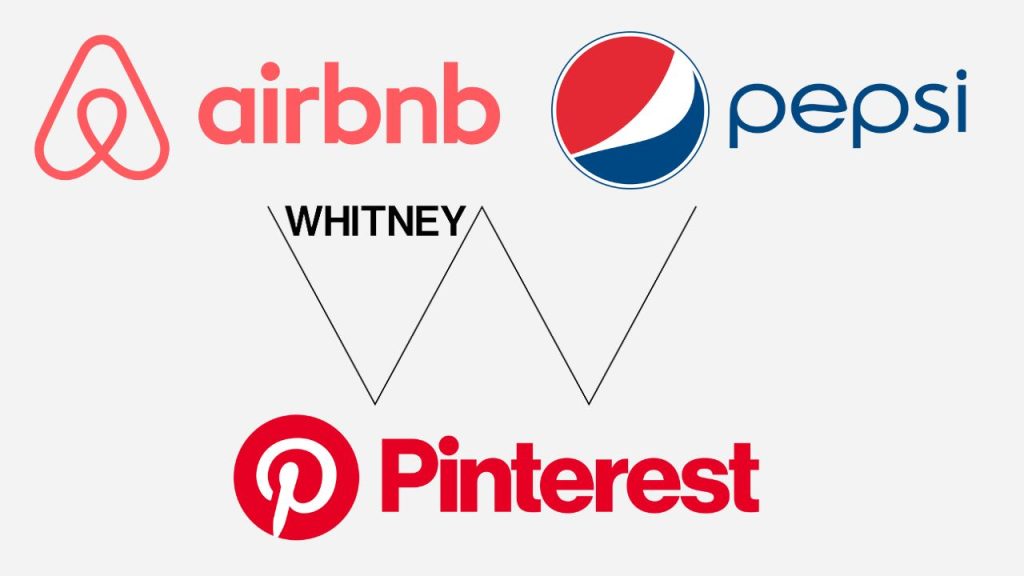
Airbnb
Another notable example is Airbnb, which transitioned to an abstract logo that embodies its core values. While you may still see the logo accompanied by the brand name, even without it, it’s instantly recognizable.
Pepsi
And who can forget Pepsi’s abstract logo? While Pepsi occasionally uses its brand name alongside the logo, the abstract symbol alone is enough to identify the brand.
The Pinterest logo is a good example of a logo that is adaptable to different sizes and formats. The basic logo features a letter “P” with a pin in the center. This logo can be used in a variety of ways, from small icons on pins to large banners on the Pinterest website.
The Whitney Museum of American Art
The Whitney Museum of American Art recently unveiled a new logo that is designed to be adaptable. The logo features a series of zig-zag lines that can be arranged in different ways to create a variety of shapes. This makes the logo versatile enough to be used in a variety of different contexts, from print to digital.
10. Descriptive Logos
A non-descriptive logo doesn’t give away much about what a company does or offers. Instead, it aims to convey the brand’s personality or values. On the other hand, a descriptive logo uses shapes, graphics, and text to instantly inform customers about the company’s offerings.
Think about it this way: when you see the older versions of the Starbucks logo, with the word “coffee” prominently displayed, or the Burger King logo that looks like a delicious burger, you know exactly what to expect. Descriptive logos cut to the chase and tell your audience upfront what your brand is all about.
For customers in a hurry, a descriptive logo is a dream come true. They don’t want to play a guessing game when they are looking for a quick meal. McDonald’s golden arches or Subway’s logo with a subway train icon are clear indications of the food options available.
Descriptive logos are great at providing quick guidance to customers. They serve their purpose by giving all the necessary information to entice people to explore your brand further. There’s really no downside to using a descriptive logo, as it can be quite effective in capturing attention.
But, there are instances where a descriptive logo might not be the best fit. Well-established companies with high brand recognition don’t need to rely heavily on a descriptive logo anymore. They have reached a level of familiarity where the logo itself is enough to convey authority and leadership.
Furthermore, if your brand name already clearly communicates what you do, then a descriptive logo might be redundant. Take a company called “Brand Attorneys” as an example. The name itself tells customers what they specialize in.
Challenges in opting for descriptive logos
Sometimes, implementing a descriptive logo can be challenging, especially for brands that offer a wide range of products or services. It’s tough to decide what aspect to focus on without overshadowing other offerings.
When to avoid using descriptive logos?
There are cases where a descriptive logo should be avoided altogether. If your company is associated with a negative concept or service, like a pest extermination business, you wouldn’t want a logo featuring a dead mouse, right?
When are they best used
- To create a logo that clearly communicates the brand’s name or purpose. This can be useful for brands that want to make a strong first impression.
- To create a logo that is easy to remember. This can be useful for brands that want to build brand awareness.
- To create a logo that is more meaningful to the brand’s target audience. This can be helpful for brands that want to connect with their customers on a deeper level.
Examples
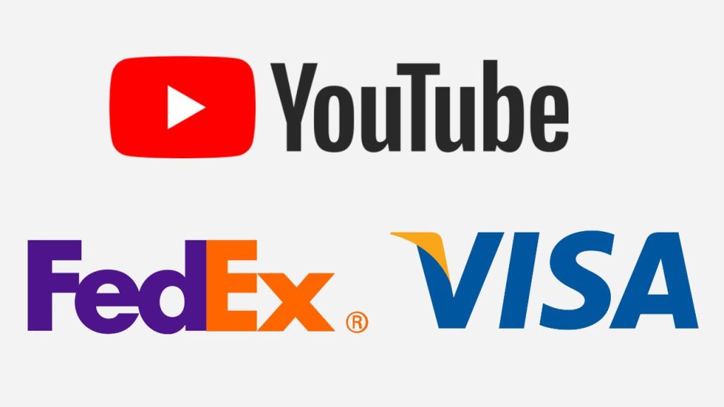
FedEx
FedEx is another example of a descriptive logo. The FedEx logo is a simple arrow that is hidden within the letters “E” and “X”. The arrow represents the company’s commitment to delivering packages quickly and efficiently.
Visa
Visa is another great example of a descriptive logo. The Visa logo is a simple “V” that represents the company’s commitment to providing secure and convenient payment solutions.
YouTube
YouTube is also a good example of a descriptive logo. The YouTube logo is a simple “Y” that is inside a red circle. The circle represents the company’s commitment to community and connection, while the “Y” represents the company’s mission to be the world’s leading video-sharing platform.
11. Typographic Logos
When you start exploring different types of logos, you will notice that many of them revolve around two main components: typography and imagery. Typography logos are perfect for companies aiming to create a strong association with a specific letter, group of letters, or even a word.
Using your brand name in your logo can be a smart move if you want to make it as memorable as possible. After all, your name is the essence of your brand.
Monograms and lettermarks are logos that shine the spotlight on a specific selection of letters that represent your company. Unlike wordmarks that display the entire word or lettermarks that focus on a single letter, monograms highlight a combination of letters that are unique to your brand.
Think about iconic examples like IBM, HBO, or HP. These companies, with their long and complex names, have found that using typist logo like a monogram logo makes it easier for people to remember their brand. It’s much simpler to recall “HP” than trying to remember “Hewlett Packard” in its entirety.
Abbreviations or initials are often used by brands for their logo because it’s easier to fit a couple of letters into a design rather than cramming the entire company name. Just imagine how complicated NASA’s logo would be if it had to incorporate the full “National Aeronautics and Space Administration” title!
Monograms and lettermarks offer a concise and impactful way to represent your brand identity. They condense your name into a memorable symbol, making it instantly recognizable. So, if you have a lengthy name or want a sleek and compact logo, a monogram might be the perfect choice.
Remember, simplicity can be powerful when it comes to logos. By distilling your brand into a few well-chosen letters, you create a visual identity that leaves a lasting impression.
When are they best used
- To create a logo that is simple and elegant. This can be effective for brands that want to convey a sense of sophistication.
- To create a logo that is bold and eye-catching. This can be useful for brands that want to make a statement.
- To create a logo that is timeless and classic. This can be helpful for brands that want to build a long-lasting brand identity.
Examples
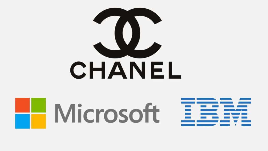
IBM
IBM is a great example of a typographic logo. The IBM logo is a simple and elegant typeface that represents the company’s commitment to innovation and technology.
Microsoft
Microsoft is another example of a typographic logo. The Microsoft logo is a simple and modern typeface that represents the company’s commitment to innovation.
Chanel
The Chanel logo is a typographic logo that features the word “Chanel” written in a script font. The logo is known for its elegant design and its use of the company’s signature black and white colors. The logo is also known for its ability to convey a sense of luxury and sophistication.
12. Letters/fonts inside shape logos
Fonts inside shape logos offer a simple yet effective approach to branding. Unlike other logotypes, these logos consist of the brand name presented within a shape, such as rectangles, squares, circles, or octagons. MasterCard and Ford are prime examples of this logo style.
If you are seeking a straightforward logo that prominently displays your brand name, this type is perfect. These logos have a timeless quality and are easily memorable, which is why many major brands across various industries opt for them.
How To Use Fonts Inside A Shape Logos
- Know About Your Brand Personality: Before diving into the logo design, it’s crucial to understand your brand’s personality and its objectives. This will guide your decision-making process.
- Choose The Right Shape & Font: Once you have a clear grasp of your brand’s personality, carefully select a shape and font combination that aligns with your desired image. With only two elements in this logo style, their harmony is essential in conveying your brand’s desired persona.
Pros
- Straightforward in communicating the brand name and persona effectively.
Cons
- Lack of attention to choosing the right font and shape may result in a vague brand image.
When are they best used
- To create a logo that is both visually appealing and memorable. This can be effective for brands that want to create a strong brand identity.
- To create a logo that is versatile and can be used in a variety of different contexts. This can be helpful for brands that want a logo that can be used on a variety of different marketing materials.
- To create a logo that is unique and stands out from the competition. This can be useful for brands that want to create a memorable brand identity.
Examples
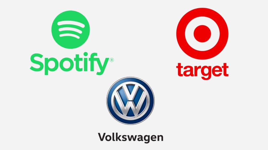
Spotify
Spotify is another example of a letters/fonts inside shape logo. The Spotify logo is a simple “S” that is inside a green circle. The circle represents the company’s commitment to music and audio, while the “S” represents the company’s mission to be the world’s leading music streaming service.
Target
The Target “bull’s eye” logo is a simple “bull’s eye” that is inside a red circle. The circle represents the company’s commitment to accuracy, while the “bull’s eye” represents the company’s mission to be the world’s leading retailer.
Volkswagen
Volkswagen is also a good example of a letters/fonts inside shape logo. The Volkswagen logo is a simple “V” that is inside a blue oval. The oval represents the company’s commitment to quality and engineering, while the “V” represents the company’s mission to be the world’s leading automaker.
13. Negative space logos
In logo design, the goal is to make an emotional impact and leave a lasting impression. Negative space logos can help us achieve just that.
By cleverly utilizing the empty spaces within a logo, designers can send additional messages to customers and forge a stronger connection between the audience and the design. It’s like giving your logo a hidden layer of meaning that captures people’s attention.
Another awesome thing about negative space is that it brings balance to your composition. By making the absence of something in a logo just as important as the object itself, you create a visually pleasing and engaging design. It’s all about finding that sweet spot where simplicity and depth coexist.
Negative space is an excellent way to make people take a second look at your logo. In a world filled with countless logos competing for attention, using negative space can be a game-changer. It grabs the viewer’s eye and encourages them to pause and truly appreciate the cleverness behind the design. It’s like a little visual puzzle that makes them stop and think.
While not every logo requires extensive use of negative space, there are some clear benefits to consider when creating your own.
- It highlights your creativity. Negative space logos require a touch of balance and out-of-the-box thinking, and when done right, they showcase your company’s ability to innovate.
- Negative space keeps your logo simple. Rather than cluttering your design with unnecessary elements, negative space allows you to work with what’s already there, creating something unique and impactful without overwhelming the viewer.
- A clever negative space logo is more memorable than a generic one. It gets people thinking and leaves a lasting impression in their minds. Plus, it engages consumers by incorporating optical tricks or hidden messages within the logo. It’s like a little surprise waiting to be discovered.
- Negative space makes your logo stand out from the crowd. By giving it a unique twist and using your creative resources innovatively, you separate your brand from the rest and leave a lasting mark on your audience.
When are they best used
- To create a logo that is both visually appealing and clever. This can be effective for brands that want to create a logo that is memorable and stands out from the competition.
- To create a logo that is simple and elegant. This can be effective for brands that want to convey a sense of sophistication.
- To create a logo that is timeless and classic. This can be effective for brands that want to build a long-lasting brand identity.
Examples
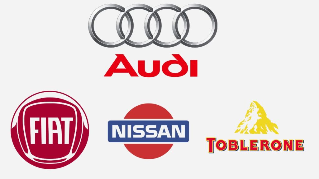
FIAT
FIAT is a great example of a negative space logo. The FIAT logo is a simple “F” that is created by the negative space between the letters “I” and “A”. The logo is clever and eye-catching, and it represents the company’s commitment to Italian design.
Toblerone
Toblerone is another example of a negative space logo. The Toblerone logo is a simple “Toblerone” that is created by the negative space between the mountains in the logo. The logo is clever and eye-catching, and it represents the company’s commitment to Swiss chocolate.
Nissan
Nissan is a final example of a negative space logo. The Nissan logo is a simple “N” that is created by the negative space between the letters “N” and “I”. The logo represents the company’s commitment to Japanese engineering.
Audi
Audi is also a good example of a negative space logo. The Audi logo is a simple “four rings” that are created by the negative space between the rings. The logo represents the company’s commitment to German engineering.
14. Dynamic logos
Dynamic marks are like chameleons in the world of logos—they adapt effortlessly to different contexts, making them one of the best logotypes out there. With no specific font or shape, dynamic marks can be transformed based on the need of the moment.
Dynamic marks are the go-to choice for businesses with creative mottos, especially in media, entertainment, and similar industries. They also work wonders for brands with diverse verticals or those aiming to convey a sense of dynamism in their business.
How to Use Dynamic Marks
- Effective Core Shape: The core shape of the logo is key. Ensure it’s unique and remains consistent, even when the font, color, or style changes. This way, it will continue to look impressive and recognizable.
- Unchanged Brand Message: Alongside the core shape, the brand message should remain unchanged, regardless of any alterations in color, font, or style. Consistency in conveying your brand’s essence is paramount.
Pros
- Dynamic logos are captivating and can seamlessly adapt to various mediums.
- Designers have the freedom to unleash their creativity when crafting dynamic logos.
Cons
- Without a compelling core shape, the brand message may get lost in the mix.
When are they best used
- To create a logo that is more engaging and visually appealing. This can be effective for brands that want to create a logo that captures attention.
- To create a logo that is more interactive and can be used to create a more personalized experience for customers. This can be effective for brands that want to build relationships with their customers.
- To create a logo that is more responsive to the user’s environment. This can be effective for brands that want to create a more immersive and interactive experience for customers.
Examples
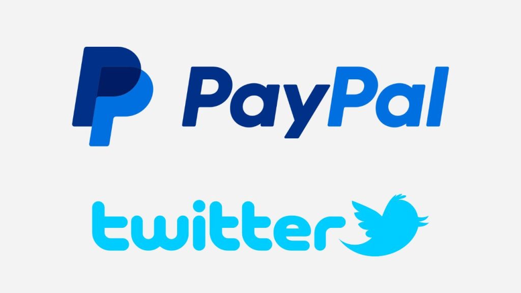
PayPal
PayPal is a great example of a dynamic logo. The PayPal logo changes depending on the context in which it is used. For example, the logo changes color when it is used on a website, and it changes shape when it is used on a mobile app. The dynamic nature of the PayPal logo makes it memorable for users.
Twitter is also a good example of a dynamic logo. The Twitter logo changes depending on the number of tweets that have been sent. For example, the logo will grow larger as more tweets are sent. The dynamic nature of the Twitter logo makes it more engaging and attention-grabbing for users.
15. 3D logos
These days, many logos refuse to be bound by the confines of two dimensions. Instead, they embrace the power of depth and dimensionality through the use of contours and shading.
The effectiveness of 3D logos ultimately boils down to how well they are executed. When done by amateurs, a 3D logo can feel forced and outdated. But when approached with a touch of minimalism and restraint, 3D logos have the power to infuse a brand’s mark with a truly memorable uniqueness.
The strongest logos are often the simplest ones. And let’s face it, adding an extra dimension inevitably introduces an additional layer of complexity. However, certain brands are well-suited for 3D logos that evoke the hyper-realistic user experiences they bring to life.
When are they best used
- To create a logo that is more visually appealing and attention-grabbing. This can be effective for brands that want to create a logo that stands out from the competition.
- To create a logo that is more immersive and interactive. This can be effective for brands that want to create a more personalized experience for customers.
- To create a logo that is more realistic and believable.
Examples
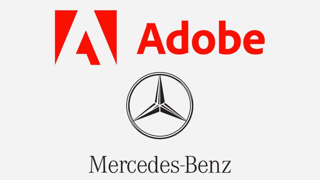
Adobe
Adobe is another example of a 3D logo. The Adobe logo is a stack of three cubes that are rendered in 3D. The 3D nature of the logo makes it more dynamic and eye-catching for users.
Mercedes-Benz
The Mercedes-Benz logo is a 3D logo that features the three-pointed star logo rendered in a way that makes it appear to be floating in space. The star is also slightly rotating, which gives the logo a sense of movement.
16. Animated logos
An animated logo is a type of logo animation that uses motion graphics to create a unique and memorable impression. This dynamic form of animation is particularly impactful when it comes to capturing the attention of your target audience and boosting brand recognition.
If you are running an online business, animated logos can be a game-changer. They infuse your brand with a friendly and fun feel, perfectly suited for the digital realm. However, it’s important to note that creating animated logos requires a significant amount of work. That’s why many web design companies charge more for animated logos compared to regular ones. But trust me; the investment is worth it!
So, what’s the purpose of logo animation? Well, it serves to convey a message or showcase the motion involved in a process, all within a short span of time.
Logo animations can range from simple to complex, depending on your needs and vision, making it essential to work with a top-rated logo animation company.
When are they best used
- Technology companies: Animated logos are a great way to show off the innovation and creativity of a technology company. For example, the Google logo animation is a simple but effective way to show how the company is constantly changing and evolving.
- Entertainment companies: Animated logos can also be used to create a sense of excitement and fun for entertainment companies. For example, the Nickelodeon logo animation is full of bright colors and movement, which perfectly captures the company’s playful brand.
- Educational institutions: Animated logos can also be used to engage and educate viewers. For example, the Khan Academy logo animation uses simple animations to explain the company’s mission of providing free education to everyone.
Examples
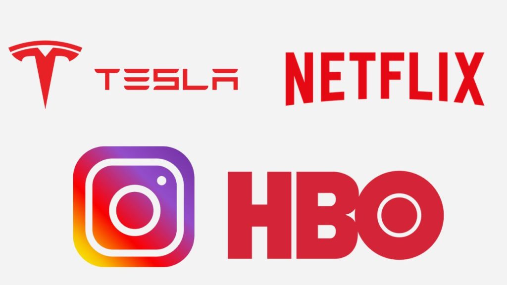
Netflix
Netflix is a great example of an animated logo. The Netflix logo is a simple “N” that is animated to look like it is melting. The animation of the Netflix logo makes it more engaging and memorable for users.
HBO
HBO is a final example of an animated logo. The HBO logo is a simple “H” that is animated to look like it is floating in space.
The Instagram logo is an animated logo that features the camera in the logo opening up to reveal a photo. This animation represents the photo-sharing nature of Instagram’s platform.
Tesla
The Tesla logo is an animated logo that features the “T” in the logo transforming into a charging station. This animation represents Tesla’s commitment to sustainable energy and its mission to accelerate the world’s transition to electric vehicles.
17. Slime logos
Slime logos, with their playful and cartoonish style, have gained popularity in contemporary branding. These unique logos draw inspiration from a slime splash and are completely customized to suit the specific needs of a company or industry.
If your brand caters to children or offers lively and vibrant products or services, a slime logo can be a perfect fit.
How To Use Slime Logos
- Understand Your Brand Message: Before committing to a slime logo, ensure that it aligns with your brand’s identity. Remember, businesses with a more serious or professional tone may not be suitable for this type of logo.
- Opt For A Suitable Character: Since slime logos often target children as their audience, it’s essential to choose a character that exudes liveliness, friendliness and captivates the younger demographic.
- Use Slime-Inspired Details: With slime logos, there are no fixed fonts or icons. So you can embrace the freedom to incorporate unique details and elements that truly represent your brand and make it memorable.
Pros
- Attractive and quickly grab attention
- Provide a distinct identity for brands with a fun and funky approach
Cons
- Not suitable for brands with serious objectives or professional image
When are they best used
- Children’s brands: Slime logos are a great way to appeal to children. The bright colors and gooey texture of slime are sure to capture the attention of young viewers. For example, the Play-Doh logo is a simple but effective slime logo that is instantly recognizable to children.
- Creative industries: Slime logos can also be used by creative industries to convey a sense of fun and imagination. For example, the Nickelodeon slime logo is a perfect example of how slime can be used to create a playful and creative brand identity.
- Tech companies: Slime logos can also be used by tech companies to convey a sense of innovation and creativity. For example, the Google Pixel slime logo is a unique and eye-catching way to represent the company’s commitment to innovation.
Examples
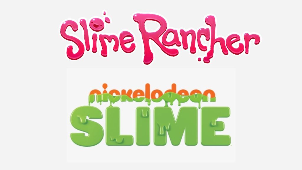
Slime Rancher
Slime Rancher is a great example of a slime logo. The Slime Rancher logo is a simple slime that is rendered in a slimy texture. The slime texture makes the logo more playful and fun for users.
Slime City
Slime City is another example of a slime logo. The Slime City logo is a simple slime that is rendered in a cityscape. The cityscape makes the logo more unique and memorable for consumers who are looking for a fun and playful slime brand.
Slime Wars
The Slime Wars logo is a simple slime that is rendered in a war-like setting. The war-like setting makes the logo more exciting and engaging for users.
Which one is the right logo type for your business?
Now that we have explored the different types of logos, it’s time to determine which one is right for your brand. Let’s go through a quick checklist to help you make an informed decision in just a few minutes:
Are you a more traditional business, or do you lean towards innovation and creativity?
- If you are traditional, consider an emblem or abstract logo for a classic touch.
- If you are all about innovation, go for a dynamic logo that captures movement and energy.
What is the personality of your brand?
- Are you playful and family-oriented, or more serious and corporate?
- If you lean towards the playful side, a mascot logo or a slime logo can add that fun and friendly vibe.
- For a more serious tone, a wordmark logo might be the way to go.
Consider the stage of your business.
- Are you a new player in the market, or have you already established your name to some degree?
- If you are new, a mascot logo or a combination mark logo can help create a memorable identity.
- If you are already known, you can experiment with dynamic, abstract, or pictorial logos to add a fresh twist.
Take a look at your business name.
- Is it short and concise, or does it have a longer, more elaborate structure?
- For shorter names, a wordmark or contoured word logo can emphasize the name itself.
- If you have a longer name, consider a monogram or lettermark logo for a more compact representation.
By considering these factors, you’ll be on the right track to choosing the perfect logo type for your brand from different styles of logos. Remember, your logo is the face of your business, so make sure it aligns with your brand’s personality and goals.
Final words on different types of logos with examples
And there you have it! We have explored some of the most popular types of logo in graphic design you will encounter out there in the wild. We have also mentioned all types of logos with names of brands they have been used for. All logo types have to be unique, and each type brings its own unique flair. It all comes down to the vibe, tone, and impression you want your brand to make. Exciting, right?
I hope this quick guide has provided you with some inspiration to create a logo for your brand.
Now it’s time to let your creativity run wild and create a logo that truly captures the essence of your brand. Remember, your logo is the visual representation of your business, so make it memorable, make it meaningful, and make it shine!
You can start by exploring a reliable logo maker that can help bring your vision to life. A logo maker simplifies the design process and offers a wide range of customizable options to suit your brand identity. With the right logo maker, logo design becomes an exciting and rewarding process.
As you create your logo, consider how it fits into your overall brand style guide and brand guidelines. Consistency in brand building is key to establishing a strong and memorable brand presence. Your logo is just the beginning of your brand development journey.
Your brand deserves a logo that stands out and leaves a lasting impression. The world is waiting to see the magic you will create!