Nike – A name that is almost religious for athletes and sports lovers worldwide today was formerly Blue Ribbon Sports, a company formed by Phil Knight and Bill Bowerman in 1964. It got its current name, Nike, in 1971, which became popular somewhere in 1980. Even today, it proudly holds its position among the 50 most valuable businesses in the world with a global annual revenue of $49.71 billion. With its footwear revenues accounting for more than 60% of the total, Nike continues to rule the charts of sports brands across the globe.
The Nike logo is as interesting as the brand itself. First designed by a student of graphics, Carolyn Davidson in the spring of 1971 for only $35, it is one of the most recognizable logos in the market today. Carolyn, who was then a student at Portland State University, designed the Nike logo (called Swoosh) for Knight’s shoes, which were to hit the market a few days later. She was paid $35 for her work which became one of the most striking logos in the history of Athleisure brands.
How did Nike get its queer name?
For starters, you will be surprised to know that the name that set the market on fire in the 80s, did not originate in the USA but in Greece, that too some thousand years ago.
Let us cut the shocks and tell you the whole brand story now.
Well, BRS or Blue Ribbon Sports was the name of the company that Bowerman started with Knight, a graduate student at Stanford and the University of Oregon, where Bowerman was a field coach and the head track at the time. He had the sole motive to create a unique line of sports shoes under a separate brand name. After his “Tiger Cortez” shoes hit the market in 1968 and made a good name, he decided to come up with an amazing name for the entire line of shoes in his company.
Some names were initially suggested, like “Dimension Six” by Knight, or “Peregrine”, which was the name of a falcon species, and even “Bengal” but none of them sat well with the employees of the company. An administrator suggested that the name should be short, consisting of not more than two syllables, with one exotic letter, as in K, Z, or X.
Jeff Johnson, who is credited for the brand name, was one of the first employees at the company. He came up with “Nike” after the winged Greek Goddess of victory as the name of the entire line of shoes. As the company was facing a factory deadline for putting a name on the boxes, Knight grudgingly decided to go ahead with a name that no one really knew how to pronounce exactly.
Now, let us come to another interesting part of the brand building process – How the logo, “Swoosh”, was created.
The making of Nike’s visual identity – “Swoosh”
Phil Knight met a graduate student, Carolyn Davidson, at the Portland State University, where he was teaching at that time. Carolyn was trying to gather some bucks for her prom dress and agreed to his proposal. She charged $2 for an hour of her work and completed the logo in 17.5 hours, thus charging $35 in total for the logo that would create history in the future. What a deal!

The initial winged design represented the Goddess of victory, which Phil, though approved, didn’t like much. However, after years, when the logo became a recognizable symbol for the brand, he offered some thousand shares of the company to Carolyn, who, as he says, never sold any of it. As for the asterisk on the logo, its mystery lies in the vision statement of the company –
“Bring inspiration and innovation to every athlete* in the world.” Bill Bowerman once stated that everyone, who has a body, is an athlete, and the asterisk pertains to this notion.
The Winged Goddess of Victory – Nike
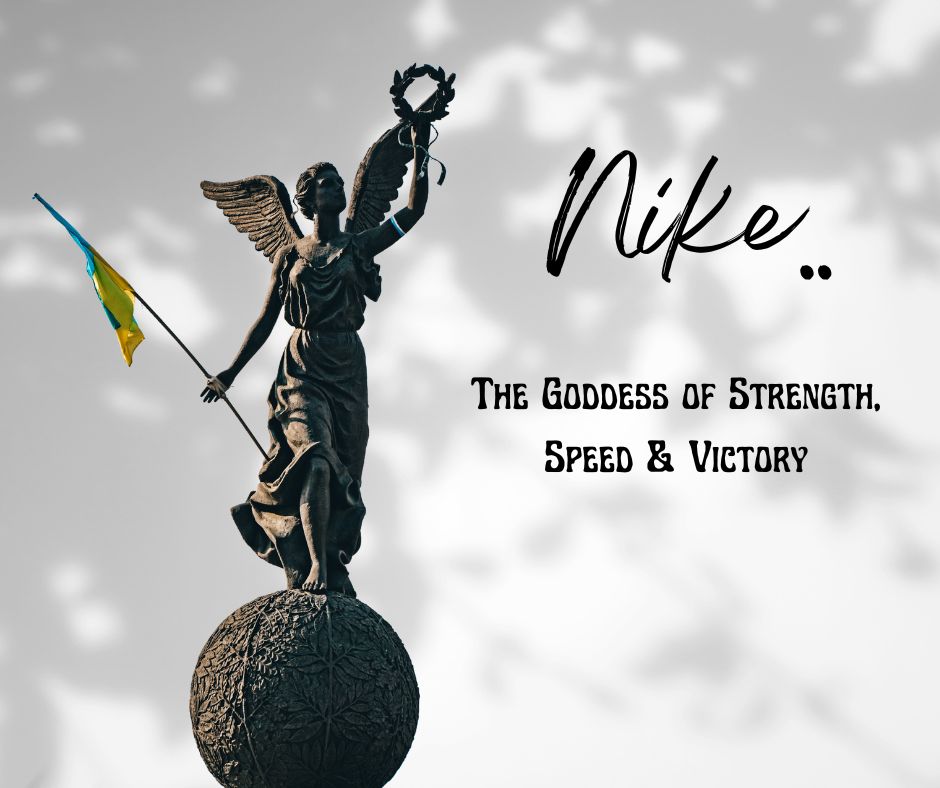
In Greek mythology, Nike is the daughter of Goddess Styx and Titan Pallas. Some stories also hold that she is the daughter of Mars – The War God in Greek mythology. In the “Clash of the Titans”, Nike was the charioteer of the Great Gods. She has also been associated with other Greek Gods, like Zeus and Athena. No wonder the games that were held in Olympia some 2500 years ago depicted Nike as a symbol of their victories. Even the modern Olympic Games use her symbol in medals.
As Phil’s company was directed towards athletes as the primary customers, using Nike in the brand identity made quite a mark later. Today, in Rome, you can find her symbol everywhere, especially in areas that depict victory and championship. The Romans are also pretty obsessed with Nike shoes, especially the latest models in sneakers and trainers.
The Nike Logo – Story of its Evolution
Coming back to the logo of the eminent athleisure brand, it has evolved drastically from its inception in 1971. The logo even has a name (as you know already), “Swoosh” that goes well with its simplistic yet impactful design. However, the story of the company’s logo goes back to 1964. Scroll on!
1964
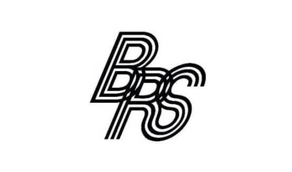
When the name, Nike, was not introduced, the company was known as Blue Ribbon Sports. It has a simple logo with interlacing alphabets and the full name printed below. Although this logo is not much renowned, it still served the business well till 1971.
1971
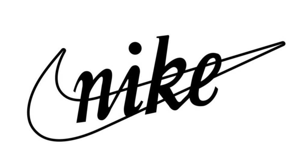
With the urge to create a separate brand name for the entire line of footwear, Phil decided to go ahead with the name, “Nike”, under the pressure of a factory deadline. The original logo was designed by Carolyn Davidson, but it failed to impress Phil much. However, he still decided to use it, thinking that it would catch up with him later.
1978
The Cursive Serif font was replaced by Futura Bold, which was more geometric to the eye. Adhering to the new brand guidelines, the “E” of the brand name was made to run into the “tail” of Swoosh. The spaces between the letters were made more interesting to catch the eye.
1985
At first, the logo was put inside a square, but it failed to meet the visual expectations of the audience. During this time, Nike became more popular with eminent athletes like Michael Jordan endorsing the brand. Hence, experiments were cut short, and the new logo emerged with only the brand tagline – Just do it – featured in the logo. This phrase was, in fact, inspired by the last words of Gary Gilmore (Let’s do it) before he was executed for being the death row killer.
1995
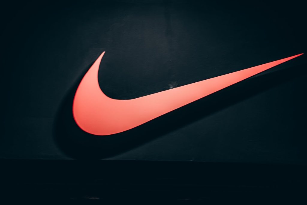
The logo, “Swoosh” as we see it today, came into being in 1995, as a lone mark even without the brand name. But the brand had become so popular by then that the “Swoosh” was enough to recognize it. This emblem today stands for athleticism, quality, and speed in the clothing market. It is undoubtedly one of the world’s most recognizable logos, despite its inherent simplicity.
The Design Elements in “Swoosh” and Their Meanings
The visual identity of Swoosh is one of the simplest. The company and its products depend largely on the logo, as it is easily recognizable and memorized. But do you know what each aspect of the logo stands for?
- The shape of Swoosh – It denotes the wing of Nike, the Goddess of victory. To date, this shape has stood out as the brand identity of all Nike products.
- The color – Over the years, the logo has had several changes in its basic color. From white to orange, it has featured other brand colors, like red, black, and more. Currently, it flaunts a basic black-and-white shade, the iconic black swoosh over a solid white background. It helps keep the logo simple and appear REAL. However, the color varies greatly depending on the marketing campaigns and product shades. They have kept it flexible to merge well with the surroundings.
- The font – Generally, the Nike logo is just an emblem – The iconic Swoosh. However, sometimes, the tagline appears with the emblem in solid Futura Bold, which was introduced as the logo’s font in 1978. It makes the logo appear eye-catching and impactful, to say the least.
What type of logo is Nike?
Among the seven most common types of logos, the “Swoosh” is basically an abstract logo. An abstract logo consists of a strong icon that makes its mark as the visual identity of the business. In the case of Nike, it is the wing or “Swoosh” that represents the brand and all its products. An interesting fact about an abstract logo is, that the symbol is not generally recognizable unless associated with the brand.

For example, if you see the Swoosh as a lone symbol, you may not understand its meaning. But on footwear, you can easily recognize it as a Nike product. There are several other examples of abstract mark logos, like Master Card, Adidas, etc.
The concept of Nike logo – What each element stands for
The current Nike logo has only one visible element – Swoosh.
As mentioned earlier, it stands for the wing of the Greek Goddess of Victory, whose name is the same as the brand name – Nike. It depicts speed, quality, power, movement, and determination. No wonder the brand is a favorite among athletes!
What is so special about the Nike logo?
What makes the “Swoosh” this special is its journey from a mere $35 logo created by a graphic design student to a global icon. Carolyn Davidson, who created the first logo for Nike, charged only $35 for the same. However, Phil offered her a good amount of shares in the company after it made its mark in the industry. But she didn’t sell any of it. This unexpected victory of the Nike logo in the world of athleisure truly makes it special. Do you know that Christiano Ronaldo, the eminent football giant, has a lifetime contract with the brand worth $1 Billion? Now you get to know how popular this brand and its logo is!

Anyone can easily attribute the success of its brand development to the thought of using the name of the Goddess of Victory. Who knows how things work in the universe, right?
Lesser-known exciting facts about the Nike Logo
- The logo was priced at $35 when it was first created. At present, it is worth $26 billion.
- The “Swoosh” in the logo is actually a representation of the winged Goddess of Victory, whose name is also the brand identity of the business – Nike.
- The first set of footwear that bore the “Swoosh” is not a sneaker but a soccer cleat worth $16.95. However, the shoe didn’t go down well with the wearers because of its less resistance to weather conditions.
- The Nike Slogan “Just Do It” is inspired by the last words of a serial killer before his execution.
- It took Carolyn Davidson, the creator of “Swoosh”, 17 hours and a half to create the logo, which would make history later.
Lesser-known exciting facts about the brand
- Nike proudly occupies about two-thirds of the US market for footwear and about 62% of the world’s athleisure market.
- “Nike” was not the first choice for a brand name. Initially, it was about to be named – Dimension 6. Just imagine!
- Most people still don’t get the right pronunciation for Nike, which is accurately pronounced as “ny-kee” and not similar to bike or like.
- Much before Nike became the top choice for athletes all over the world, the first one to endorse the brand was Illie Nastase, a tennis player, in 1972.
- Nike has 2 Emmy awards in its kitty for its commercials, “The Morning After” in 2000, and another impactful one, “Move” just two years later.
- The company does not own any factory in its name. On the contrary, those are owned by contractors paid by Nike to produce their goods.
- In 1990, a strange accident led to the loss of about 80,000 Nike shoes in the sea. To date, some of the Air Solo Flights, Strike Forces, and Pegasus shoes can be spotted in the water.
- The company allegedly created a pair of “Satan Shoes” in 2021 with the mark of human blood. However, the brand denied this allegation and even took care of the issue legally.
- Although Nastase was the first official ambassador of the brand, Nike’s heart belongs to Steve Prefontaine, a runner, who, unfortunately, died in a car accident in 1975. Phil still refers to him as the “Soul of Nike”.
How popular is the Nike Logo?
Besides being worth $26 billion today, the Nike logo has impacted the world of sports numerous times at recognized events.
- In 1988, the company launched the “Just Do It” campaign to stress the importance of the phrase both universally and in the personal space. The campaign was a huge success and features the “Swoosh” on merchandise, billboards, and even Graffiti. The campaign aimed at making sneakers a fashion statement instead of being only sports gear.
- The logo was also featured in the “Dream Team” Olympics campaign in 1992, with eminent players, such as Michael Jordan and Charles Barkley flaunting the same on their jackets, etc.
- In 2018, the company also went ahead with its social injustice propaganda by featuring Colin Kaepernick, an outcast American Soccer player and activist. Although the shares fell, the campaign still managed to make its mark in the sportswear industry.
The Nike logo is immensely popular to date, as it inspires billions of people and motivates them to give their best. Its most-loved tagline during the 2018 campaign went – “Believe in something, even if it means sacrificing everything.” It IS something, right?
Nike logo designer who helped change the sportswear industry
Carolyn Davidson was the person behind the unique concept of the Nike logo. And how much did she charge for this amazing piece of history? You won’t believe it! Only $35!
In 1971, Davidson was a student of graphic design at the Portland State University. Phil Knight, who used to teach there, knew about Davidson’s financial needs to some personal end. He asked her to design the logo for Nike, the brand name for the new line of shoes in Phil and Bowerman’s company. The “Swoosh” that Davidson designed to indicate fluidity of movement and speed was not entirely approved by Phil. If the rumors are to be believed, he made her improvise the same several times before she gave up and left, after being paid for the job, of course.
However, when the logo started taking the market by storm, the company owners threw a party in Davidson’s honor to celebrate her contribution. She was gifted a substantial amount of Nike stock, which is believed to be worth $1,000,000. That was not all. Davidson was also gifted a diamond and gold ring featuring her “Swoosh” design. So yeah, she was paid well by the company for her role in the creation of history.

Nike Logo Rebranding (Make or Break)
Nike was previously Blue Ribbon Shoes, as you know already. At that time, BRS used to import and sell shoes. But when the owners decided to manufacture their shoes, they opted for a complete rebranding in 1971. Of course, we know how it went. This step was probably the luckiest one in the history of the footwear industry. The company went from a hardly-known brand to a global icon (from Blue Ribbon Shoes to Nike) with its unique “Swoosh” logo. So the rebranding endeavor turned out to be 100% profitable for the company. The logo was simplified later, but little changes were made to the original design.
Final words
The logo “Swoosh” played a huge role in establishing Nike’s supremacy in the footwear industry. The story behind the design is intriguing but its use in athleisure products makes it all the more exciting to the customers. The logo not only appears powerful from a design POV (point of view) but also in the spiritual sense. Not to be superstitious but, who wouldn’t like the idea of getting on the field under the influence of the Greek Goddess of Victory? And the Nike logo gives just the impression.
No wonder Nike’s brand style guide inspires several other companies in the sports and athleisure industry today! Being an abstract logo, the “Swoosh” is enough to get customers’ attention to a product that defines style, speed, and passion, motivating the wearers to do their best, much as the tagline says – Just do it!