With revenue of $9.168 billion, a whopping 12.49% increase over the years, your favorite coffee destination is ruling the global charts even in 2024, 52 years since its inception. They celebrated their golden jubilee in 2021 gloriously and rightly so. After all, the brand has its claws spread over the entire North America and other 80 developed and developing countries with over 30,000 stores worldwide. A success like no other, Starbucks deserves all the appreciation for maintaining its standards throughout several decades, mesmerizing generations of coffee lovers.
Now besides its coffee, the logo of Starbucks has caught eyeballs over the decades.
But why?
What is so special about the Starbucks logo?
Well, if you look carefully, the current logo features a fantastical woman, probably a mermaid. Now, you must be scratching your head wondering what could be the relation between coffee and a mythical creature like a mermaid, right?
Let’s bust your first misconception then. The mascot on the Starbucks logo is not ONLY a mermaid. She is a Siren from ancient marine legends, a creature well-known for its seductive ability to lure sailors to their deaths.
In this post, we will know all about Starbucks’ Siren and its role in making the brand a success.

Just kidding!
What we meant is that we will discuss the various features of the logo and understand its significance for the brand’s identity.
Before we get to the logo story, let’s shed some light on how the brand got its unique name.
How did Starbucks Get its Star-Struck Name?
The brand building process of Starbucks is interesting enough to get you to the edge of your seat. Let’s take a ride on the time machine to go back to 1971 to know the entire brand story in short.
The founders have got together and are deciding on a suitable name for their coffee brand. They have different opinions but have agreed on one point – the name should depict adventure and excitement, like coffee itself. The early coffee traders were sailors, so they decided to name their brand after the ship in Moby-Dick, the novel.
However, “Pequod” the ship has a peculiar pronunciation, “Pee-Kwod”, which will most likely not interest the customers. In Mt. Rainier, a popular landmark in Seattle, the founders finally agreed to name their brand, Starbucks, after the name of the first mate on Pequod in the novel.
Thus was born the brand, which was about to create history in the world of coffee.
After the name was decided, the next job was to create a compelling logo to help the business kick off.
The Story of the Starbucks Logo
Coming back to the logo, it has an interesting story attached. The brand guidelines of Starbucks were entirely themed on ancient Greek nautical mythology. And the logo was created accordingly.
1971 – The Siren
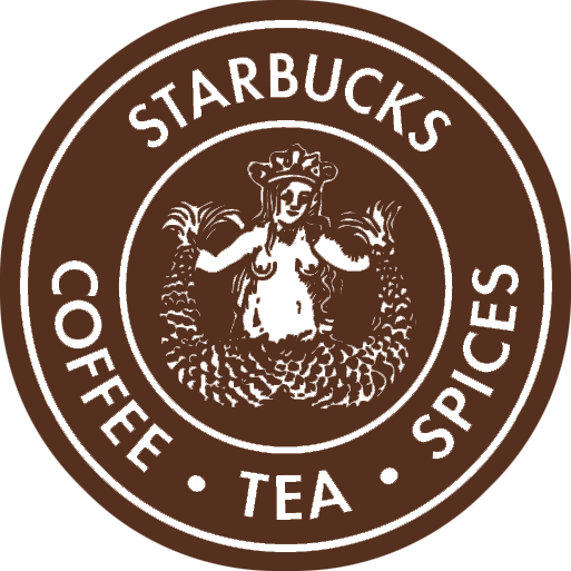
The first-ever Starbucks logo was in sync with its earliest brand name – Pequod, the name of the ship in Moby-Dick (Novel by Herman Melville). It consisted of a brown, twin-tailed mermaid (known as the siren) in the center and the name surrounding it in a circular manner, exactly like it does now. Now, the sirens are mythical creatures believed to lure sailors to their deaths. The message was clear – Starbucks was about to lure the customers into buying coffee, and for sure they did!
1987 – The Siren 2.0
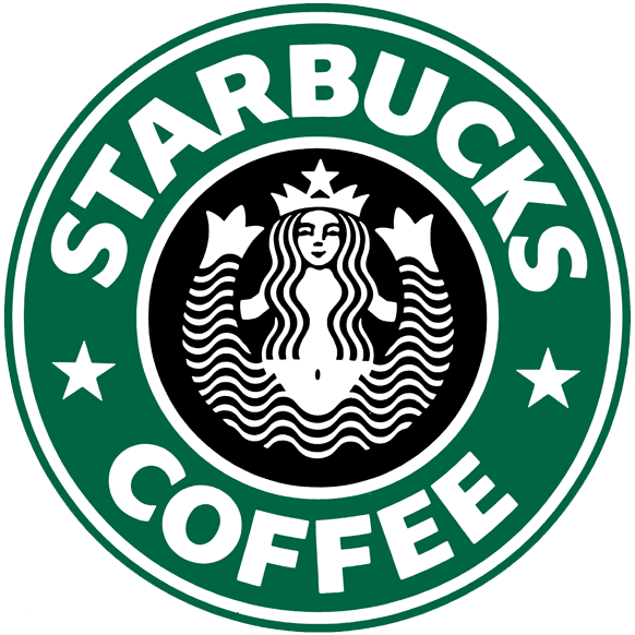
When Howard Schultz bought the company, he immediately improvised the logo and made the somewhat intimidating mermaid look gentler and more appropriate for the general audience by covering her chest with her long tresses. He also changed the logo color from brown to green and black.
1992 – Zoomed-In
In the third logo upgrade, the mermaid was zoomed in, so that her navel is no longer visible. It gave her a more closer-up, clearer view, thus making the logo stand out. The font was also changed, making the logo appear more professional than ever.
2008 – Logo Rebranding
On the 40th anniversary of the company, the officials decided to rebrand its identity and revive the original logo, with the siren being her seductive self on a darker background, ready to lure customers into getting some good coffee. However, this attempt to revive the original concept did not go down well with the loyal customers of the brand.
You may ask if the logo rebranding initiative was a make-or-break. We would say that it almost “broke” the spine of the brand if actions were not taken at the right time. On receiving severe backlash from them, the company decided to go down to its simpler logo of green and black with the mermaid holding a prominent position at the center.
2011 – All but the Siren
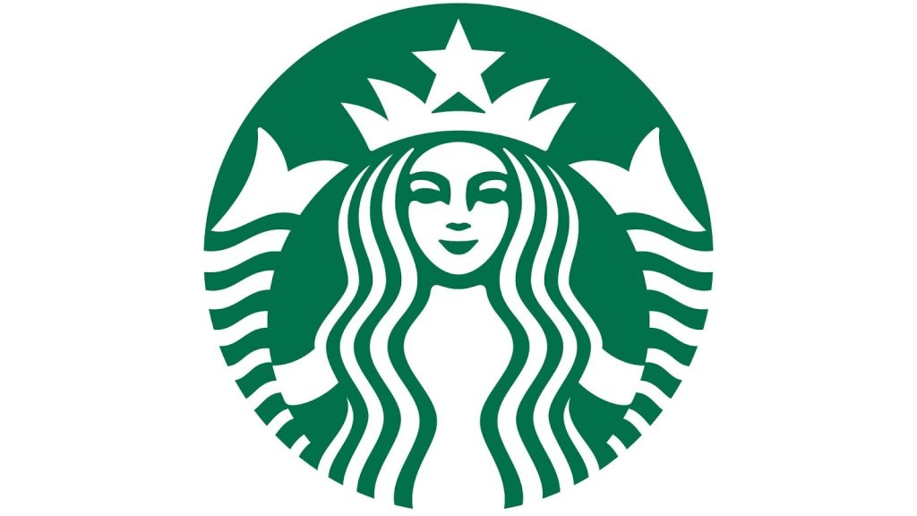
By this time, the brand had gained immense popularity over the globe. So the company took the final decision to drop all elements from the logo except the familiar mermaid. Yes, the wordmark, stars, and ring were removed, thus giving the mermaid complete supremacy over the logo design.
This logo is still in use with negligible changes, as the company owners understood that their loyal customers do not like to part with familiarity, be it the taste of the coffee or their favorite brand’s logo.
The Different Aspects (Logo Concept) of the Starbucks Logo
The earliest Starbucks logos had all the aspects of a brand style guide, namely, wordmark, stars, and an outer ring that separated the mermaid from the brand title. Let us explain the significance of these aspects in detail.
| Color | Font | Shape |
| The brown color of the 1971 logo depicted a sense of calm, representing the natural qualities of Starbucks’ earliest products – coffee, spices, and tea. The green, white, and black brand colors of the logo depicted freshness, opportunity, and yes, growth. The current green represents sustainability and growth, depicting that the company has now joined the family of greens to support a greener future. | Starbucks has been using the Sodo Sans, Pike, and Lander fonts, time and again, to stand out. Sodo Sans – Versatile and apt for body content Pike – Creating impressive impact for headlines Lander – Highly expressive, making the copy more visible The current logo, however, doesn’t have any text copy. | The brand has maintained its primary circular shape throughout the decades, as it is one of the earliest and commonest of graphic designs. According to the experts, the circular shape depicts Starbucks’ continuity over the years, as a circle does not have any beginning or end points. |
What Type of logo is the Starbucks’?
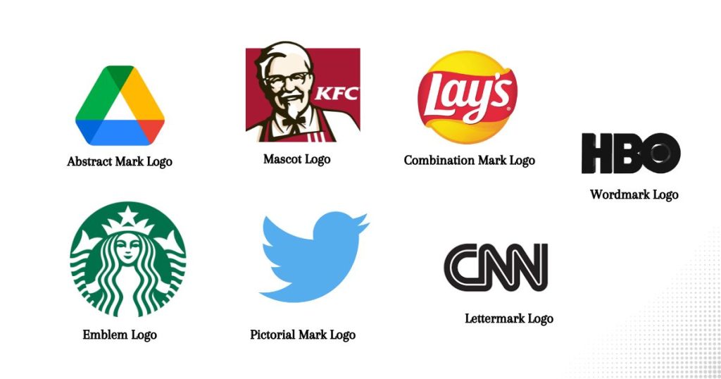
The popular Starbucks logo is one of the perfect examples of an Emblem Logo.

Well, an emblem logo is one that has text engraved inside a specially chosen icon, badge, or seal (or emblem, as the name implies). These logos have a traditional essence and appear quite striking. Generally, this type of logo is chosen by:
- Government organizations
- NGOs
- Educational institutions
- Traditional businesses
The emblem logo is a classic style popularized by brands, like Harley-Davidson and Starbucks.
What does the mascot in the Starbucks logo represent?
The mascot at the center of the logo is a mermaid, or a Siren, to be precise. The founders and the logo designers wanted to keep it essentially “marine”, thus synchronizing with the brand name, and hence, this symbol was introduced. Sirens comprise ancient marine folklore, where these mermaids lure sailors to their deaths. As exciting and dangerous as it sounds, the mermaid symbol was chosen to depict the sense of adventure associated with “coffee” in those days.
But the earliest symbols went through several modifications over the years, transforming her into a professional, yet attractive mascot for the brand. Her hair was lengthened to cover her bare chest, and a significant part of both her tails was cut off from view. The Siren that the current logo of Starbucks has is, according to the company stakeholders and followers, imperfect with an asymmetric face, almost resembling a mask and not some human. It highlights the concept – “imperfection is real beauty” – in a queer sort of way.
The popularity score of the Starbucks Logo
It is needless to say that the logo of the world-famous coffee brand is unmatched. According to a survey on brand awareness of Starbucks, 92% of US respondents were said to recognize the brand by both its logo and the name. It would not be wrong to say that a true coffee lover in any part of the world is familiar with the unique twin-tailed siren of the Starbucks logo.
There’s no denying that the logo stands out because of its distinctiveness. Further, its brand color – a bright yet soothing green – which replaced the earliest brown and black tones of the previous versions, also makes it catch eyeballs wherever posted. The popularity score of the logo is so high that it doesn’t require the brand name to be printed on the emblem anymore.
What is so Special about the Starbucks Logo?
The Starbucks logo is very different from other logos. Unlike the logos of rival companies, it is not brand or product-specific. It tells a widely different story, a quite alluring one indeed. The visual identity of the brand, thus, does not depend on its products, but its motive – to attract customers towards world-class coffee.
The entire brand-building process of Starbucks is inspired by the marine coffee traders of earlier times. Hence, its logo is not an exception. The twin-tailed siren highlights the motivation behind building the brand and its inspiration – Moby-Dick, an 1851 novel by Herman Melville. This story is all about hunting a gigantic whale (the rare white sperm whale). If you are wondering how it is linked to a coffee brand, we have you covered.
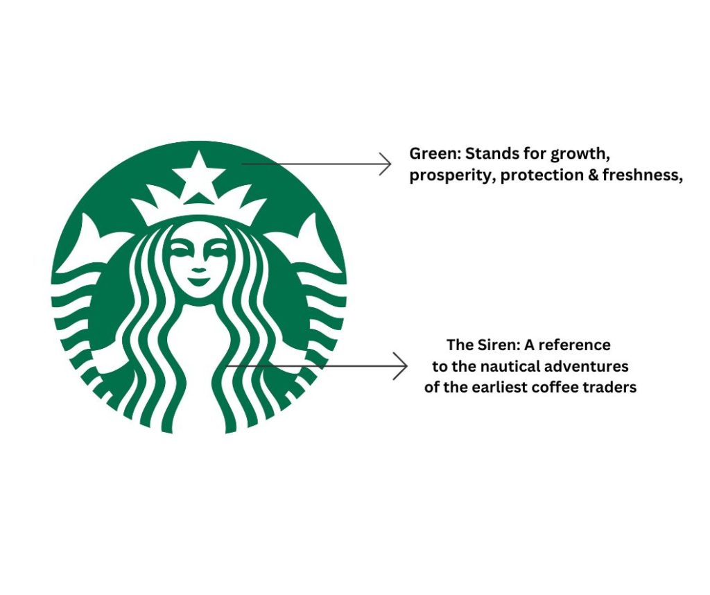
The twin-tailed mermaid actually depicts excitement and adventure. The earliest coffee traders in the West were essentially sailors. The brand founders chose this logo to pay homage to their seafaring tradition, including their popular myths about mermaids and sirens. These beautiful mythical creatures were said to have caused several shipwrecks in the earlier centuries, one of these being right off the coast of Starbuck Island in the South Pacific.
The mermaid in the Starbucks logo is not just a part of its brand identity. She is a solemn storyteller of those times when the coffee traders risked their lives to bring world-class coffee to the mainland. It is this compelling story that makes the logo so interesting and special at the same time.
A Few Exciting Facts about Starbucks and its Logo
As of now, you are already overflowing with information about the Starbucks logo, its color, symbol, and the story behind choosing its mascot. But there are few fun facts yet to know about the logo and the brand at large. Scroll on!
- Dark and alluring – The twin-tailed siren in the logo is a dark creature. She also appears a bit creepy, if you notice carefully. However, the reason why she was designed this way is to represent the dark, alluring nature of coffee that seems to capture the hearts of drinkers all over the globe, exactly the way these sirens captured the hearts of sailors, causing shipwrecks in the dark seas.
- Green and white tones – The green and white brand colors of Starbucks depict sustainability, freshness, protection, healing, and growth. All these features sync perfectly with the popularity of the brand and its intention for its loyal customers. The green also represents the brand’s corporate social responsibility, which they take quite seriously.
- The endlessness of the circle – All the logos of Starbucks maintained their circular form, depicting endlessness. As a circle has no fixed beginning or end, such is the brand that has kept on going and growing over the decades.
- No word art – The brand has now become so popular that anyone recognizes it with the emblem itself. Hence, the makers decided to remove all words from the logo, as the symbol was self-sufficient enough by then.
- Perfect to imperfect – The siren in the earlier versions of the logo was perfect in her graphical form. However, the current one is a bit asymmetrical, which is a deliberate attempt by the latter designs to uphold the true meaning of beauty that lies in imperfection.
- Conspiracy theories – According to some conspiracy theorists, the Starbucks logo has a close resemblance to the signs and symbols used by the Illuminati (the 15th-century secret societies). If you turn the earliest logo upside down, you will see that it is similar to the head of a goat, a popular symbol of the Illuminati.
- Anti-semitism – Some anti-Semitic groups also suggest that the siren in the logo is none other than Queen Esther, a Biblical character, who risked her life to save the Jews. As a result, the brand has also been associated with anti-Semitic activities, but these allegations are yet to be proven.
There have been so many stories floating around the Starbucks logo that have managed to keep eyebrows raised for decades. All these tales and theories just make the brand even more alluring.
Final Thoughts on the Starbucks Logo
Of all emblem logos, Starbucks stands out because of its compelling story behind the image. It inspires excitement, adventure, and seduction, a staple of good coffee. Although it is a far-fetched reference, the logo has been working its magic on the customers, luring them into ordering coffee that tastes the best, undoubtedly.
Over the years, the logo has gone through several upgrades, making it more and more alluring each time. No wonder the global brand contributes a huge part of its success to the logo – An inspiration to millions of business owners today!
Lastly, if you want to create a story with your business logo, make it like Starbucks.
FAQs that Need Answers Fast
Who created the Starbucks logo?
The original Starbucks Logo was designed by Terry Heckler in 1971. He was again asked to improvise the logo in 1987, and he did it by giving the siren in the logo a quality makeover.
Are sirens and mermaids the same?
Mermaids are mythical marine creatures flaunting a scaly fish tail in the place of legs. They are believed to be harmless beauties, living in the deepest recesses of the ocean. Sirens are basically evil mermaids, who lure sailors and sea workers with their beauty and cause shipwrecks.
Is the siren on the Starbucks logo inspired by Greek mythology?
The siren on the Starbucks logo is often associated with Medusa, a character in Greek mythology, who was seduced by Poseidon, the Sea God, to the temple of Athena. However, Starbucks holds that its siren is nothing but a thematic representation of nautical Greek mythology without any direct reference to Medusa or any such character.