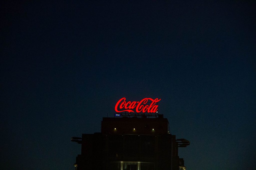
The $106.1 billion soft drink brand is not unfamiliar to anyone. People consume this carbonated drink in big cities, towns, and even remote villages. There’s not a speck of doubt that is one of the most-loved soft drinks in the world, ruling the market for over a century. But besides the product, the Coca-Cola logo is easily recognizable and also highly familiar among several generations.
Of course, the Coca-Cola logo that we see today has been through a series of evolutionary stages, syncing with the mindset of the audience from different time phases.
A hundred years is not a matter of joke, right?
The first-ever Coca-Cola logo was a simplistic machine-inscribed one, which was improvised into a stylized design by Frank Robinson, an accountant by profession. We will get to the brand story and learn other exciting facts about the Coca-Cola logo in this post, but before that, let’s learn how the brand got its unique and everlasting name.
Coca-Cola brand story – Nomenclature
It takes a hell lot of time to develop a popular brand identity, something that will stay with your brand and all its products lifelong. As with other world-class brands, Coca-Cola did not get its popularity in a fortnight. It took the brand years of research, brainstorming, and marketing to reach the level it is now.
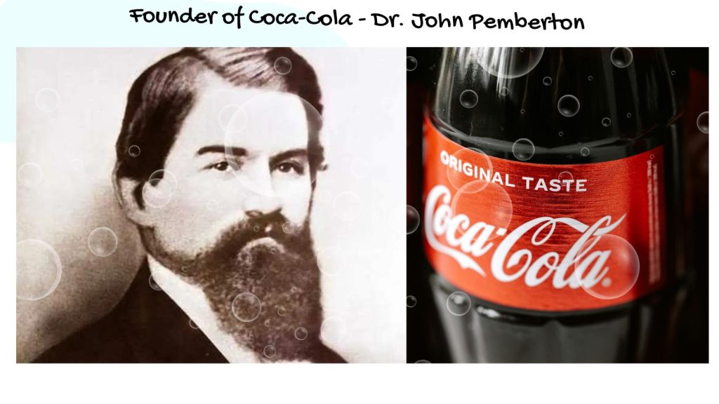
The credits for the recipe of Coca-Cola is attributed to John Smith Pemberton, an Army veteran and a chemist, who sold the same to Asa Griggs Candler, a business tycoon as well as an eminent politician, for a meager $238.98 before his demise. It was Candler who turned his soft drink recipe into a multi-billion dollar brand.
The name, however, was proposed by Frank Robinson, Pemberton’s accountant, the same person who designed the original logo for the brand. It was derived from the two basic ingredients in the drink – coca leaves and kola nuts. And we all know how that went. From children to the elderly, every age group is superbly familiar with the brand name of the soft drink.
Apart from the original drink, the brand also features several other flavored drinks, namely, Diet Coke, Coca-Cola Raspberry, Coca-Cola Zero, etc.
The unique brand name is one of the big reasons for the popularity the drink enjoys today. Another reason is its iconic, eye-catching logo. It has been through several changes over a period of hundred years. Let us go down memory lane to witness the Coca-Cola logo’s amazing journey.
The Evolution of the Coca-Cola Logo
One thing you should note about the brand’s logo is, that it does not represent the product but stands for and depicts love, passion, purity, and humility. In none of the logos that were designed through the years, you will notice any symbol that represents a drink. A simple, contoured word logo, Coca-Cola uses a special 19th-century script called the Spencerian Script, which features a handwritten font. Now, it was not like in 1886, when the brand was born. Keep scrolling for the full history of its evolution.
1886
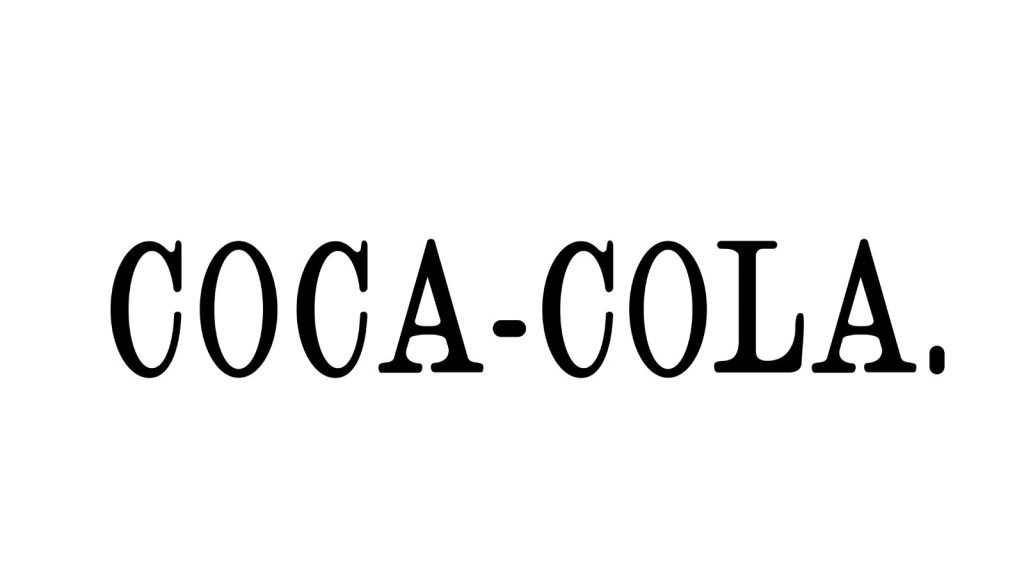
A simple Serif wordmark, the first-ever Coca-Cola logo was developed by Frank Mason Robinson, Pemberton’s friend and partner. It consisted of the two words, Coca and Cola, separated by a hyphen and succeeded by a full stop. The entire wordmark logo was in upper case, thus making the brand name bold and impactful. However, it was in the following year that the characteristic brand typeface was introduced, making the brand name stand out.
1887
The idea of using the catchy Spencerian script in the logo was also Robinson’s. This type of naturally-flowing writing was widely popular in the US before the typewriter came into practice. To give a dramatic touch to the logo, he introduced the brand name in this script, which is still in use today (with a few tweaks, of course). Although there were several variations of this script in the advertisements, the original one is not too different from the current one even after a century and a half.
1889-1890
During this phase, the script was changed a bit to catch more eyeballs to the brand name. The tails of the Cs were elongated and stretched, making the two Cs stand out even more. Then, some diamonds were incorporated into the logo, under the swirls of the two Cs, attracting more eyeballs to these letters hence. However, this design was not used in too many places – apparently only on the company’s first calendar.
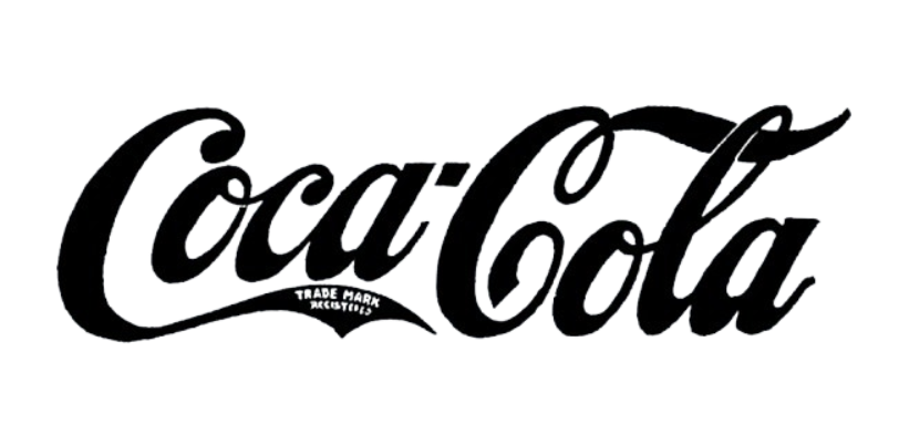
1891
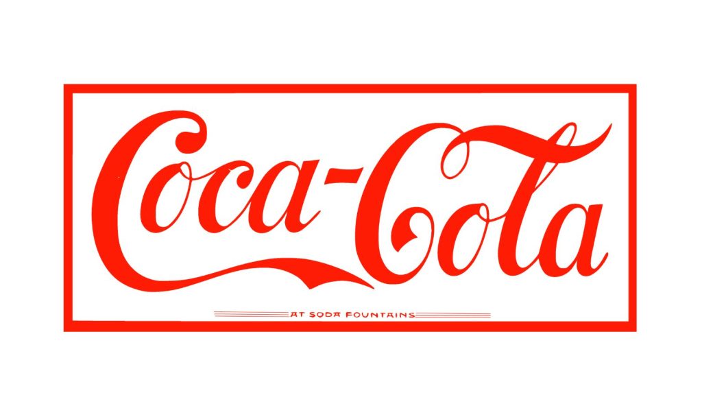
The 1891 Coca-Cola logo is already pretty much similar to the current logo (except the red border), as you can see in the picture. However, the letters are more erect and appear taller than in the existing one. But to a layman’s eye, both the logos are almost the same, with the characteristic Spencerian script in bold red on a white background standing out as a staple for the brand.
1893
This year, the logo chucked its bright red tone and went back to black temporarily. The script, however, holds more resemblance to the current logo than the one in 1891.
1941
It was not before 1941 that the characteristic Coca-Cola logo, an art form that would take the brand’s niche market by storm, was introduced. The letters were slanted a bit diagonally. The logo also appeared more balanced in terms of the sizes and weights of each letter.
The ‘trademark’ was also dropped from the logo to create a clean look. However, it was to be used underneath in several applications of the logo, as the information was crucial. Eventually, it was incorporated as an ‘R’ at the end of the logo. The font color was changed from black to bright red, thus sealing one of the most popular brand building stories of all time.
1958
Keeping the basics of its visual identity unchanged, the company started experimenting with different kinds of backgrounds. In the 50s, the logo was introduced into a fishy arc-like shape of a background while used on various advertising materials. This background was red, and the font was made white, thus keeping the fundamental brand colors intact.
1969
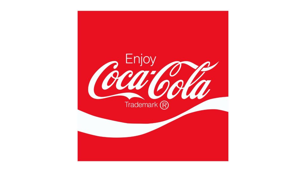
It was this year that the distinctive white wave was introduced to the Coca-Cola logo. Known as the “Dynamic Ribbon Device”, this wave was inspired by Arden Square, named after Elizabeth Arden, the eminent cosmetics entrepreneur. Further, the word “Drink” was dropped from the logo (it was only used in advertisements) and replaced by “Enjoy”. These simple tweaks helped accelerate the brand building process to a great extent in the 60s.
1987
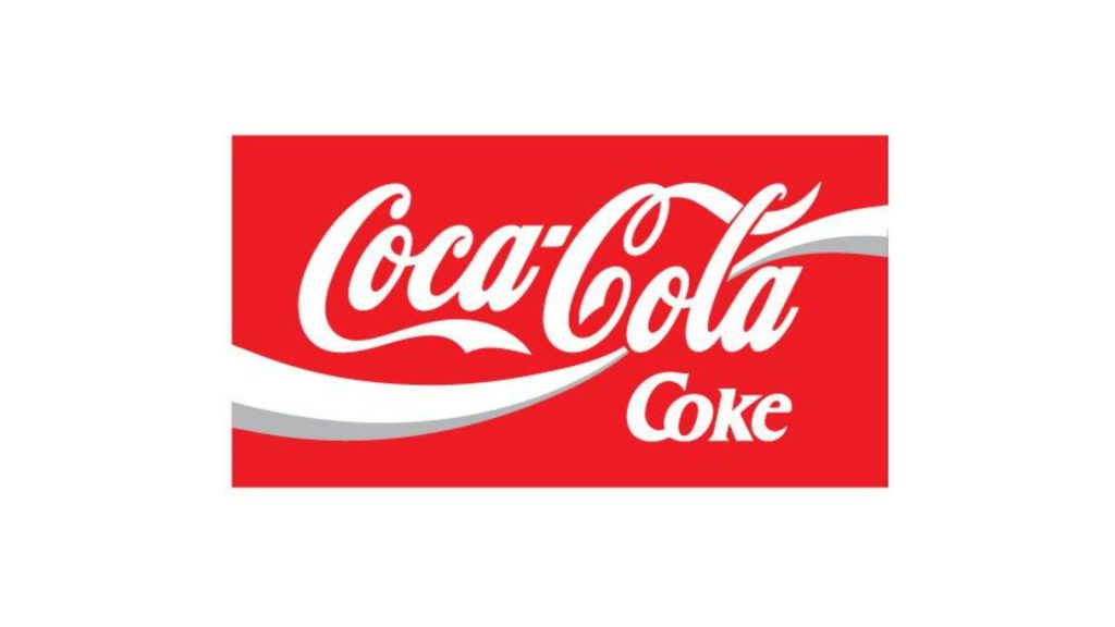
The Dynamic Ribbon Device became more prominent, flowing through the main script, i.e., the brand name, with a grey streak added to it. This grey shadow was made to create a deeper impression of the white wave. The original typeface was retained in white tone on a red background.
2003
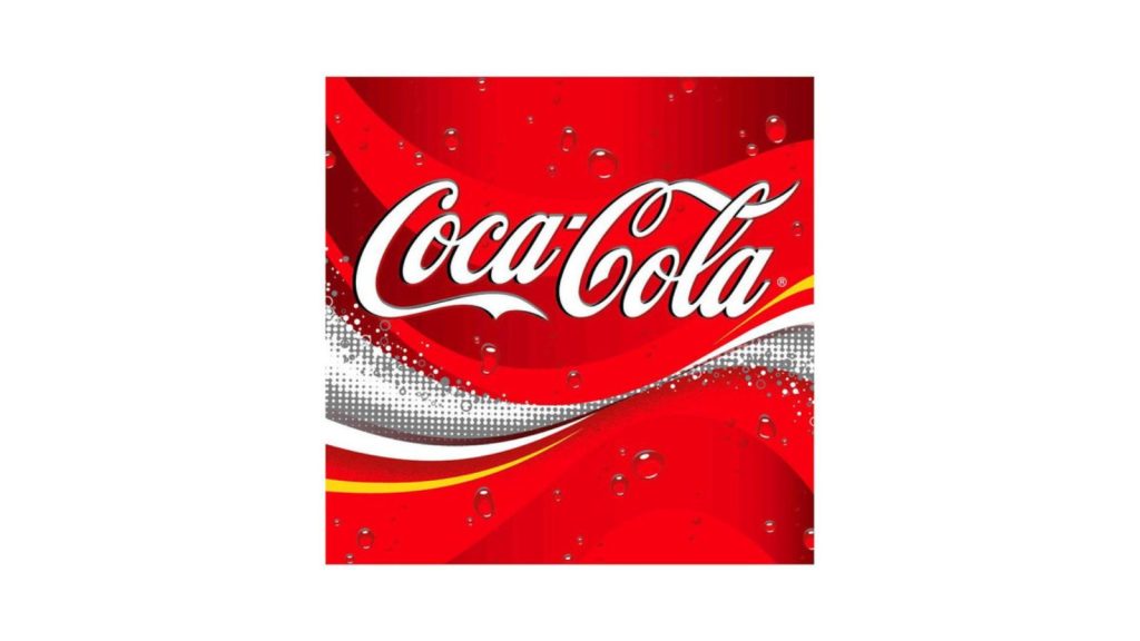
The 2003 Coca-Cola logo was made more relevant with the launch of the “Coca-Cola Real” campaign. The ribbon obtained a maximized impression with a tinge of yellow accompanied by white bubbles.
The 2021 hug logo
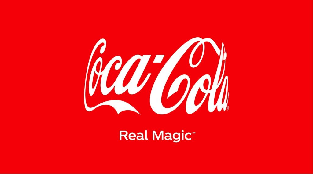
The Coca-Cola “hug” logo was introduced in 2021 for the “Real Magic” campaign of the brand. It was inspired by the way the logo appears on the bottles, attaining a virtual hug shape. This logo is intended to recreate the “moments of magic and celebration” associated with the drink. It was indeed a sweet gesture by the brand that always stood for its people and their emotions.
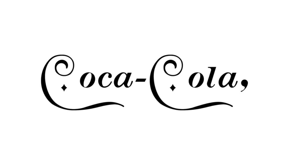
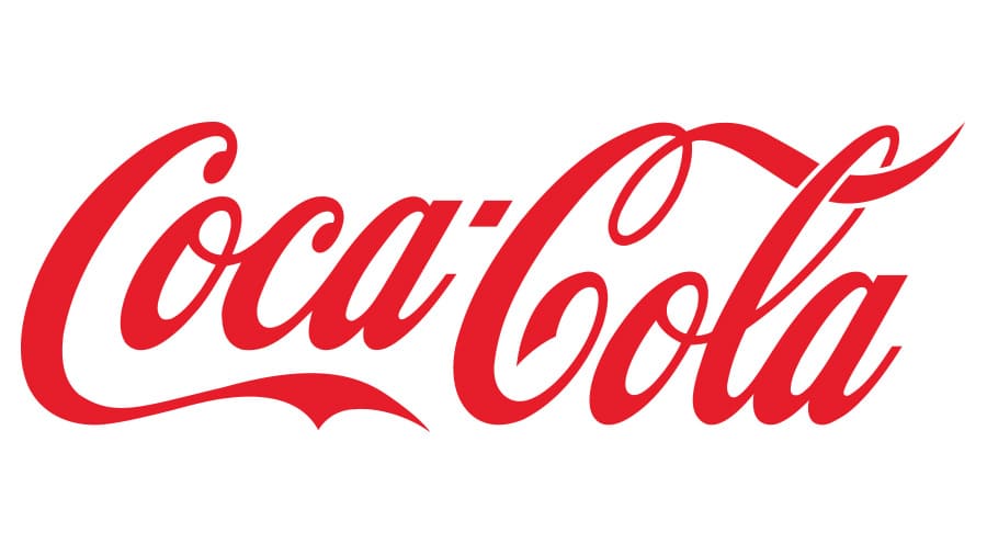
The Coca-Cola logo of today (2024)
The logo that we see today is not much different from the 1887 one. The script is the same (Spencerian), and the base colors are red and white. Perhaps, it is the simplest of all the previous versions, thus easy to remember and recognize.
Diet Coke logos
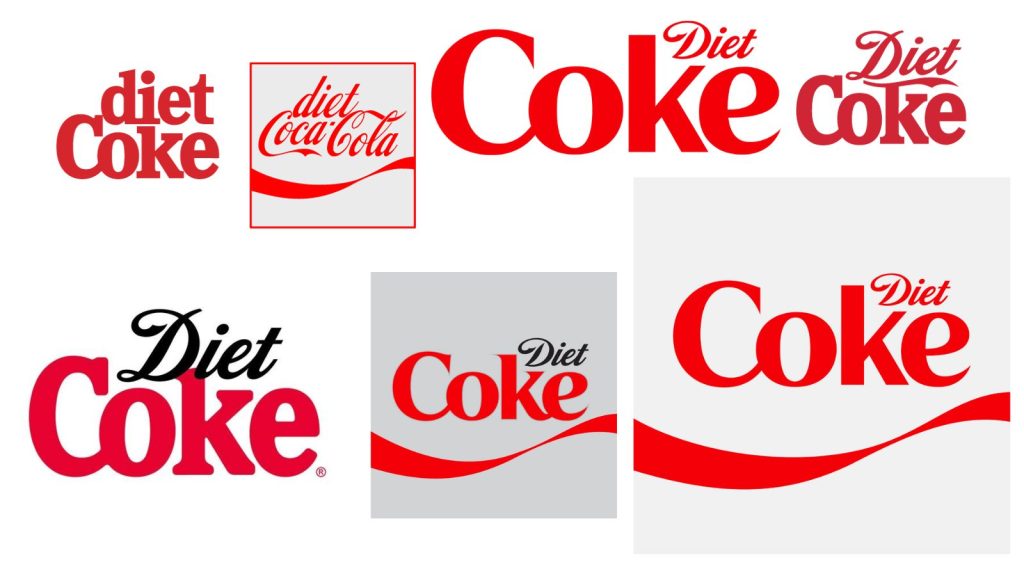
The sister brand of Coca-Cola, Diet Coke, is also quite popular as an individual drink. It is meant to be an alternative to sugary drinks for people who avoid consuming sugar.
However, you will be surprised to know that since its inception in the 1980s, the logo of Diet Coke has been through several changes, with new tweaks being done repeatedly to match the brand identity of its main brand – Coca-Cola. From capitalizing the “d” in “Diet” and introducing the same Spencerian script to minimizing the size of “diet” and adding it to the topmost corner of the word, thus emphasizing “Coke”, the logo has seen it all.
In the picture, the one at the bottom right, the biggest one, is the current logo of the product.
But it should be noted here, that a few things, like the brand colors and style, were nearly consistent throughout this phase, to portray its association with the world-class drink.
Logos of Zero Coke
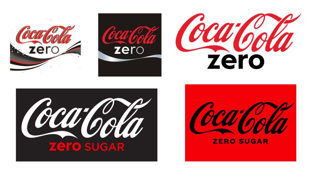
Launched in 2005, this zero-calorie drink from the company garnered quite some popularity in a short span. Unlike the Diet Coke, this was primarily developed for men, especially those who maintain a strict diet.
The original logo of the product (in 2007) featured the brand name “Coca-Cola” with a “Zero” in black underneath. The “z” and “e” of the word were bold.
In 2009, the Zero Coke logo was changed to a simpler version with the brand name in its existing form and a bold “zero” in black underneath.
In 2017, the word “sugar” was added to “zero”, to be in sync with the slight changes in the recipe of the drink. The background was black, while the word “Coca-Cola” was changed to a white font. The “Zero Sugar”, however, was reddened.
This design was again changed in 2021 and is in use currently. The background was made red and the script black. It is a minimalist design that is used in all the distributing countries.
We are living in an age when brand development strategies change at the bat of an eyelid to stay relevant and prominent. But as you can see, the Coca-Cola logo is a brilliant example of consistency and popularity, even in such uncertain times. Hats off to the brand!
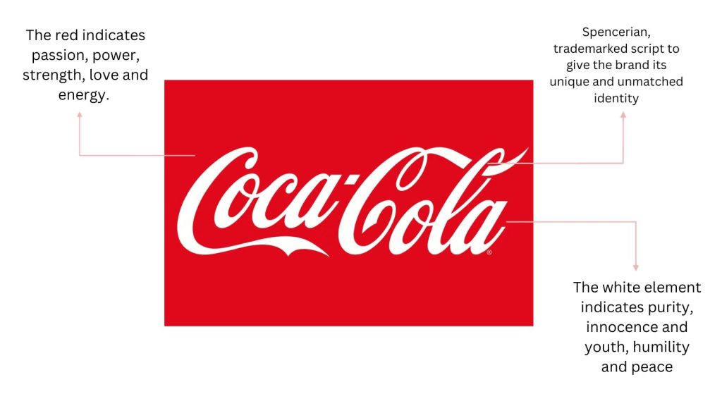
Salient Features of the Coca-Cola Logo and Their Meanings
The essential features of the Coca-Cola logo have been explained below:
| Font | Colors | Shape |
| This unique, Spencerian font was quite popular in the US in the late 1800s to early 1900s. The founder wanted the brand to stand out, and hence, he proposed this typeface for the brand name in the logo. | It is said that the color red was used to mark the barrels storing the drinks to separate them from alcoholic ones. Later, this color was used in the logo as well, as it helped create an impact on the eye. | The swirly shape of the Coca-Cola logo is a testament to the fact that Frank Robinson, the original creator of the logo, was a mastermind. However, the shape of the background has been experimented with several times, depending on the types of advertisement materials. |
Dynamic Ribbon Device
The iconic “white wave” in the Coca-Cola logo was introduced in the 60s. It closely resembled the shape of the contoured bottles, in which the drinks were packed and distributed.
Coca-Cola Logo Concept: What does each part of the logo stand for?
Every popular brand has some message (or messages) hidden in the shapes, colors, symbols, or script of its logo. It is an indispensable part of common brand guidelines to spark curiosity in the minds of the audience. The Coca-Cola is not an exception. Here’s what each part of the logo has to say:
What type of logo is Coca-Cola?
The Coca-Cola is a contoured word logo, to be exact. These are a lot similar to wordmark logos; the only difference is an eye-catching shape or symbol inserted along with the main script. In this case, it is the 2Cs and their peculiar shape. It helps the brand to create an impact with its unmatched creativity. The colors used in this type of logo are also quite impactful, helping the brand stand out easily.
Brand logos also appear in our lives in various forms, such as Logo Neon, logo pins, logo stickers and other peripheral products. It may also appear in various advertising, film and television series in the form of sponsorship and cooperation. Not only can it play a promotional role, but it can also deepen customers’ loyalty to the brand.
There are 16 other different types of logos that you may have seen in your day-to-day lives. The renowned brands, sometimes, fuse two or more types of logos to create an everlasting visual identity for their business.
What is so special about the Coca-Cola logo?
The Coca-Cola logo is undoubtedly a designer’s fantasy because of its unmatched brand style guide. It has undergone a few changes in 130 years, a milestone that every designer dreams to achieve. The most special aspect of the logo is its typeface, a Spencerian script that was popular in the late 1800s to the early 1900s in the USA, i.e. before the typewriter was even born (invented).
Next, it is special because of the brand’s global popularity of course. Currently, it is valued at $106.1 billion and ranks in the world’s top 10 most popular brands list.
Last but not least, the logo is also special because of its inherent simplicity. In a social media-dominated age, it remains unaffected by trends or fads that come and go. It maintains its dominance over years, decades, and even ages – something that definitely deserves appreciation and admiration.
Summarizing a few exciting facts about the Coca-Cola logo

- The brand color is allegedly said to be inspired by Santa Claus, who wore his quintessential cap and robe while advertising the brand once. However, the brand itself denies this story, calling it a rumor. It claims that the red color has been a staple of the brand from its growing days.
- Although there is no proof of this – The logo has always spiked several rumors. People assumed that it hides cryptic messages. According to the rumor mill, one of these messages was – “No Mohammed no Mecca” in Arabic. It was because of this rumor that the brand was scrutinized in Egypt in 1951.
- It is one of those few logos that do not give any idea about the brand’s products. There is no symbol or mascot that stands for soft drinks in the logo. However, this has not impacted the brand’s popularity over the years. In some countries, the word “soft drink” is synonymous with “Coca-Cola”. That’s how popular it is!
- The Coca-Cola logo elements depict fun, youth, passion, energy, and good times. No wonder it has become an essential non-alcoholic ingredient in house parties, birthdays, annual celebrations, corporate parties, etc.
- The Coca-Cola logo script is trademarked, as you may know already. In 1893, the brand registered it as a trademark “Spencerian Script” with the US Patent Office. Hence, you will not see any other brand with the same script in their logos.
- If you observe the logo carefully, you will notice the “Danish flag” in the “o” of the “Cola”. Although it is merely a coincidence, the brand, sometimes, leverages this instance in its marketing advertisements.
A few facts that you may not (yet) know about the brand
- In the early 1900s, several copycat soft drinks emerged in the market, interfering with the popularity of Coca-Cola. It was then that the trustees of the Bottling Organization decided to make the packaging bottles so distinguishable that they may even stand out in the dark. Thus was invented the iconic green bottle with its characteristic ridges, and the logo was embossed on the surface.
- It was the brand that helped popularize portable plastic coolers that we use these days. Previously, metal ones were used to store drinks at a particular temperature. However, the popularity of Coca-Cola can be attributed to the development of plastic coolers for easy transport.
- Do you know that the recipe for the world-class soft drink is kept in a secret vault, like some magic device in Harry Potter? Yes! You will not see the recipe displayed anywhere. But you can visit the World of Coca-Cola museum in Atlanta to see where it is kept under lock and key.
- The first-ever product to be featured on the cover of Time magazine was, yes, Coca-Cola. It was an illustration of Earth drinking from a bottle of Coca-Cola featured in 1950.
- The popularity of Coca-Cola has surpassed this planet, to be honest. Yes! In 1985, the world-famous astronauts of the Challenger space shuttle were seen drinking coke after their accomplishment.
- An employee of the organization was sent to prison for trying to sell the secret recipe to the rival soft drink manufacturer, Pepsi. Joya Williams, the former secretary of the organization was made to serve an eight-year-old sentence in 2007 for trying to do the nasty stuff.
- In 2013, a survey revealed an interesting fact about the consumption of Coca-Cola. It was revealed that Mexico, and not the USA, had the highest consumption rate of the soft drink. According to the study, an average Mexican drank about 745 servings of the product, including soda and everything else. In the USA, this number was 401. Interesting, right?
- The company is one of the longest-running sponsors of the Olympics. It has been sponsoring the games since 1928. However, it doesn’t mean that athletes should be drinking Coke to hydrate themselves. Lol!
- Two countries where Coca-Cola cannot be officially made or sold are Cuba and North Korea. According to a report by the Associated Press in 2017, the drink doesn’t operate officially in these two countries. However, the bottles do find their way from the China market to some upscale stores in these “coke-forbidden” countries.
- In the beginning, the drink was advertised as having medical properties. However, it was not proven, and health enthusiasts will not agree with the claims of “drinking coke to reduce nervous system disorders” today.
How popular is the Coca-Cola logo?
The Coca-Cola logo is universally recognized. To be exact, about 94% of the planet’s population recognizes this iconic red-and-white logo. With its presence in over 200 countries, and serving about 1.9 billion people, the brand and its logo is undoubtedly a star in its niche market.
So, who designed this superstar logo?
As mentioned earlier, Frank M. Robinson is credited for this iconic logo and the name of the brand. In other words, the entire brand identity is his brainchild. But you’ll be surprised to know that he was not a designer or a marketing manager of the brand. On the contrary, he was the accounts manager of Dr. John S. Pemberton, the pharmacist who invented the formula for this world-class soft drink.

Coca-Cola Logo Rebranding – Was it a make or a break?
The Coca-Cola logo went through several rebranding endeavors since its inception in 1886. Every time, the logo was tweaked to attract more eyeballs. Unlike many other brands, every rebranding venture was quite impactful and helped accelerate the popularity of the brand. Hence, we can say that the logo rebranding ventures of Coca-Cola were mostly successful.
In final words
Coca-Cola is one of the biggest examples of consistent brand identity, as stated earlier. Although its logo has gone through subtle changes in a period spanning 100 years, it maintained its uniqueness and consistency throughout. It is associated with good times, fun memories, and celebrations, depicted by its bright brand colors and unique, trademarked script.
The swirly design of the logo script portrays elegance and beauty, a thing quite rare in products of the same niche. It was one of the notable brand development strategies of the company that helped create a timeless impact on the consumers. No wonder the contoured word logo reigns supreme to this day!
Got Questions about the Coca-Cola Logo?
Why Coca-Cola is called Coke by consumers?
Coca-Cola is the original brand name of the product, while “Coke” is essentially a shortened version of it. As the drink’s recipe contains coca from the Coca plant and Kola nuts, the brand name was chosen. People love to call it coke, a shortened version of cocaine, which originates from the same plant.
Does the Coca-Cola Company have any mascot?
Many a time, polar bears are used as mascots by the brand for advertisements. These fictional bears are commonly known as Coca-Cola Polar Bears. Its logo, however, doesn’t feature anything else except the script and the “white wave” beneath.
How much did the Coca-Cola logo cost?
The logo was created by Pemberton’s accounts manager, Frank Robinson, in 1885/1886. He didn’t charge anything for the same. At least there is no record of it. Hence, you can say that the iconic logo was created free of charge. Wow!
What is the reason for the popularity of Coke in Mexico?
There is a big reason for the popularity of Coca-Cola in Mexico. Vicente Fox, the former president of the country, started his initial career as a delivery agent for the Coca-Cola Company in Mexico before joining politics. When he became the president of Coca-Cola Mexico, the drink rose to popularity as well. However, when he became the president of the country, the brand’s popularity surpassed even that of the US.
How big is the market of Coca-Cola right now?
As of 2023, the market capitalization of the brand stands at $252.57 billion. It is thus the 34th most valuable brand on the planet.