What do you feel when you look at the Amazon logo?
Well, of course, the name “Amazon” brings to your mind one of the planet’s largest tropical rainforests that covers almost 5,500,000 sq km of the 7,000,000 sq km Amazon basin. But these days, if you type “Amazon” in the search query of Google, the rainforest appears later in the SERPs.
The first result is of Amazon, the e-commerce giant with its characteristic yellow smile.

So how did this brand make such a huge mark on the internet that it even surpassed the source of its name in the search results? And how did it come with such an impactful logo that people can recognize within milliseconds, no matter where they are on the planet? We will discuss all these in this elusive post along with other exciting facts that you may have never heard of.
How did Amazon get its brand identity?
The company started merely as an online bookstore early in the 90s in a garage. Yes! Jeff Bezos, the founder, chairman, and the former CEO and president of Amazon started the company in his garage on 5th July 1994. He then lived in Bellevue, Washington, where he incepted the company under the name Cadabra, Inc. Now, the path from “Cadabra” to “Amazon”, the world’s largest e-commerce website worth $1375.36 billion, was not traversed in a fortnight, but it didn’t even take years.

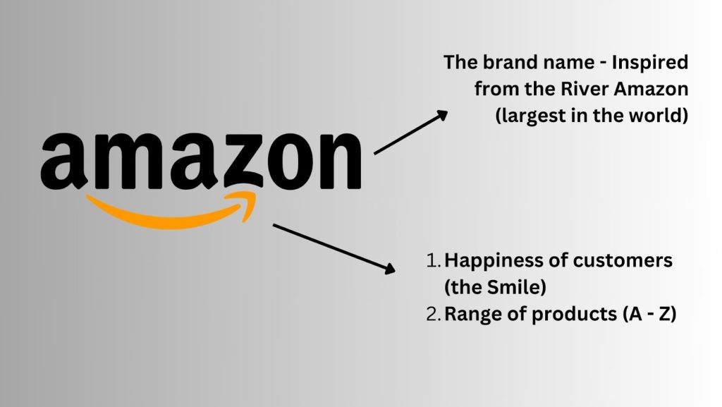
Just a few months after its launch, Bezos decided to find a new name for the brand, as the existing one felt a little creepy. Also, it had close similarities with Cadaver, the brand name of a television network. So, he came up with the new name “Amazon” (derived from the name of the largest river, Amazon), which became the bookstore’s brand identity. He also chose the name because it started with the letter “A”, which would easily come up in search results. The new name was both exotic and unfamiliar, ultimately making the brand climb the ladders of success seamlessly.
But one thing you should note here. The brand remained an online bookstore for some time before it ventured into other products. It delivered books to about 50 states and 45 countries from Bezos’ garage itself. However, the company faced losses, like all other brands that started small but made it big later. By 1997, the company started making revenues, gradually expanding its product line from ‘only books’ to other consumer items. But it was not before 1998 that it extended beyond books, and in 2003, Amazon’s gross profits escalated to about $73 million from $3 million in 2002.
Amazon Logo – Origin, history, and hidden meaning
The first-ever Amazon logo was very different from the current one. It had the river (from which the name is derived) as the main aspect with the “A” of Amazon designed as a trapezoid in black. The white, curvy, empty space in the middle of the trapezoid represented the River Amazon. The brand name, amazon.com, was put in bold below the trapezoid as an easily recognizable wordmark. This logo was designed in 1995 by Turner Duckworth, a designer in Bezos’ form.
The subsequent logos were experimental too, until the current one, which we see today, was established in 2000 and became a worldwide feature. It consisted of the brand name, “amazon.com” with an orange-yellow arrow starting from “a” and pointing towards the “z”, also depicting a kind of smile, something that Bezos wanted to bring on the faces of his global customers.
Amazon logo evolution story (part-by-part)
The logo for Amazon went through several subsequent changes since its inception in 1995. Let us go through each of these events to understand the entire brand-building process of Amazon.
1995

As mentioned earlier, the original Amazon logo consisted of a trapezoid with the “A” of Amazon as its characteristic feature. You can see in the picture how the empty, curvy, white space in the middle of the trapezoid closely represents a river, namely, the Amazon River, from which the brand name is derived. Although this logo was a little outdated in terms of design and had to be revised in 1997, it adhered to some of the basic principles of logo design during that time.
1997-1998

The first-ever improvisation made to the logo was the zebra print tone of the trapezoid. It was said to be inspired by “A Night at the Roxbury (1998)”, because of its garish and unnecessary pattern, a remarkable feature of the 90s styling, ridiculous yet brilliant.
However, one cannot negate the fact that the zebra print added no value to the visual identity of the brand and almost worked as a distraction from the brand name. Thus, it was only in use for a year and revised in 1998, AGAIN!
1998
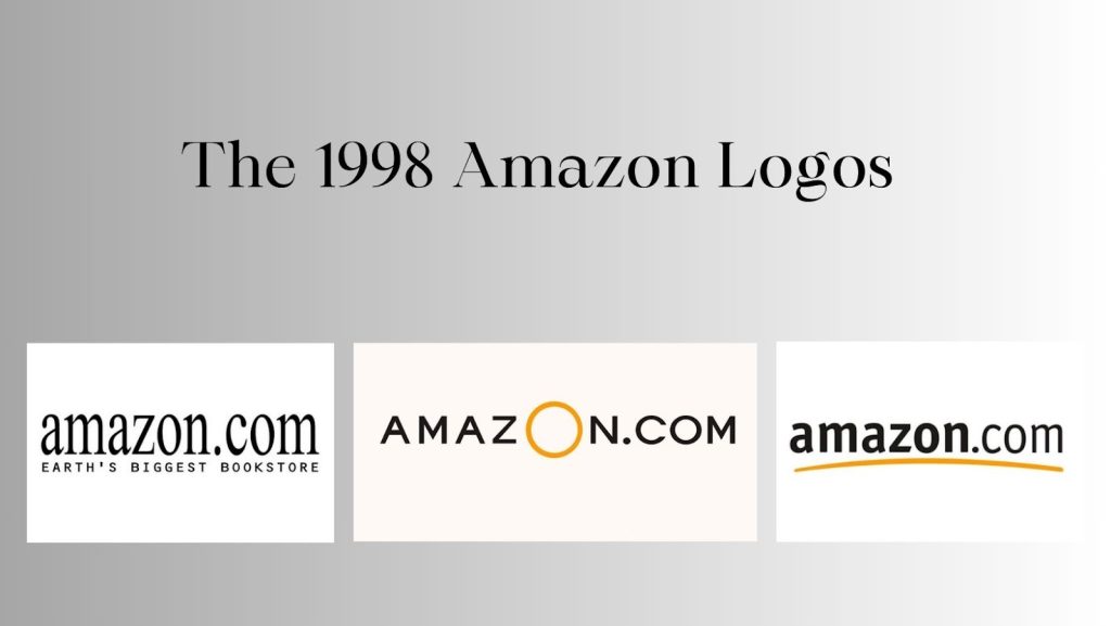
More than one logo was created this year, each of those lasting for a brief phase, until a design was finalized to develop a robust brand identity. But one thing was common in all the three improvisations of the Amazon logo – wordmark. All the improvised logos were wordmark logos, obliterating the original trapezoid.
So the first improvisation was a simple wordmark logo in serif typeface with the tagline – Earth’s Biggest Bookstore – incorporated below the brand name.
The newer version was made in uppercase to depict the dominance of the brand. Further, the “O” of “Amazon” was made yellow to attract eyeballs. This logo remained in action for some months.
At the end of the year, the logo was changed again. This time, the yellow swish that we see in the current logo was introduced. The font was also changed to Officina Sans to create a greater impact. The brand name was made bold to enhance visibility, keeping the “.com” portion lighter.
2000
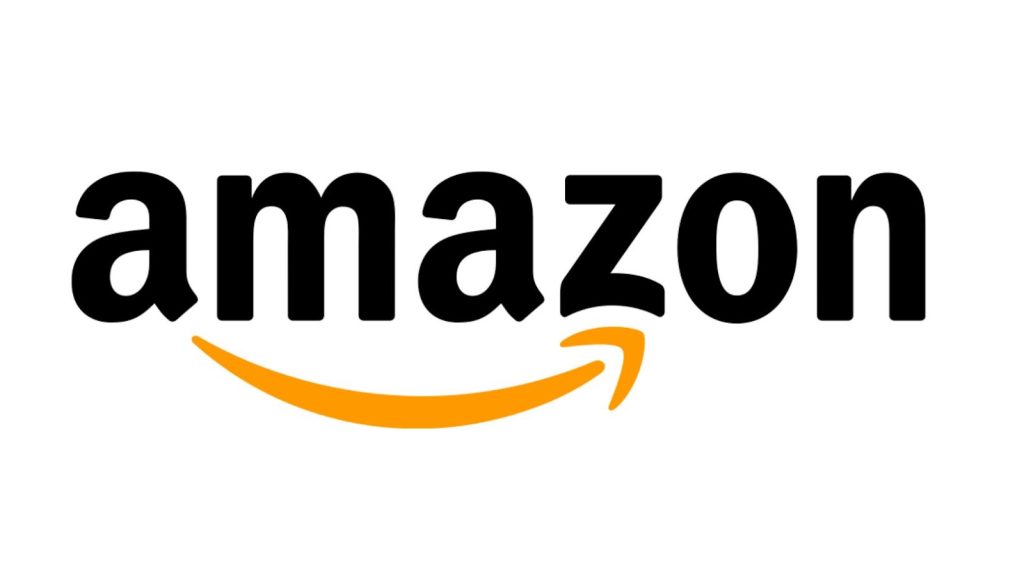
With the onset of the new millennium, the Amazon logo finally got its staple appearance, one that we know today.
- The yellow swish was extended to seem like a smile under the brand name.
- This swoosh was extended from the letter “A” to “Z”, depicting that the customers can find any item, whatever they seek, at the online store.
- The smiley also depicted customers’ happiness on receiving the products at their doorstep without any hassle.
- The “.com” portion was removed completely.
This logo continues to be the brand’s visual identity to this day.
Evolution of the brand’s mobile app logo
By 2010, mobile apps were taking the market by storm. According to Jeff Bezos, this trend rose because of the inherent simplicity of buying online stuff through mobile apps. Smartphones, by then, had become too popular, even more than computers. Many companies, like Google and Apple, were leveraging the Smartphone trend to deliver exemplary customer satisfaction through in-app services.
Why would Amazon stay back?
In 2011, the brand launched the popular Amazon Appstore for Android and Fire-OS devices. From reading (Kindle) to shopping and entertainment, the store flaunts several apps today for its loyal customers to have all of it from a single brand. Today, the Appstore consists of about 175,491 apps in the genres – games, entertainment, lifestyle, travel, utilities, etc. – published by several developers across the world. On average, about 139 apps get published on the platform daily.
Now, the logo of the Amazon App Store has an interesting history as well. Let’s dive in!
At first, it depicted a shopping cart with the brand name – a simple logo that was expected to do no extra wonders for the brand.

In 2021, 5 years after its launch, the shopping cart logo was replaced by a brown package, featuring an envelope with jagged edges at the top, and the smiley swish of the brand in the middle.
Just after its launch, a group of netizens started claiming that the logo (especially the jagged edges of the envelope) gave an illusion of the face of Adolf Hitler.
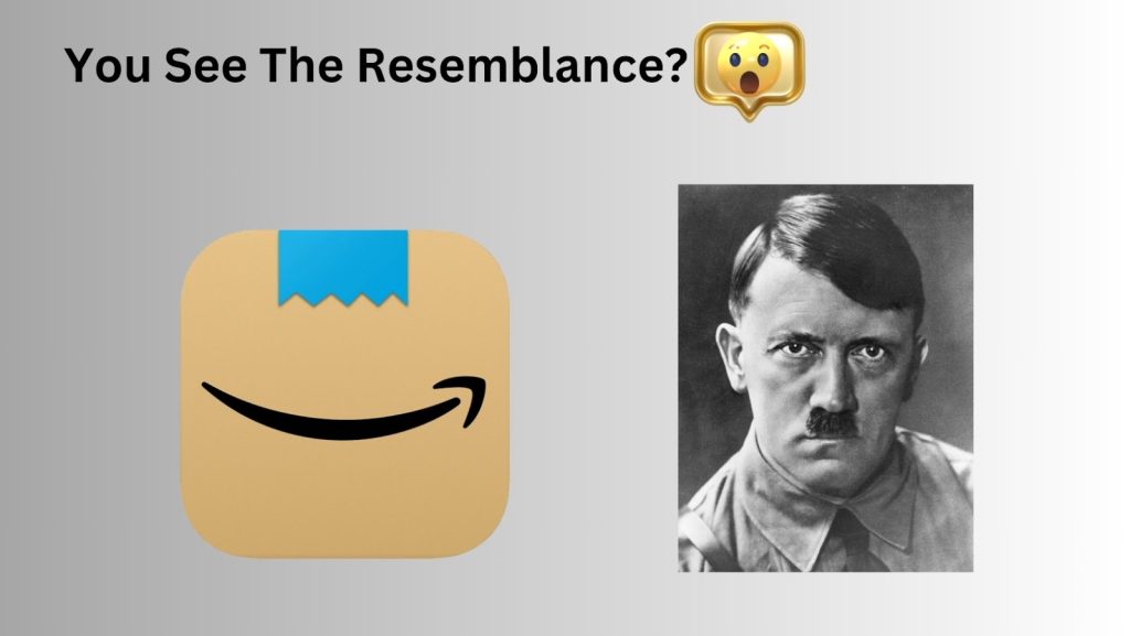
They used social media to voice their opinions and the company took notice. In a brief phase, the brand owners tweaked the design a little and replaced the jagged-edge envelope with a neat one, folded at the side.
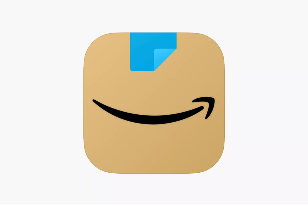
It depicted a delivery package that had been opened. Nothing else was changed though, but the illusions along with the discontentment vanished, thus establishing this logo as the identity of the brand’s mobile Appstore.
Logos of some other Amazon products
Amazon Prime

Prime was launched by Amazon in 2005 as a means to expedite delivery services within the US. The paid subscription model later expanded into the entertainment zone to offer exemplary services to the customers. Subsequently, the Amazon Prime model was launched in other countries, like Germany, Canada, the UK, France, Italy, India and Japan. Currently, the brand has over 200 million Prime subscribers globally.
So this classic sky blue Prime logo retains all the essential elements and themes of the original brand logo, including the swish underneath. It is also a wordmark logo with the name “Prime Video” toned in black, and the swish finishes the characteristic smiley effect.
Amazon Music

Like other products of the brand, Amazon Music flaunts the characteristic logo style with the name of the parent brand in bold and the word “music” in a lighter font. The swish, as usual, connects the “a” to the “z” of Amazon. The colors remain the same bold black, as you can see in the picture already.
Amazon ads

Again a logo with simplistic but impactful features, the Amazon ads logo flaunts the parent name in bold black and the word “ads” added after in a lighter font. In the brand style guide, the swish doesn’t change its position (connecting A to Z), thus retaining the original theme.
Amazon Studios

This one, however, deviates from the original design and appears a tad more stylish, visually.
As you can see in the image above, the logo features white font on a dark background all in uppercase. While the word “Amazon” is made bold, you find “Studios” in a lighter font style.
What type of logo is the Amazon?
There are basically 17 types of logos that world-class companies use as their brand symbols. From simple wordmarks and mascot logos to slime, typographic, and descriptive logos, their subtle variations and characteristics will blow your mind.
So what type of logo is Amazon?
It is a simple, wordmark logo with a swish (depicting a smile) underneath. Although the first-ever logo of the brand was an abstract mark logo with the “A” resembling a trapezoid, it was later simplified into the easy wordmark we know so well today.
Breaking down the design elements of the Amazon Logo
The Amazon logo is simple yet highly impactful. The main design elements in the primary logo and their meanings have been explained below:
| Font | Color | The Swish or Arrow |
| The wordmark logo is written in Amazon Ember font, a Sans Serif font that was specifically designed for the brand. It emphasizes the inherent friendliness of the brand. | The brand name in the logo is all black, one of the most dominant brand colors in the logo design industry. It represents the brand’s dominance in the niche industry. The smiley-swish is bright yellow, creating a contrast in the logo and also depicting the satisfaction of the customers. | The arrow represents a smile, which depicts the happiness of the customers with the brand. Also, it connects the letters, “A” with “Z”, thus implying that you can get everything at the store. |
What is so special about the Amazon logo?
As the brand story reveals, Jeff Bezos chose the name to represent his brand’s dominance in the niche market. Amazon is the name of the largest river in the world, and supposedly, Bezos wanted his brand to become the greatest in the niche market. In the original logo of 1995, you will see that the image of the river is incorporated into the white space of the symbol “A”, thus giving credit to the source of the brand name openly. In the subsequent designs, however, the symbol vanishes, including the river. But everyone, by then, knows the store of the brand identity.
One notable thing about Amazon’s brand development strategies is introducing the yellow swish underneath the brand name.
It is shaped like a smile, depicting the happiness of the customers who shop from Amazon. Besides, the arrow points from “A” to “Z”; thus highlighting the fact that you can get everything (A – Z products) at the world-class online store.
Summarizing a few exciting facts about the Amazon logo
- The current logo of Amazon was created in 2000, and it persisted.
- The swish in the logo aligns with the company’s aim to “deliver smiles to your door”.
- Amazon’s mobile app logo initially resembled the mustache of Adolf Hitler, thus inviting severe controversies on the internet. It was later tweaked a little to tone down the effect.
- The font used in the logo has been made specifically for the brand (Now that’s something huge).
- All the products of Amazon have their separate logos, but except Amazon Studios, every one of those retains the characteristic “swish” smiley in their logos.
- The black color of the logo depicts supremacy and elegance, while the yellow (or yellowish-orange) of the swish stands for happiness and pride.
- There were three improvisations to the original logo in 1998, only to be changed after two years, yet again.
- The swish of the logo also represents the range of products (A-Z) available at the world’s biggest online store.
- Although the logos of all Amazon products are distinct and separate, they maintain consistency with the primary logo.
- The Amazon logo has never, NEVER offended any culture (even by mistake) across the globe. The only controversy regarding the mobile app logo was soon resolved.
Intriguing facts about the brand that you may not know
- Amazon was initially named “Cadabra”, inspired by the magical verse “Abracadabra”. Jeff Bezos wanted his brand to magically deliver books to the customers’ doorstep.
- The brand was first launched as an auction site to compete seamlessly in the e-commerce space. Later, in 1999, its shares increased by 8%.
- Amazon also competed with Google and Yahoo by launching a search engine, A9.com, in 2004 for a brief period.
- The customers of Amazon can willingly donate to several charitable organizations while buying goods.
- The first book that Amazon sold in 1995 was “Fluid Concepts and Creative Analogies” by Douglas Hofstadter. John Wainwright was the first buyer of the company.
- In the initial days, whenever a customer bought from Amazon, the company workers used to ring a bell to celebrate the small achievements.
- The company employed about 1.271 million people across the globe, more than Google, Facebook, and Alibaba combined.
- Amazon is also developing a drone delivery system, called Prime Air, which is supposed to deliver packages within 30 minutes of ordering.
What is the popularity score of the Amazon logo?
The smiley arrow of the brand is instantly recognized as a sign of happiness and contentment. When Amazon delivers its products to the customers’ doorstep, the smile on their faces is what the brand has put forth in its logo. In fact, the brand’s popularity can be attributed to this aspect of the logo that makes it come out as a friendly and satisfaction-providing online store. Every product, as well as the delivery packages, flaunts this smiley arrow to establish brand dominance and loyalty. As the brand building process of Amazon reveals, this arrow has created a huge impact on the minds of the customers, as well as the brand’s popularity.
Further, the packaging boxes of Amazon are sturdy enough to be recycled and reused, thus propelling the brand’s popularity further. The packages are designed carefully to make them stand out along with the smiley-arrow that never seems to give up on the customers.

The logo is also quite popular, as it takes the brand development process to another level by enabling customers to donate 0.5% of their purchase amount to charitable organizations, through the AmazonSmile program.
Who are the designers of the Amazon logo?
The original Amazon logo was created by the design agency, Turner Duckworth, in 1995. It had the “A” shaped like a trapezoid with the white space in between designed in the form of a river. The website name, i.e., amazon.com, and the tagline, “Earth’s Biggest Bookstore”, was incorporated into the logo.
However, the critics and other brand developers did not like the logo much and called it “outdated” and “cliché”. In the subsequent years, the logo was improvised several times until it got its deserving status in the current design.
Amazon Logo rebranding history (Make or Break)
Rebranding the Amazon logo was one of the biggest steps that the company took to popularity. In 1997, the first-ever logo was redesigned to create an impactful visual identity, marked by the zebra pattern. However, it was short-lived, as the logo design diverted the audience from the brand, and thus, it was again refurbished thrice in 1998. It was not before 2000 that Amazon came up with its current logo which is recognized globally.
The logo rebranding endeavor of Amazon was thus a huge success that “made” the brand global, to be honest.
Got questions about the Amazon Logo
What is the current Amazon logo?
The current Amazon logo features a simple wordmark with the brand name in black. Also, it features a yellow arrow in the shape of a smile, connecting the letters A and Z, thus denoting customer satisfaction and also the range of products in the store.
When did Amazon come up with the Smile logo?
In 2000, the brand came up with the smile logo to denote the happiness of its customers on receiving its products at their doorstep. The smile is also made yellow, in contrast with the black of the brand name, so that it is easily spotted.
Is there any special reason why the Amazon logo is black?
According to brand guidelines, black denotes professionalism, elegance, and supremacy in business. The Amazon logo is black, as it holds supremacy in the niche market and is also professional enough to deal with customer queries and issues.
Why is the font used in the logo so special?
The font used in the Amazon logo is a custom-made one, Amazon Ember, specifically designed by Dalton Maag for the company. It is a sans-serif font tweaked a little to give some uniqueness to the logo. Another font, also custom-made by Dalton Maag, Bookerly, is seen in some Amazon products, like Kindle, Alexa, etc.
Final words
The company that started in a small garage became one of the global names in the e-commerce industry. The logo of Amazon plays a huge role in this success story. With its simple structure, colors, and inherent simplicity of design, the logo managed to make a huge impact on the minds of the brand’s audience. Today, everybody recognizes the characteristic smile of the logo, its authoritative black font, and the “a” of the brand name, without much hassle. It is one of the best examples of a wordmark logo with a symbol, as simple as a swish, to denote customers’ happiness with the brand.
Named after the largest river in the world, Amazon has managed to climb the ladders of success in visual identity besides its services and products. If there is anything that the logo teaches us is this – Consistency and simplicity are the keys to popularizing brand identity. Before your products/services capture the minds of your audience, the visual identity of your brand will be noticed, accepted, or rejected. Hence, you should design your company logo carefully, so that it reflects your business, the company culture, and character seamlessly.