A large part of running a successful business goes into identifying current trends and predicting future market growth. A new spending guide by the IDC, projects that spendings on Big Data and Analytics Solutions will rise to $215.7 billion in 2021. In fact, small companies spend more than $10K a year on analytics!
Today, companies have access to a large number of figures and numbers. But none of it means anything if you cannot convert them into actionable data. Unstructured data can be a market study team’s (or any team’s!) biggest enemy.
However, there is a horde of representation tools and analytical techniques out there that can help you make sense of these statistics. This includes data visualization tools like mental models, decision mapping, Venn diagrams, and other infographics.
What we’re looking at today is a tool called a histogram. A histogram is essentially a frequency chart that allows you to see the average number of occurrences of a specific event against another variable like day or time.
On the whole, histograms offer a visual way of representing data that makes it easier for the team to identify trends, find deviations, compare outcomes, and plan ahead.
Even then, if working with large datasets scares you, fret not! The age of the internet has a solution for everything.
What is a Histogram maker?
An online histogram maker is essentially a web tool that allows you to create histograms quickly. You can upload the data onto the site as a CSV file or enter data manually.
A free histogram maker may be limited in the options it offers. However, most online histogram maker tools contain options for adding datasets, labels, bins, etc. You can also get a histogram maker for grouped data, a histogram maker with intervals, a histogram maker with a frequency table, and more.
Moreover, based on the online histogram make, you can represent your data using different colors, 3D views, and legend styles. Of course, the question remains as to why should one even use an online histogram maker?
Why is Histogram important for business and how a Histogram maker can help
Nothing attracts people like numbers that speak volumes. One can observe trends and analyze patterns all they want. However, when the data is presented in the form of numbers – that’s when people actually take note.
Moreover, being a visual tool, they allow one to immediately identify deviations from a normal curve, or see the overall trend during a week, month or year.
A histogram maker can be beneficial since:
- They can allow you to identify trends – The rise and fall of the graph can help you zero in on specific trends like timings when people are most active online. This data can then be used to create more effective marketing plans, for example.
- They can help you set goals for your business – By looking at the mean and variance of the histogram, you can determine where improvements can be made. For example, a histogram of a restaurant waiting time may reveal spikes during the day when it is too long. The manager can then take measures to reduce the time by employing peak-hour waitstaff.
- They can help you classify data – In cases where multiple factors affect the output, histograms can be used to find out how they affect the output altogether. As such, they are more effective than bar graphs that work with 2 variables at a time.
- They can help you compare results – A Histogram maker with class boundaries or specification limits can help one compare the results based on the available resources and see if the outcome was “good” enough.
However, the days of making one by hand are long gone. Since histograms deal with large data sets, using an online histogram maker is the easiest way to create a customized one.
How to use a Histogram maker?
You need two things to create a histogram – datasets and an online histogram maker. The essential steps include:
- Finding an easy histogram maker for your needs and selecting the type of histogram you want. An online histogram maker typically comes with pre-existing templates that can be customized.
- You can now enter data manually or upload a CSV file in the given format. Identify the values from your X and Y axis and enter them accordingly.
- Once done, a histogram will be generated. You can also get a histogram maker with intervals or a histogram maker for grouped data depending on your variables. A histogram maker with standard deviation will also supply information like skewness, variations, mean value, and more.
- Once done, you can add icons, labels, change colors, etc. to match your brand visuals.
- Typically, an online histogram maker will allow you to save the result offline as well as export it in a multitude of formats.
Bad with numbers? 14 best Histogram makers to help you find your next business direction!
Visme
If you’re looking for a wide range of visually appealing templates then Visme is the tool for you. Being an online tool, Visme does not need any downloads. You can simply log in and get started.
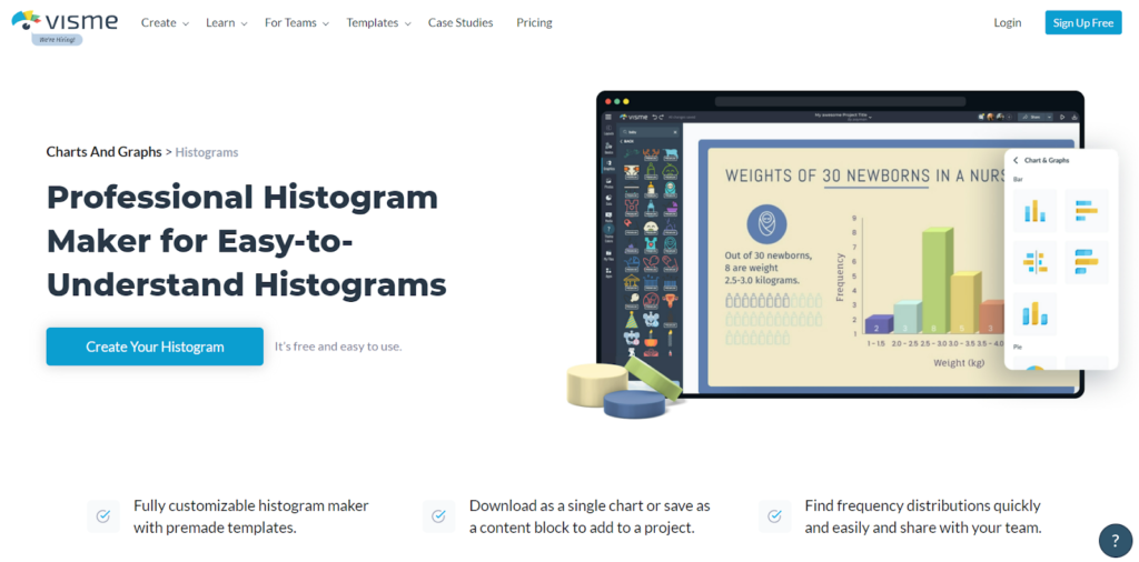
You can upload mass data as a CSV file, and further customize their templates based on color, shape, font, and more. If you have a particular brand visual, you can create a guide that can be used for all future histograms.
However, Visme’s best part is that it allows animated histograms! This is great if you’re looking to add the chart onto your website. Visme allows you to embed the chart onto your website or download it as a PDF.
What we love: Allowing animated embeds onto a website
Best for: People looking for creative and interesting visuals
DISPLAYR
Displayr offers a wide range of data visualization methods with their Histogram creator being just one of them. However, where Displayr performs better than its contemporaries is its analytical capabilities.
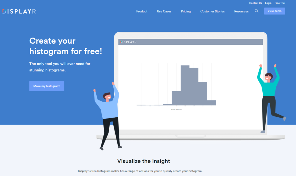
It allows one to create histograms by uploading data sets, and customizing them further along the lines of color and font – that’s the basic package. But Displayr also allows one to extract useful information from it! Using machine learning and statistical analysis, Displayr can help you identify possible deviations and anomalies.
Moreover, their paid package allows online collaboration and document sharing which is great for teams to work with. You can also export their files in three different formats and secure them using team passwords.
What we love: Machine learning for data extraction
Best for: People looking for formal, business presentations
Social Science Statistics
If you’re looking for an easy and free histogram maker, then it doesn’t get better than Social Science Statistics. However, being free is also more limited in its abilities than the ones above.
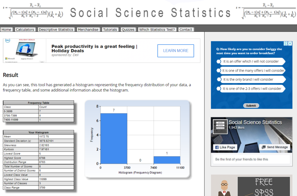
As of now, Social Science Statistics allows you to enter data manually and generate a histogram with a single click. It can generate both regular frequency distribution charts and charts with a specific class range. It also provides all relevant information like distribution ranges, skewness, standard deviation, and more.
However, there are no customization options or templates available. On the whole, Social Science Statistics is a great tool for someone looking to understand data using a free, online tool.
What we love: Everything is free!
Best for: People looking to understand frequency distribution without frills
Meta-chart
Meta-chart is a data visualization tool that comes with its own free histogram maker. It offers basic customization for colors and labels, but on the whole, it is more focused on function than visuals.
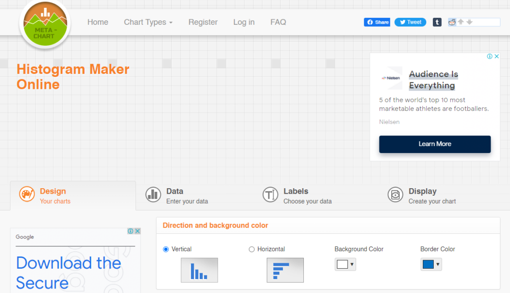
The data has to be entered manually. You can choose whether you want to see a 2D or 3D result. It does allow one to set ranges for error values. However, if you want to compare data among specific intervals, you will still need a histogram maker with bins.
The chart can be saved offline, but you need to log in and create a free account for that. Charts can be exported as an imagen vector or a PDF file.
What we love: Multiple exports and sharing options not usually seen in free tools
Best for: People looking to understand frequency distribution without frills
PicMonkey
With a huge template library to choose from, PicMonkey’s histogram maker is great for anyone looking to gather insights while creating a visually appealing chart. Keeping up with design trends, PicMonkey offers templates with pop-color splashes to retro touches.
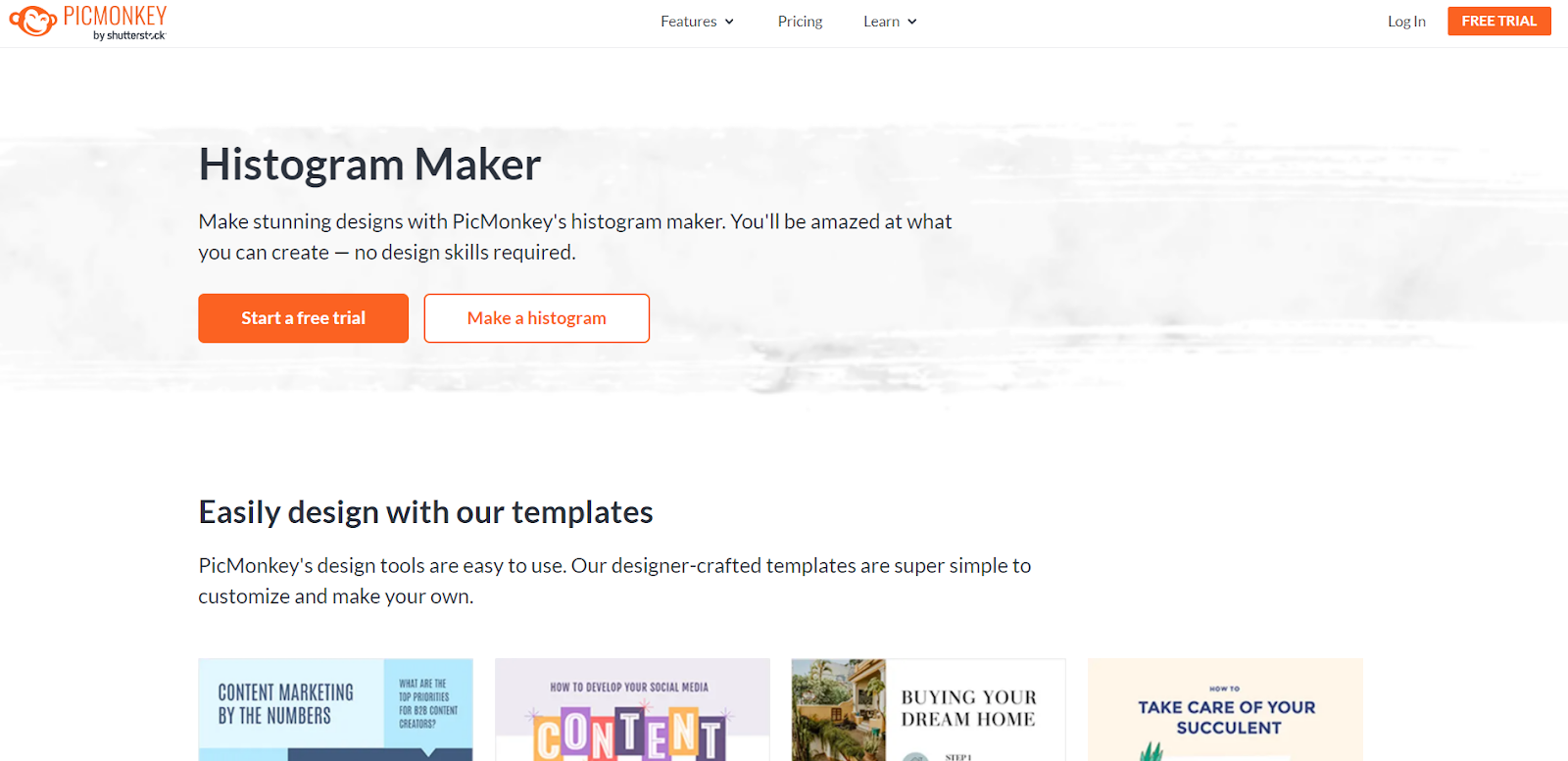
You can further customize the chart by adding labels, vectors, stock images, stickers, and more. Datasets can be uploaded as a CSV file, and the result can be exported and shared with teams.
PicMonkey was designed for quick work, and its templates and huge library allow one to do just that. However, PicMonkey is not free and even the Basic Plan will cost you $7.99USD per month.
What we love: Huge template library
Best for: Visually appealing charts for presentations
Statistics Kingdom
If you’re looking for a free histogram maker with bins, then head over to Statistics Kingdom. Statistics Kingdom, like Social Science Statistics, is a functional and easy histogram maker that does not allow visual customization but gets the job well done.
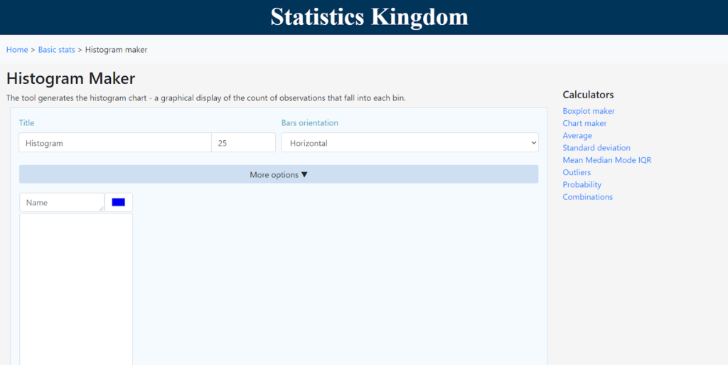
Unlike Social Science Statistics, it offers many additional features. One can set outliers, edit the number of bins, set specific ranges, and more. Data can only be entered manually and you do not need to log in or create an account.
Even then, Statistics Kingdom keeps your last chart in temp memory so you can recover it should the need arise. As of now, there’s no option to export the histogram other than taking a screenshot.
What we love: A highly functional online histogram maker
Best for: People looking for a histogram maker with bins
Easy Calculation
Easy Calculation is a histogram maker for grouped data where you can enter data manually and get instant results. You can enter the X and Y axis values separated using commas. While it does not allow any visual customization, it is absolutely free to use.
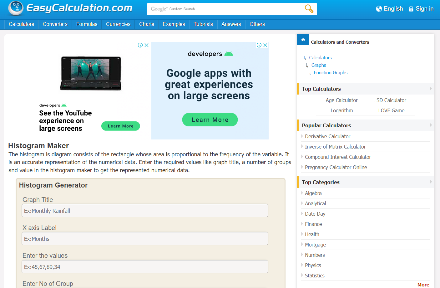
Another interesting feature is that Easy Calculation allows you to embed the graph onto your website. You can do this by getting the code of that specific chart from Easy Calculation and adding it to your website – this will require some basic coding knowledge.
Easy Calculation does not store any charts, nor does it have any export options. So make sure you get the code or take a screenshot.
What we love: Code for embedding on websites
Best for: People looking for a histogram maker for grouped data
MathCracker
As a histogram maker for math fans, MathCracker boasts of a horde of other graphing and visualization tools like scatter plot makers and calculus solvers. MathCracker’s online histogram maker is a simple tool where you can manually enter data separated by commas and specify the grouping.
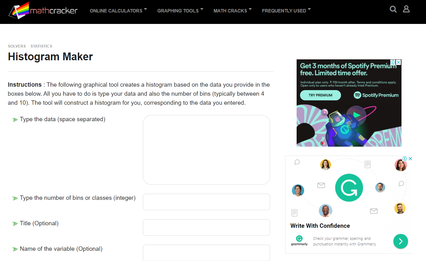
MathCracker also allows you to assess the normality of your curve using the Anderson-Darling test calculator. It does not offer any visual customization. But similar to Easy Calculation, you can get a chart code for adding it to your website.
What we love: Code for embedding on websites
Best for: Basic understanding of a frequency chart
EDraw
EDraw by Wondershare differs from the other tools on the list, in the sense that it is downloadable software. And as such, it offers way more customization than other tools.
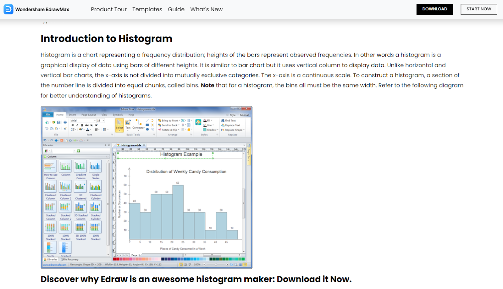
Unlike other tools where you can mainly customize the colors, EDraw allows you to experiment with multiple stack styles as well. You can choose 2D or 3D graphs, graphs with cylindrical bars, gradients, and more.
It also has a special hyperlink function where you can source web pages. Their template library is also regularly updated and you can add styles of your own onto their online library! Final results can be exported in both vector and PDF formats.
EDraw is available for both Windows and Mac OS. Perhaps the only place where it comes next to an online histogram maker is that it does not have any collaborative features.
What we love: Highly customizable charts
Best for: Histograms of all types and visual appeals
AAT Bioquest
One of the main purposes of a histogram is to be able to use it to compare amongst multiple datasets. AAT Bioquest is a free histogram maker that allows one to do just that. You can compare up to 3 different data sets by entering them manually, or pasting them from an excel sheet.
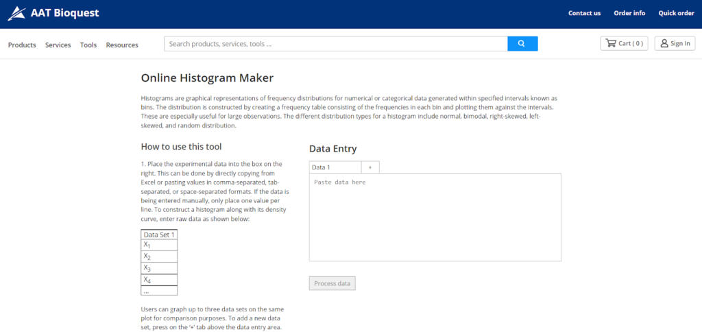
AAT Bioquest does not allow visual customization. It does however offer information related to ranges and counts.
What we love: Three-way comparison between data sets
Best for: People looking to compare multiple frequency sets
DATATab
DATATab is an online statistics calculator that offers multiple data visualization tools for free use. However, unlike other online tools, where each calculator is a separate tool in itself, DATATab allows one to exercise all calculations within the same table.
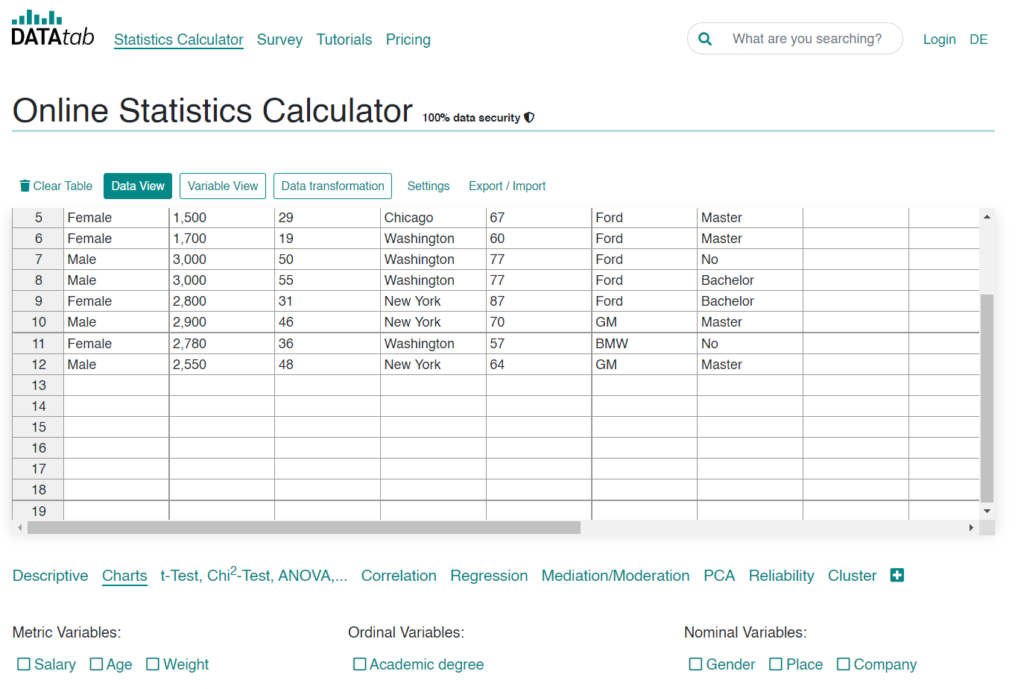
This means, once you have entered the data, you can choose if you want the results to be displayed as a histogram, or as a scatter plot or line chart. You do not need to change tools and enter the data again!
Its free histogram maker with bins comes with its own Excel-sheet format data entry space. So while entering data is manual, it is easy to copy-paste it directly from a CSV file.
What we love: All-in-one interface
Best for: People looking to perform multiple tests
Omni Calculator
For beginners, Omni Calculator is a great choice as it not only is an easy histogram maker but offers a blog that explains in great detail how histograms work!
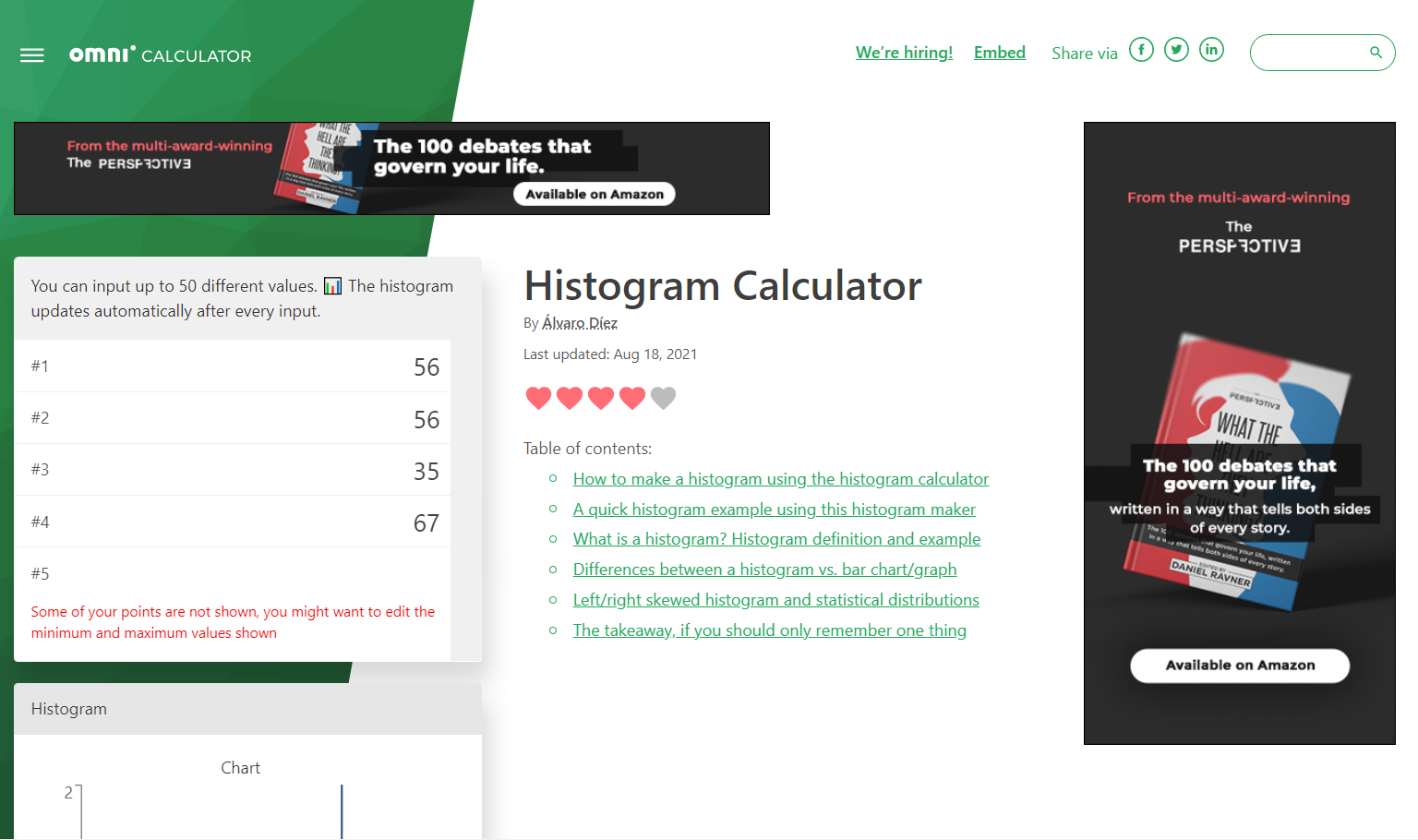
What it does differently is that, unlike other tools that generate a histogram at the end, Omni Calculator offers a continuously changing histogram that updates as you enter values. Hence, it’s great if you want to see how different values affect your system.
However, it is also worth mentioning that Omni Calculator is much less intuitive than the other free histogram maker tools on the list. As such, you need to enter more than just the values and press “Generate”. You also have to define the top and bottom values for the graph generated.
What we love: Self-updating histogram feature
Best for: People looking to work with ever-changing data
Desmos
Desmos is essentially a histogram maker for math nerds. In other words, it comes complete with all types of features – being able to set bin sizes, generate frequency tables, get data on skewness, standard deviation, and more.
But it also comes with an infinite graph that allows you to deal with large data sets and see an ever-changing graph as per the values you enter.
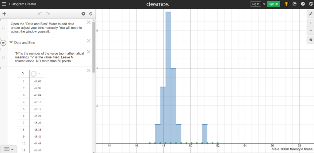
Desmos is highly customizable. You can not only change the font and color, but also the equation and code that the site uses to generate histograms (though we hope you won’t need it).
It is also pretty self-explanatory and comes with pre-filled data to help you understand the interface. As far as getting work out of a histogram goes, Desmos does it like no other.
What we love: User-friendly, and highly functional interface
Best for: People looking to work with large data sets
iMathas
iMathas might look like an easy histogram maker for beginners, however, it does take some time to get used to.
While other histogram makers ask you for raw data value and then bin size to calculate the frequencies, iMathas asks one to directly enter the frequency for each bin size. It is essentially a histogram maker with a frequency table that does not calculate the frequency by itself.
Hence, you might need to sit with a separate paper before you actually enter the values in it. On the whole, iMathas does what it set out to do. You can enter an unlimited number of classes – which is usually limited in other tools. We tested it out with 1,00,000 classes and while the tool lagged – it did not return an uncomputable error!
What we love: Free tool with unlimited classes
Best for: People looking to work with large data sets
Your burning questions on Histogram maker, answered!
Final thoughts on Histogram maker
On the whole, histograms can be a cool addition to any website as well as a great tool for you to understand where your business is headed. With an online histogram maker, the task of mapping has become infinitely easier. All you need is the data from your end.
However, a histogram is simply a representation and you will still need to analyze and extract insights from it! Some tools like Displayr are working on the analytical capacities of such tools as well. Till then, get started with an online histogram maker and see how it benefits you strategizing!